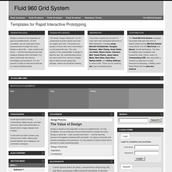
960 Gridder - Lay out websites with ease. Grid design basics: Grids for Web page layouts By CraigGrannell Introduction Since tables were co-opted for layout purposes, columns have become key to many Web design layouts, and this thinking continued when CSS took over from tables (at least in the minds of savvy designers) for Web-page presentation. Thinking modular Grids are a template, a framework within which creativity can flourish. Instead of arbitrarily picking column sizes, grids enable you to create a common visual language throughout an entire Web site, rather than deciding things on a page-by-page basis. Creating a layout grid Unlike in print, there’s no set canvas size for a Web page. With the majority of users now having monitors capable of a resolution of 1024 x 768 or higher, the tendency for layouts is towards a width of about 950. That said, too many columns can result in excessive complexity, so when working on initial grid designs, stick to about a dozen columns. Taking grids to the Web The basic page structure can therefore be marked up as follows: Summary
A Detailed Look at the 960 CSS Framework CSS frameworks are bloated. CSS frameworks are for people who don't know how to code. CSS is too simple to implement a framework. If you've ever read a tutorial on a CSS framework, I can guarantee that many comments mimic the previous statements. My guess is that the majority of these comments are stemmed from slight ignorance. Once you take the opportunity to spend some time with 960, you'll be amazed at how much time can potentially be saved when developing your web applications. Rapidly speeds up development time. Let's imagine that we want to work with the "12 column" structure to create the extremely simple layout seen below. Specifying an id here isn't required by any means. Now we want to create a simple header and two column structure. I'm going to choose a header width of "940px" (+ 20px margins = 960), a sidebar width of "220px", and a main content width of "700px". You must assign a class to each div.
#grid — A layout grid in JavaScript and CSS for web design and typography Gui Prototyping Tools Here is an alphabetical list of tools helping with drawing screen mock-ups. 10screens create and share clickable rich prototypes online, Now free as of July 2012 Allows multi-level drill-down of workflows to screens. Use VB for the demo. I think MS has some "crippled" versions for free. VB may suck in many ways, but for throwing a GUI up quick, it is hard to beat. - Try to populate tables with data in VB. I've been doing simple prototyping in html before, to get a view of the application structure. Kudos to the WikiGnome that sortificated the list! Thank you, thank you, thank you! I've used Qt Designer (part of the LGPL Qt SDK) for prototyping desktop apps before. The following is a large spreadsheet comparing all the UX / IXD tools I could find - Everything from Wireframing to Prototyping, on the Mac, PC, and Web. RealBasic works. We just launched into Open beta.
960 Grid System The 960 Grid System is an effort to streamline web development workflow by providing commonly used dimensions, based on a width of 960 pixels. There are two variants: 12 and 16 columns, which can be used separately or in tandem. Dimensions The 12-column grid is divided into portions that are 60 pixels wide. Purpose The premise of the system is ideally suited to rapid prototyping, but it would work equally well when integrated into a production environment. Resource Name 960 Grid System Resource Creator Nathan Smith Description
Mastering the 960 Grid System We're already familiar with the 12- and 16-column variants of 960.gs, but did you know that a 24-column alternative exists too? In this article, you'll master the 960 grid system by dissecting the 24-column version demo. If you've only used 960gs before for Photoshop mockups, consider this your lucky day. A 960 Grid System Master—that's what you'll be after you've gone through this article. We first need to check the HTML code of the demo, so view its source—if you're using Chrome, Firefox, or Opera, just press ctrl+U; if you're using Internet Explorer, change your browser! Next, you'll need to download the 960.gs files (if you haven't done so yet), and open the uncompressed CSS file 960_24_col.css. That's pretty much all we need to prepare, aside from a semi-functioning brain. The three sections consist of the following: First, we have a top area that shows two columns for each row, where the left column grows wider as the right column gets narrower, until they are equal in size.
Building fluid grid layouts in Adobe Dreamweaver CS6 | Adobe Inspire Magazine With the ever-increasing use of mobile devices, it has become necessary to design online content that appears on multiple screen sizes and a myriad of desktops, laptops, tablets, and smartphones. The challenge involves designing sites that adapt to fit a variety of different resolutions and use the available screen real estate effectively. Previously, these goals have proven to be time-consuming. Hand-coded media queries and complex mathematical calculations were often required to deliver online presentations with fluid layouts to reach the widest audiences. Adobe Dreamweaver CS6 introduces the Fluid Grid Layout feature to help make designing for multiple screens easier. Fluid grid-based layouts display content in containers that have widths set to percentages, which react proportionately to changes in screen sizes. If you don't already have Dreamweaver CS6 installed, you can download and install the free, 30-day trial software.
960 Grid System Sample Workflows — Kepler Kepler comes with a number of demo workflows that can be found in your KeplerData/workflows/module/outreach/demos directory. Highlighted here are two workflows from the demos/getting-started directory. Lotka-Volterra Workflow Author: Rich Williams, NCEAS The Lotka-Volterra workflow solves the classic Lotka-Volterra predator prey dynamics model, which describes the relative populations of a predator and its prey over time using two coupled differential equations: one that describes how predator population changes (dn2/dt = -d*n2 + b*n1*n2); and one that describes how prey population changes (dn1/dt = r*n1 - a*n1*n2). The workflow is displayed above in the Kepler interface, and the major components of the workflow (actors, ports, parameters, etc) are identified with callouts. To run this workflow in Kepler, open the application, select File > Open File from the menu, and then select the 02-LotkaVolterraPredatorPrey.xml workflow from the demos/getting-started directory. Web Services Workflow
ARIS Express - Free Modeling Software Download your free of charge copy ofARIS Express right nowDownload for Free now!Version 2.4 available since Dec 19, 2012 ARIS Express is free of charge Perfect tool for occasional users and beginners in Business Process Management Intuitive user interface − modelers can work productively from the start Models for organizational structures, processes, application systems, data, and more Free training material available in ARIS Community All results can be re-used and enhanced in professional ARIS Platform products Share ARIS Express with your peers
Taverna - open source and domain independent Workflow Management System 960 grid photoshop - Google Search Advertisement Creating a grid is typically one of the very first things you do when starting a design comp. After all, it provides the basic structure on which the rest of your design will lie. Method 1 The first method uses GuideGuide1 by Cameron McEfee2 to set up vertical columns. Set Up Your Grid in 5 Seconds Determine the margins, number of columns and gutter widths. An example of 12 columns with 20-pixel gutters and margins set to 120 pixels. You can also set a baseline grid this way, but you’d end up with a lot of guides. Method & Craft’s Extensible Baseline Grid Here is a brief summary of the steps for setting up an extensible baseline grid. Establish the grid’s baseline value, then create your pattern template. Adjust the opacity as desired. An example of method 1 with the columns and baseline grid together. Advantages You get an optional baseline grid, which you can use independent of the vertical column grid. Drawbacks Method 2 Modular Grid Pattern7 is an all-in-one grid solution. (al)
The Power of Wireframes and Mockups by anthony on 08/17/10 at 8:16 pm In user experience design, there are a variety of deliverables that a typical UX designer generates. They can include personas, process flows, site maps, concept maps, heuristic evaluations, user scenarios, content inventories, and etc. While these deliverables are fashionable in their own way, there is one set of deliverables that outshine the rest. They are WIREFRAMES & MOCKUPS. These deliverables are the most important deliverables of all deliverables for the following reasons: They are easy for clients to understand.They realistically communicate vision and expectations.They directly relate to actual design.They are the most actionable.They create the most change & impact.They allow for easy discussion & collaborationThey track the progress being made. I’m always baffled when people spend so much time and effort focusing on the other deliverables that make little to no impact. Wireframes are like blueprints in architecture.