

Lucie Nechanicka ; Nude photography. How to shoot at home and stay creative under bad conditions I hope this article can serve as inspiration (not only) for all budget nude photographers who are lacking good quality equipment, a studio, lighting or any other ‘necessary’ things photographers can’t work without.
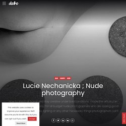
A little about me I used to live in an apartment that was great for shooting. It had almost no furniture, there were lovely wooden floors, white walls and a lot of space. Call for entries. Submission Dodho Magazine accepts submissions from emerging and professional photographers from around the world.

Their projects can be published among the best photographers and be viewed by the best professionals in the industry and thousands of photography enthusiasts. Dodho magazine reserves the right to accept or reject any submitted project. Due to the large number of presentations received daily and the need to treat them with the greatest respect and the time necessary for a correct interpretation our average response time is around 5/10 business days in the case of being accepted. UX for the Next Billion Users. Zeroheight · document your design systems, together. Stylish new McDonald's ads promote home delivery service.
The posters are the latest in a long running series of ads from McDonald’s that have taken a simple, minimalist approach, making clever visual use of its iconic branding or its products to send a message to its audience.
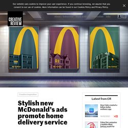
In this set of images, one half of the golden arches logo is shown beaming into homes, with the simple statement ‘We Deliver’ below. The houses featured include a range of architectural styles from modern tower blocks to a Victorian terraced house. Created by Leo Burnett London, the posters follow last year’s UK campaign, which focused on words to describe items on the McDonald’s menu, and an enigmatic campaign for McDelivery in France (created by TBWA\Paris) which featured cityscapes shot through rain-soaked windows. The new campaign appears the week that a rebrand of McDonald’s’ packaging was released, which also uses a simple, illustrative approach. Superscene 3D Illustration Constructor. Studio Malvah. Kalidoface - Become a Virtual Character.
Susana Baca, Wendy Sulca y Marié protagonizan campaña "Mujer Montaña" contra violencia de género en Perú. Three.js Journey. Free Lottie Animation Files, Tools & Plugins - LottieFiles. Marketplace for Podcast Sponsorships and Advertising. iHeart Radio - Arun Jacob - Product Designer. Mobile, Tablet, Windows and XBox Application The Beginning iHeartMedia wanted a brand new experience for their Mobile, Tablet and Xbox app of iHeart Radio.
Overview iHeartRadio is an Internet radio platform owned by iHeartMedia, Inc.[2] Founded in April 2008 as the website iheartmusic.com, as of 2015 iHeartRadio functions both as a music recommender system and as a radio network that aggregates audio content from over 800 local iHeartMedia radio stations across the United States, as well as from hundreds of other stations and from various other media. iHeartRadio is available online, via mobile devices, and on select video-game consoles. The Problem The first version of iHeartRadio has proven that the app needs some re-design, starting from the UX point. Research When we conducted the user research of an existing product, we learned more about our user characteristics, needs, desires and preferences. We tried to find what are current users pain points, so we could fix them.
The Challenge. Figma: los mejores plugins para diseñar y documentar — uiFromMars. Discover the best websites of 2020 and win 2 Tickets for the SF Conference! Free illustrations - Free to use illustrations & vectors. Lucia Bustamante. 500! - Sennep. 500! - Sennep. Paymo · Work Management Software for Teams. Gde.Design. Agency - ShipBob. Ghostbuster Afterlife Fan Made Site. Robin Noguier - Interactive Designer. Followers Application.
Framer: A Free Prototyping Tool for Teams. LottieFiles - Free animation files built for Lottie. TOP 20 Amazing UI Interactions of the Week#15. Uber Eats iOS Design Patterns - Mobbin. Festival 2020 - Edition 9.5 - KIKK 2020. Gorillaz. Gorillaz. Festival 2020 - Edition 9.5 - KIKK 2020. Lyft iOS Design Patterns - Mobbin. MaintainX: Creating efficient experiences for industrial workflows. Terminator 2 — Fan Project. Alessandro Romagnoli. Copia de Figma: Pautas Diseño Accesible - Presentaciones de Google. Color Contrast And Why You Should Rethink It. About The Author Cathy O’ Connor has worked as a senior web application designer for fifteen years in large and small companies.
She relishes the challenge of … More about Cathy O' Connor … When you browse your favorite website or check the latest version of your product on your device of choice, take a moment to look at it differently. Step back from the screen. When you browse your favorite website or check the latest version of your product on your device of choice, take a moment to look at it differently. Can you still see and use the website? In this article, I’ll share one aspect of design accessibility: making sure that the look and feel (the visual design of the content) are sufficiently inclusive of differently sighted users. Work ✦ Ajeeb. Time Scale Point Data. Bump.
The Bump chart can be used to show the ranking of several series over time.
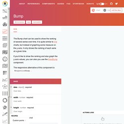
It is quite similar to line charts, but instead of graphing some measure on the y-axis, it only shows the ranking of each serie at a given time. If you'd like to show the ranking and also graph the y-axis values, you can also you use the AreaBump component. The responsive alternative of this component is ResponsiveBump. Start interacting with the chart to log actions. Streamline 3.0. Streamline UX - 9,000 illustrations. Pittsburgh Web Design, Branding & Marketing Agency. Graphic Designer, open positions - inCUBE. – Corn. Revolutionized. 30 Great Websites with Parallax Scrolling. 10 ways to explain the job of a graphic designer to a 5-year-old. If you’re a professional graphic designer and parent, have you ever tried explaining to your kids what it is exactly that you do for work?
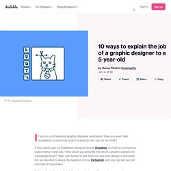
A few weeks ago on Dribbble’s design podcast, Overtime, we had an anonymous caller chime in and ask, “How would you describe the job of a graphic designer to a kindergartener?” Well, who better to ask than our very own design community. So, we decided to share the question on our Instagram, and you can bet we got all kinds of responses. Color Palette Generator - Create Beautiful Color Schemes.
Shaban Iddrisu™ □ Nominees. Mav Farm™ Nominees. Coffee. References.Design. Las mejores combinaciones de colores para probar en 2020 – nosotros-los-diseñadores. ¿Estás buscando combinaciones de colores geniales para probar en tus próximos proyectos de diseño?
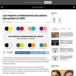
En este artículo Graphicmama, ha reunido y revisado algunas de las combinaciones de colores más modernas en 2020 para diseño web, diseño gráfico e ilustraciones digitales. Ha incluido algunos clásicos absolutos que sería un pecado no intentar. Otras combinaciones de colores son súper innovadoras, por lo que también debes probarlas. Cada dúo de colores está respaldado con ejemplos inspiradores, así que no perdamos más tiempo y sumérgete en la inspiración. Negro y amarillo Brillante, casi amarillo neón y negro es una combinación muy moderna en este momento que solo llama la atención. Index. Ideas and A/B tested patterns for higher conversion rates and growth.