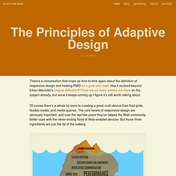

The Principles of Adaptive Design. There’s a conversation that crops up time to time again about the definition of responsive design and treating RWD as a goal unto itself.

Has it evolved beyond Ethan Marcotte’s original definition? There are so many articles out there on the subject already, but since it keeps coming up I figure it’s still worth talking about. Of course there’s a whole lot more to creating a great multi-device than fluid grids, flexible media, and media queries. The core tenets of responsive design are obviously important, and over the last few years they’ve helped the Web community better cope with the never-ending flood of Web-enabled devices. But those three ingredients are just the tip of the iceberg.
So what beyond fluid grids, flexible media, and media queries do we need to concern ourselves with when crafting multi-device Web experiences? Screen Sizes. Fluidbox (v1.3) 12 November 2013, baked by Erin Kissane. Nothing quite underscores accessibility and usability knowledge like direct experience.

I'm just now creeping back onto the big-screen internet after spending the first six weeks of my daughter's life using only a smartphone to connect, with one free hand at most. Combine that with a slightly bumpy recovery from surgery and all the sleep deprivation you can expect from life with a newborn, and I've had plenty of very recent experience using the web while bleary, impatient, and on a device smaller than my hand. The highlights (and lowlights): If someone in an emergency situation might need to contact you via your website, you need to have your main phone number and physical address (if applicable) in large type near the top of your homepage. Anything else is hostile and irresponsible.Trimming content because you assume mobile users won't need it remains a terrible idea, as Karen McGrane's been telling us for years. Responsive images – end of year report. It’s nearly two years since I suggested a <picture> element as a strawman proposal as a way to solve the problem of responsive images, so let’s have a look at how we’re doing.

In September there was a big meetup at Mozilla’s Paris office organised by Mozilla’s Marvellous Mr Marcos who’s been very active in the Responsive Images Community Group and did the hard work of actually turning the <picture> strawman into a spec. Such is the combined allure of Marcos and Paris that a rep from Apple showed up – kudos to Edward O’Connor.
The outcome of the meeting was that <picture> isn’t a viable option. Breaking Development: Atomic Design. Télécharger Edge Inspect CC : Adobe Creative Cloud. Admin & dashboards. Le trafic mobile en hausse de 300% entre 2012 et 2017. Responsive Design : comment optimiser la navigation multi-canal [infographie] Aujourd’hui, le Responsive Web Design devient de plus en plus incontournable pour les grands sites internet de ce monde (et pour tous, même).
![Responsive Design : comment optimiser la navigation multi-canal [infographie]](http://cdn.pearltrees.com/s/pic/th/responsive-infographie-46196333)
La navigation se déportant progressivement de l’ordinateur familial au laptop, puis au smartphone en passant par la tablette de style iPad, il est clair que la taille de l’affichage n’est plus aussi homogène qu’il y a 10 ans. Valraiso : Agence e-commerce à Lyon - Développez votre chiffre d\'affaires sur internet. SVG, l’ami du Responsive Web Design. Responsive Web Design: 50 Examples and Best Practices.
Responsive web design term is related to the concept of developing a website design in a manner that helps the lay out to get changed according to the user’s computer screen resolution. More precisely, the concept allows for an advanced 4 column layout 1292 pixels wide, on a 1025 pixel width screen, that auto-simplifies into 2 columns. Also, it suitably fixes on the smartphone and computer tablet screen. 60 Examples of Responsive Website Design. Responsive design : définition, fonctionnement, ressources et tutoriels. Responsive Web Design: 50 Examples and Best Practices. How Responsive Design Affects Online Businesses. The development and usage of smartphones, tablets and iPads is growing at an exponential rate. Consumers are lining up in droves to get their hands on the latest gadgets, while tech giants are developing more creations to “wow” a technology-hungry crowd.
According to a recent comScore study, more than 100 million U.S. mobile subscribers use smartphones and nearly 234 million Americans use various mobile devices. These numbers increased by double digit percentages from its last time period ending October 2011 to the current study time period of January 2012. With mobile usage so high, online businesses are realizing the need to optimize the mobile experience for their website visitors. Love your devices: adaptive web design with media queries, viewport and more.
By Chris Mills Introduction It's time again to reflect on happiness and well being: that of yourselves and the members of the public who consume the web content and services you create.

Today we are going to talk about getting more satisfaction from battery-powered devices... ...no silly, I'm talking about the vast profusion of alternative browsing devices sweeping through our society like wildfire. A lot of us used to deal with support for mobile browsers with very short-sighted expressions of duality, such as completely separate mobile and desktop sites, or handheld media type stylesheets to provide separate styling to mobile.
But designing for specific browsers hasn't been cool since IE and Netscape were slugging it out in the mid to late 90's, and it sucked even more back then because we pretty much had to create separate site versions if we wanted to support both contenders. What we need is a different way of thinking. Sit back and enjoy the ride. Responsive web design: a project-management perspective. By Rudy Rigot, Sophie Taboni French translation | Traduction française: Responsive Web Design, du point de vue du chef de projet Introduction What strikes many people about responsive web design, the first time they hear about it, is the simplicity of the syntax.

As Rich Quick said in his recent talk at Front Row to introduce the basic concepts: it’s all roughly about learning one single line of CSS code! Of course, it would be unthinkable for any self-respecting web geek to hear about this and not immediately try to manipulate that one magical line of CSS code everyone is talking about to the limit! This is where many people stop. These challenges mainly have their origins in how the usual roles and profiles on a project blur on larger projects, with graphic designers having to understand HTML, or front-end developers ending up making design choices. Does this project need to be responsive? Will each view have the same content and features? Some butterfly effect! Will it be fluid all the way?