

7 Rules for Creating Gorgeous UI (Part 2) – Erik D. Kennedy. Rule 5: Make text pop— and un-pop Styling text to look beautiful and appropriate is often a matter of styling it in contrasting ways— for instance, larger but lighter.

In my opinion, one of the hardest parts of creating a beautiful UI is styling text— and it’s certainly not for unfamiliarity with the options. If you’ve made it through grade school, you’ve probably used every method of calling attention to or away from text that we see: Size (bigger or smaller)Color (greater contrast or lesser; bright colors draw the eye)Font weight (bolder or thinner)Capitalization (lowercase, UPPERCASE, and Title Case)ItalicizationLetter spacing (or— fancy term alert— tracking!) Margins (technically not a property of the text itself, but can be used to draw attention, so it makes the list) There are a few other options that are possible for drawing your attention, but not particularly used or recommended: Underline. 7 Rules for Creating Gorgeous UI (Part 1) – Erik D. Kennedy.
Introduction OK, first things first.

This guide is not for everyone. Top Things to Do in Philadelphia in November 2018 — Visit Philadelphia. Smithsonian African American Film Festival. Planes de seguro de salud individuales y familiares - Aetna. Brian Hoff Design. Secur Glass - White Label. Home - KIKK Festival. Carrello – Excalibur. Home - Ranch House Designs, Inc. Pracownia Olszańska – malarstwo, rzeźba, lalkarstwo, batik, rysunek, biżuteria. Margo Weathers – Director Photographer Fashion Beauty Portraits. SCROLL FOR YOUR HEALTH - by Tomer Lerner. Rich in minerals Rich in vitamin C Makes you less hungry Low on calories Source of B-complex vitamins Rich in anti-oxidants Will make you poop...
Rich in vitamin C Contain vitamin A & E Makes your teeth whiter Low in calories Rich in anti-oxidants Makes you feel peachy Rich in natural sugar Rich in vitamin B6 Makes you feel happy :))) Portfolio — Hot Dot Production. Toi - UX/UI design agency based in SF and Austin. Red Bull Records. WTF Is A Bullet Journal And Why Should You Start One? An Explainer. Academia — Epic Queen. La Moulade - Creative Studio. Sweet Punk designed by Sweet Punk. PONOS INC. designed by BEES/HONEY INC. 20 blogs de diseño y UX en español que no deberías perderte. Si conoces UX con eñe (comunidad de diseño centrado en el usuario en Google+), sabrás que siempre estamos buscando buenos contenidos acerca de diseño de experiencia de usuario para compartir.

Y no es fácil, ya que hay muchísimo contenido en inglés pero bastante menos en español. Por esto merece la pena hacer un listado de quienes están creando buenos contenidos en español (Actualizado en enero de 2016). También puedes introducirte en el tema con este curso UX ;) no solo usabilidad Esta añeja publicación (desde 2001 dando guerra) está dirigida por Yusef Hassan Montero y Francisco Jesús Martín Fernández, aunque cualquiera puede participar. Usable y accesible – Olga Carreras Olga también lleva nada menos que desde 2007 compartiendo sus extensos conocimientos, en especial sobre accesibilidad, pero también sobre usabilidad, arquitectura de información y otros temas relacionados. Full-img.jpg by htmlstream.
Romsey Based Design Studio. 10 bancos de imágenes gratis para tus contenidos. Le Mugs - Flagrant délit de gourmandise. Inferior Browser. » Projects. Frontpage. Publicis90 : Startup global initiative. Quechua - Lookbook Primavera / Verano 2016. Trek.
Love Notes - Update your browser. DADA / DATA / Dada-Depot. DADA will win!

And DADA has won! DADA is grateful! And DADA-DATA has drawn the first winners in its Connected Readymade draw! In ten days, over 130,000 of you have visited from around the world. And one in twelve of you took part in the Connected Readymade. DADA is delighted! Remember: We will be drawing Connected Readymade winners three times a day! First daily draw, held at the historic premises of the Cabaret Voltaire with the masters of the house, Nora Hauswirth and Adrian Notz, and DADA-DATA’s Anita Hugi. Strava Cycle Tracks - Music Generator. Share This Ride Please note: Sharing your tracks makes this Strava data publicly available.
<div class="no-js warning"> This site requires JavaScript to function. Ortiz León Architects. Femme Fatale Studio. SIRIN LABS - Solarin - Explore. Flamingo - Agency & Freelance Portfolio Theme by Zizaza - design ocean , via Behance. Google Fonts Jura. Grumpy wizards make toxic brew for the evil Queen and Jack.
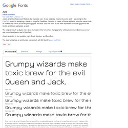
Light 300Grumpy wizards make toxic brew for the evil Queen and Jack. 40 Stunning Website Designs with Great Color Schemes. Design Selecting a color scheme for a given website design project is not always easy.

Sometimes the product or service will help to determine the base or main color, but where to go from there is usually a matter for the designer's imagination and inspiration. There are sites that offer huge selections of color combinations where you can search for a specific color or just browse by categories such as newest, most popular, etc., but sometimes there is just no substitute for browsing other sites for inspiration, where designers have used color schemes that, as a palette may not be obvious bed-mates. In this round up we have selected 40 sites that have some outstanding and/or unusual color combinations, and where the designers have applied a great deal of creativity.
Websites with Outstanding or Unusual Color Schemes Each featured site has a color palette of 5 colors below the screenshot. SecretKey. Trendy Web Color Palettes and Material Design Color Schemes & Tools. A few weeks ago, Matt DesLauriers @mattdesl, a graphics programmer working at Jam3, showed us an interesting development carried out on our platform.

As you already know, Awwwards has been collecting information on the most noteworthy websites since 2009 – something which makes us an essential source for web design trend analysis. The project started as an experiment, I was just learning Node at the time and decided to see if I could scrape Awwwards for some data visualization. Matt developed a tool which requests each page of the Awwwards winner gallery, then searches the HTML for all the available metadata like site name, author, date, URL, thumbnail, etc. The RGB pixels of each thumbnail are analyzed to get a rough color palette of the 3 primary colors. The result is this brilliant data visualization in which each site is represented as a pie graph showing the distribution of its 3 primary colors. 1. 20 Sites of the Day with Great Color Schemes #c0dfd9 #e9ece5 #b3c2bf #3b3a36 Brdr. 2.
Website Color Schemes: The Palettes of 50 Visually Impactful Websites to Inspire You. Did you know that Facebook is blue because Mark Zuckerberg is red-green color blind? “Blue is the richest color for me; I can see all of blue” says Zuckerberg. While this choice of color doesn’t seem very scientific, it still proves that a lot of thought is put into the choice of color. As Buffer writes, over 90% of our assessment of a product is made on color alone, so it makes sense that color should be considered with care for every design decision, particularly on websites.
Chances are, if we don’t like the color palette, we’re not going to stay on the site for very long. Trolleys, Trolley Manufacturer, Custom Built Trolleys. 50 Beautiful Color Palettes for Your Next Web Project. Choosing the right color scheme is essential to your website’s success. Your layout and other design choices — including font — should be developed in concert with your color scheme, which can ensure readability, cohesiveness, and beauty in the final product.
Unfortunately, making that choice or creating a color palette from scratch can be quite the challenge. Trendy Web Color Palettes and Material Design Color Schemes & Tools. 40 Stunning Website Designs with Great Color Schemes. Meet Google Drive – One place for all your files. PANIC. The Ghost Open Marketplace. Case Study - Get inspiration! Slick - the last carousel you'll ever need. Set up your HTML markup. <div class="your-class"><div>your content</div><div>your content</div><div>your content</div></div> Move the /slick folder into your project Add slick.css in your <head> <link rel="stylesheet" type="text/css" href="slick/slick.css"/> // Add the new slick-theme.css if you want the default styling <link rel="stylesheet" type="text/css" href="slick/slick-theme.css"/> Add slick.js before your closing <body> tag, after jQuery (requires jQuery 1.7 +) Initialize your slider in your script file or an inline script tag When complete, your HTML should look something like: NOTE: I highly recommend putting your initialization script in an external JS file.
Set up your HTML markup. Slick - the last carousel you'll ever need. Slick - the last carousel you'll ever need. 10 Portfolios online de diseñadores web, desarrolladores y más. UI/UX Designer & Front End Developer. Design, Branding, Digital Marketing. Guillaume JUVENET - Portfolio. Garphee - Razvan Garofeanu, UI/UX/WEB Designer. Pixels by Tomer Lerner - Work.