MockFlow - Online Wireframe Tool
10 Responsive Design Problems and Fixes
The Internet is changing, with responsive websites quickly adapting to any device and screen size to bring the user the most dynamic experience possible. From multinational corporations like Sony, Microsoft, and Nokia to global tech stars like Salesforce to online travel giants like Expedia, serious players are turning to responsive web design to march in step with the current trends in and reach an even wider audience of customers. But making responsive websites has its downsides. The value the site provides to the user is more important than ever, and aesthetics often take a backseat while performance reigns supreme. 1. In the past, the client had to approve static images and screenshots before development could begin. Fix: There are two approaches to responsive sketching. 2. Before responsive design, every user knew where navigation was. Fix: Designers should spend more time trying to make navigation intuitive and self-explanatory. 3. 4. 5. 6. 7. 8. 9. 10. Conclusion
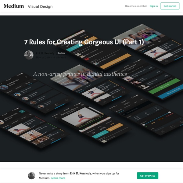
7 Rules for Creating Gorgeous UI (Part 2)
Rule 5: Make text pop— and un-pop Styling text to look beautiful and appropriate is often a matter of styling it in contrasting ways— for instance, larger but lighter. In my opinion, one of the hardest parts of creating a beautiful UI is styling text— and it’s certainly not for unfamiliarity with the options. If you’ve made it through grade school, you’ve probably used every method of calling attention to or away from text that we see: Size (bigger or smaller)Color (greater contrast or lesser; bright colors draw the eye)Font weight (bolder or thinner)Capitalization (lowercase, UPPERCASE, and Title Case)ItalicizationLetter spacing (or— fancy term alert— tracking!) There are a few other options that are possible for drawing your attention, but not particularly used or recommended: Underline. Up-pop and down-pop You can divide all the ways of styling text into two groups: Styles that increase visibility of the text. Lots of up-pop going on with the “Material Design” title.
What's the tradeoff for using an icon driven navigation?
#130 Monitoring with God
Need to ensure your background processes stay up and running and don't use too many resources? Check out the god gem as shown in this episode. Download: source codeProject Files in Zip (121 KB)mp4Full Size H.264 Video (27.9 MB)m4vSmaller H.264 Video (16.9 MB)webmFull Size VP8 Video (42.3 MB)ogvFull Size Theora Video (38.9 MB)
Transcribe - online transcription and dictation software
Responsive Design: Getting Advanced Filtering Right
Designing user interfaces for filtering content lists can be very challenging, especially when dealing with a lot of different parameters. Think of combining parameters like date range, content types and content statuses with keyword search. Good old and well-established design patterns do exist for this scenario. But now add small screens and responsive design to the mix: Great user experience faces big threats from factors such as decreased screen estate, clumsy fingers and variable viewing distances. A View Mode Solution As Daniel Wiklund (@danielwi) points out in his article “View mode” approach to responsive web design, off canvas navigation works well in responsive web design because it lets the user focus on the content, when browsing content, and it lets the user focus on navigation, when the user needs to navigate from a grander overview. Dealing with Lists of Business Documents On typical desktop and tablet sizes the list looks like this: The Mechanics of filtering these Lists
UX for Mobile: The Rise of Fat-Finger Design
We already know that users are turning to mobile for all kinds of needs: from simple-search to shopping, to the use of financial apps. And we also know that mobile-friendly websites are better ranked. But at the beginning of 2018, Google announced the mobile-first indexing since a lot of user searches are made on a mobile device. And if you have any doubt about it, Statista clearly shows that the global digital population as of July 2018 is 4.1 billion, from which 3.8 billion are uniquely mobile internet users. It’s estimated that this population will grow to 4.78 billion until 2020. Where to Begin First things first. Context Matters Whenever you are designing you should keep in mind the user context, and there are many layers to it. Responsive? Mobile can be developed in many ways so you must decide if it is a responsive website, adaptive, a native app, or a hybrid app. The choice is yours, just make sure that you are careful about conventions. Be Fat-Finger Friendly Navigation Is Key Forms
Brakeman - Rails Security Scanner
Las 15 películas más polémicas de la historia según sensacine
Twitter6386 6386facebook230K 230Kpinterest103 103google plus1599Share1599linked in58 58email13 13stumbleupon10.7KShare10.7Kmeneame81Share81 En Cultura Colectiva hemos presentado más de un conteo o listado de películas que, en su momento, fueron transformadoras, revolucionarias y controversiales, pero que esto sólo las hizo apoderarse de un lugar en las memorias cinematográficas; diversos sitios especializados o quienes se reconocen amantes del cine elaboran populares listas sobre películas de alto impacto histórico, cultural, social, sexual o ideológico. La anécdota está en que, en su mayoría, coinciden en los títulos, lo que sólo hace más evidente que las buenas historias permanecen entre la colectividad como otro de los legados que compartimos. Esta vez el sitio sensacine.com compartió una lista con las 15 películas más polémicas de la historia; nosotros les contamos de qué va cada una, ¿cuál agregarían? 1. Basada en el libro Los 120 días de Sodoma, del Marqués de Sade. 2. 3. 4. 5. 6.
Guidelines | Usability.gov
Guideline: Provide content that is engaging, relevant, and appropriate to the audience. Comments: Content is the information provided on a Web site. Do not waste resources providing easy access and good usability to the wrong content. One study found that content is the most critical element of a Web site. Sources: Asher, S.R. (1980). Related Resources: Title: Whats Important to Search Engines Description: Providing useful content is one way to ensure good results with search engines URL: Related Usability Guidelines:
Design for Fingers, Touch, and People, Part 1
Capacitive Touch Now, in 2017, when someone talks about touchscreens, they mean capacitive touch. This is the type of touchscreen on all mobile phones, tablets, entertainment systems, cars, kiosks, and increasingly, other small devices that are currently in production. Capacitive touch uses the electrical properties of the body. That’s why it doesn’t work with any old pen as a stylus, when wearing gloves, or even when your skin is too dry. While high-resolution detectors exist, they are used only for special devices such as fingerprint sensors. This is not a perfect system. A few years ago, Motorola put a handful of devices in a little jig, so they could robotically control the pressure, angle, and speed of touch sensing precisely. While the irregular spacing of the lines in Figure 3 is my fault—I’m not a robot—the other issues demonstrate the limits of the touchscreen. Size, Pressure, and Contact Patches Obsolete Standards The ISO is not the only group promoting obsolete standards.
scottjehl/picturefill
