

Austrian Artist Reinvents Door With Innovative 4 Folding Triangle Design. EmailEmail Artist Klemens Torggler has reinvented one of the most fundamental pieces of any home – the door.
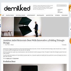
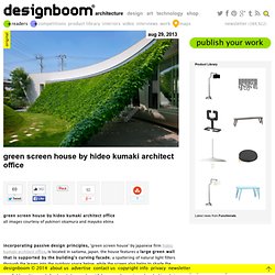
The artist’s brilliant door design, called “Evolution Door,” is made of four triangular panels that elegantly open and close with only a light flip. While this prototype door system may not seem practical or safe, the artist does his best to assuage our fears. The system is made with soft edges to prevent hand and finger accidents. The artist creates door systems out of many different structures: eight, four or two panel systems and systems with rods, epitrochoid curves and triangles that come in glass, steel, and wood. Source: torggler.co.at (via: thisiscolossal) Evolution Door Safety Assurance. Green screen house by hideo kumaki architect office. Aug 29, 2013 green screen house by hideo kumaki architect office green screen house by hideo kumaki architect officeall images courtesy of yukinori okamura and mayuko ebina screen acts as an extra room for the house, offering a relaxing space for the family to enjoy dining together the play of sunlight through the green screen thermally incorporated design principles help the energy consumption of the building’s interior.
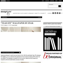
"Tear Off" Wallpaper by ZNAK. Applying wallpaper to walls has never been so fun.
Open Book Chair by TILT. TILT, who brought you the collaborative furniture we recently posted about called Quiet and Call, has also released another chair as part of that collection called Open Book.
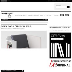
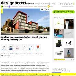
While this isn’t the first bookshelf chair we’ve seen, this chair goes the extra mile in terms of function. In fact, it goes so far as to combine chair, bookshelf, lap desk, side table and magazine rack all in one, while at the same time giving you a little bit of privacy on one side. Whew. Villa SSK. Aguilera guerrero arquitectos: social housing building in tarragona. Nov 27, 2012 aguilera guerrero arquitectos: social housing building in tarragona ‘social housing building’ by aguilera/guerrero arquitectos, tarragona, catalonia, spainimage © pepo seguraall images courtesy of aguilera/guerrero arquitectos the white exterior is either framed or covered with a bold red screen to open to the views or offer privacy. the shell acts as a ventilated double facade which responds to the hot and dry climate. vertically striated metal panels offer optical effects as well as a waterproof protection from weather. steps navigate the steep site changesimage © pepo segura street level shops address the streetimage © pepo segura a facade of balconies open to the viewimage © pepo segura image © pepo segura textured metal panel elevationimage © pepo segura double facadeimage © pepo segura rear side of buildingimage © pepo segura floor plan / level 0.
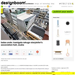
Tadao ando: kamigata rakugo storyteller's association hall, osaka. Nov 27, 2012.
Kenjo: Cabin-Like Prefab Guest House or Studio. Swedish company Kenjo designs small, cabin-like prefab rooms that can serve as guest houses, offices, studios or any other type of space that you like.
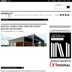
Each cabin is built with glass sliding doors providing the openness that smaller module type structures are generally lacking. Kenjo Horisont – A family needed more space than their summer home provided so they built this one on the water! (first image also) The houses come in a variety of sizes with different options making customization possible. You can even connect multiple modules together to get a larger space. Kenjo Harmoni 3 – A creative sanctuary that took a helicopter to make it happen because of its remote location in a Stockholm archipelago. Amazing Marker-drawn Wall Murals by Charlotte Mann. EmailEmail White walls or window-less spaces are not necessarily boring.
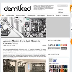
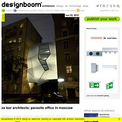
To a British artist Charlotte Mann, this just gives room for creation. Using an ordinary black marker, she creates incredibly meticulous wall murals that turn empty spaces into funky cluttered rooms. Charlotte’s mural art adds extra space and depth, and the scrupulously drawn details can replace any wallpaper. She draws everything real-life creating a room-within-a-room impression. Za bor architects: parasite office in moscow. Nov 22, 2012 za bor architects: parasite office in moscow ‘parasite office’ by za bor architects, moscow, russiaimage © peter zaytsevall images courtesy of za bor architects light structure suspended in the air leaving the lower street open to public useimage © peter zaytsev a metal staircase touches the ground leading to the entranceimage © peter zaytsev interior with translucent polycarbonate panels and exposed concrete walls.image © peter zaytsev floor plan / level 0 floor plan / level 1 floor plan / level 2 section.
Pretty Please Lounge Melbourne. Alta House / AS/D Architeture. Matsubara House / Hiroyuki Ito + O.F.D. Architects: Hiroyuki Ito + O.F.D.A.
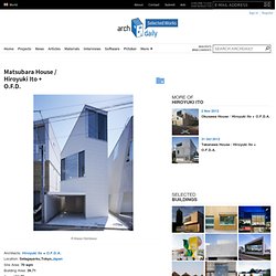
Location: Setagaya-ku,Tokyo,Japan Site Area: 70 sqm Building Area: 39.71 Area: 104.58 sqm Year: 2008 Photographs: Masao Nishikawa Being located in a very small space facing only the north, and in order to avoid directly facing the house on the opposite side, also trying to get as much light as possible into the tiny light-garden, the flat plan of this house is awkwardly shaped in a hexagon. It is also designed to create a multi-impression effect according to what angle the house is viewed from the street , combining the houses on both sides,by having a wavy byobu-screen-like surface. Pavilion Siegen / Ian Shaw Architekten. Architects: Ian Shaw Architekten Location: Siegen, Germany Year: 2012 Photographs: Felix Krumbhlotz The pavilion’s dramatic, planar form articulates an assured, yet subtle compression of space, framing views of the lake and the local topography. The building’s tectonic rigor is palpable, its seemingly gravity defying configuration enabling the floor plate and ceiling to cantilever some 6m beyond the lakeshore.
The scheme is both a weekend fishing retreat and a garage for three classic cars. A toilet and washroom facility is also included, as is a storage area for the client’s angling equipment. Detailing is measured throughout – from the integrated lighting to the fully glazed internal area. Apartment Blocks in Nanterre / X-TU. The Infinity of the Room by Pia Jensen. The recent exhibition by Danish artist and weaver Pia Jensen entitled The Infinity of the Room transforms an entire room into a three-dimensional experience that centers around the hexagon. Hexagonal patterns are made out of various materials like acrylic, tiles, and wood, and cover all of the walls and the floor, turning the space into a textural wonderland.
Her wish was that everyone who enters the room would see that out in the world, we are constantly surrounded by patterns that are created in all different ways, be it nature or man-made. Photos by Finn Brøndum & Co. The Tree House / Baumraum. Architects: Baumraum Location: Hechtel-Eksel, Belgium Architect In Charge: Andreas Wenning Year: 2012 Photographs: Markus Bollen Sappi, The Flemish Forest and Nature Agency, the commune of Hechtel-Eksel and Proximity joined forces in a unique partnership to stimulate companies, politicians and organisations to embrace sustainability in their daily activities.