

Vertical-Align: All You Need To Know - Christopher Aue. Often I need to vertically align elements side by side.
CSS offers some possibilities. Sometimes I solve it with float, sometimes with position: absolute, sometimes even dirty by manually adding margins or paddings. I don’t really like these solutions. Floats only align at their tops and need to be cleared manually. Absolute positioning takes the elements out of the flow so they do no longer affect their surroundings. But there is another player here: vertical-align. Peculiarities Of Vertical-Align But, vertical-align can be a real scumbag sometimes. Unfortunately, most resources on the matter are somewhat shallow. So, I set myself the target to clarify the behavior of vertical-align once and for all. So, let’s tackle the rules of the game. Vertical align anything with just 3 lines of CSS. With just 3 lines of CSS (excluding vendor prefixes) we can with the help of transform: translateY vertically center whatever we want, even if we don’t know its height.
The CSS property transform is usally used for rotating and scaling elements, but with its translateY function we can now vertically align elements. Usually this must be done with absolute positioning or setting line-heights, but these require you to either know the height of the element or only works on single-line text etc. So, to vertically align anything we write: That’s all you need. It is a similar technique to the absolute-position method, but with the upside that we don’t have to set any height on the element or position-property on the parent. To make it even more simple, we can write it as a mixin: You can find a demo of it here: See the Pen Vertical center with only 3 lines of CSS by sebastianekstrom (@sebastianekstrom) on CodePen.
Centering in CSS: A Complete Guide. Centering things in CSS is the poster child of CSS complaining. Why does it have to be so hard? They jeer. I think the issue isn't that it's difficult to do, but in that there so many different ways of doing it, depending on the situation, it's hard to know which to reach for.
So let's make it a decision tree and hopefully make it easier. The Best Way to Vertically Align in CSS. “The best way to vertically align something in CSS is to close your laptop and head out to the bar.”
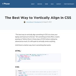
(Or something to that effect, read in passing on Twitter.) Even in these days of CSS3 where styling has advanced so much, it’s still a pain to vertically center anything. Until there’s a better way, here’s something that works: <! -- containing element to implement centering trick on --><div class="wrapper"><! The major benefit of this method over others is that it doesn’t use tables or display:table-cell (which has its own quirks) and the height of the element to be centered doesn’t need to be known. You might also like... September 19, 2013 How to Use Inline-Block I’ve been using `display: inline-block` more lately—With the widely-accepted dropping of support for IE7 and below, it's a brave new world.
In "Development" Centering in the Unknown. By Chris Coyier On centering, pseudo elements, vertical-align When it comes to centering things in web design, the more information you have about the element being centered and its parent element, the easier it is.
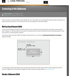
So what if you don't know anything? It's still kinda doable. #Not too hard: Known Child If you know the height and width of both the element to be centered and its parent element (and those measurements won't change, i.e. not fluid width environment) one foolproof way to center the element is just to absolute position it with pixel values so it looks perfectly centered. Let's say you know the exact width and height of the element you are centering, but the parent element can change in height and width. You absolutely position the element to be centered and set the top and left values to 50% and the margin top and left values to negative half of the elements height and width. #Harder: Unknown Child The hard comes in when you don't know the dimensions of the element to be centered. (casi) Todas las formas conocidas para hacerlo (24) Pocas cuestiones como el tema de centrar suscitan tantas y tan variadas consultas por quienes se inician en Css.
Bueno, y no tan iniciáticos. Este tema suele ser fuente de múltiples frustraciones. Y en la mayoría de los casos el error inicial es no pararse a pensar en qué tipo de elemento se pretende centrar y qué propiedades tiene. Al plantearse centrar un elemento con css hay que tener claro como cuestión preliminar si es un elemento de bloque o si es de línea, si a priori se conocen sus dimensiones y en qué unidad están definidas (absoluta o relativa) y las de su contenedor.
Sin olvidar que no es lo mismo el centrado en X (horizontal) que en el eje Y (vertical). Así que vamos a ver diferentes formas (16) 25 de centrar una caja con Css. Sólo se puede centrar un elemento dentro de otro cuando su tamaño es inferior al de la caja que lo contiene.