

Sweetgreen eco-eateriy by Core Architecture, Bethesda – Maryland. Always committed to the environment, both CORE and Greens Restaurant Group, looked for ways to reuse materials, reduce chemicals, and reduce electricity use.
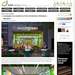
Maintaining the same clean palette and simple lines of the original location, the new locations use salvaged hickory for the walls and millwork reclaimed from local barns. Wood recycled from old bowling alleys is used for the tables and chairs. The new eco-eateries are substantially larger than the original Georgetown store, known for its 500 sf footprint. With the added space the new locations are able to seat 20.
The design uses the graphics and colors from the Georgetown location but on a larger scale, made from sustainable paper and dye products, an oversized sweetgreen logo wall graphic is a signature design feature at all locations. Lighting. Penthouse furniture showroom by Studio Yaron Tal, Tel Aviv. Penthouse furniture showroom in Tel Aviv Israel was redesigned by Studio Yaron Tal and opened in March 2012.
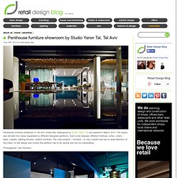
The space was divided into zones separated by different designed partitions. Each zone displays different furniture- sofas, chairs, beds, carpets, lighting fixtures, outdoor furniture. Yoshinoya Japanese fast food restaurant by AS Design, Hong Kong. “We want customers to understand (the image) at the first glance, being simple and direct would make more sense.”
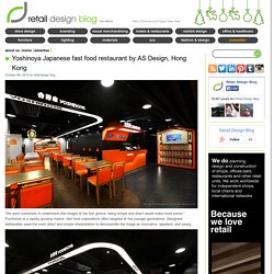
Positioned at a rapidly growing market, fast food corporations often targeted at the younger generations. Designers deliberately used the most direct and simple interpretation to demonstrate the image as innovative, apparent, and young. Designers Four Lau & Sam Sum used “Home” as the core design element to build a “Chic Home”, presenting the brand image as young, energetic, and warm. The shape of “House” created a marker that makes the customers easily associated with the new image “Home”. Yellow pillar structure, orange geometric triangle patterns, and levels of distinctive colors have become the new image elements of Yoshinoya fast food chain.
High malleability and varied house—shaped design could link different areas and makes the spaces more stereoscopic. Design & Presented By AS Design Service Ltd. Neo Derm interior by Beige Design, Hong Kong. Taking ‘line’ and ‘lime‘ as the representation of dynamics, young and energetic to respond to the design brief, designer creates this 15000 sq. ft. lifestyle space with a concept of sustainability and continuity.
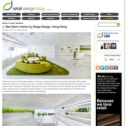
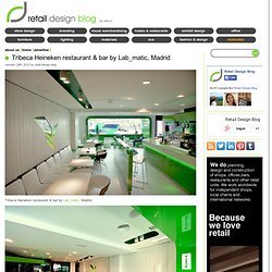
Backdrop of the reception is a lime color wall with a front layer of translucent recycled resins panel, the embossed lines on the panel are just like the light beams dashing around to embrace the space speedily. A clean white high-gloss paint reception island landed on the reconsistute stone flooring create a contrast to the backdrop. Beams of white dashing lines are running throughout the white ceiling and extending to the surrounding space with dynamics. The relaxation zone adjacent to the reception is set on a lime on lime color tone from furniture to carpet that emphasizes the young and rejuvenated brand essence by overviewing the Victoria harbor. Fabric sofas are designed with rounded ends to offer a comfortable and warm mood to welcome customers. Designed by Beige Design. Tribeca Heineken restaurant & bar by Lab_matic, Madrid.
Tribeca Heineken restaurant & bar by Lab_matic, Madrid.
Nat. Fine Bio Food Restaurant interior by eins:eins Architects. Concept: The purpose of the newly-founded chain, nat. fine bio food, is to make fast food healthy, to offer delicious organic food in a timely manner – and this in a contemporary environment. nat. brings together Organic and Lifestyle, and with this follows the increasingly-important LOHAS-Trend (Lifestyle of Health and Sustainability).
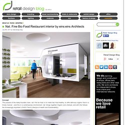
The claim, “nature comes to the city” guided the design concept. Motives from nature were made so abstract that they can be only vaguely discerned. The ceiling allows association with cloud formations; the columns remind one of tree trunks; backlit walls dissolve the spatial boundaries through oversized, blown-up plantand herb-panoramas. Modern restaurants Search Results. It Me Eco Fast Restaurant by Joanna Pszczółka & Łukasz Brandys, Ochaby – Poland.
It!
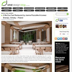
Me fast food restaurant, which is located in Dream Park in Ochaby, was created at the beginning of July, 2011. It is the first branch of the planned chain of eco-restaurants. The designers made an attempt to give this small place an image that would make it distinct from other big fast food brands. A mixture of elements, such as a proper choice of materials, limited colour gamut and refined details allowed the designers to achieve an unpretentious effect of modern and delicate beauty. It determined an unambiguous identity of this brand new restaurant. The entire image was adjusted to the small size of the place and its function. The main idea was to create an eco-brand which makes use of biodegradable ecological materials.