

Particle World. Infographic of the Day. Duolingo Intro. 簡報技巧:Nancy Duarte 精彩簡報的5個原則 Five Rules for Presentations by Nancy Duarte. D: InfoGraphic Designs: Overview, Examples and Best Practices. Information graphics or infographics are visual representations of information, data or knowledge.
These graphics are used where complex information needs to be explained quickly and clearly, such as in signs, maps, journalism, technical writing, and education. They are also used extensively as tools by computer scientists, mathematicians, and statisticians to ease the process of developing and communicating conceptual information. They can present a rich amount of information without intimidating you. Or sometimes they intimidate you, but make the digesting of the information much more bearable. Here in this article below, we are going to discuss best practices for designing infographics followed by some examples which might help you learn a thing or two.
You may be interested in the following related articles as well. Feel free to join us and you are always welcome to share your thoughts that our readers may find helpful. Don’t forget to and follow us on Twitter — for recent updates. The Ghost Map by Steven Johnson. Envisioning the future of technology — by Michell Zappa. Looks inside the brain. Wonderfully Textured Website Designs. InShare3 Texture is a great way to add some visual interest to a design and give it that extra spark.
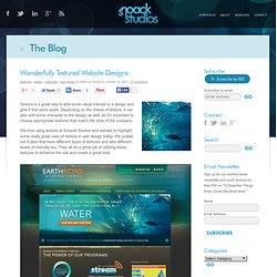
Depending on the choice of texture, it can also add some character to the design as well, so it’s important to choose appropriate textures that match the style of the company. We love using texture at Snoack Studios and wanted to highlight some really great uses of texture in web design today. We picked out 8 sites that have different types of textures and also different levels of intensity too. They all do a great job of utilizing these textures to enhance the site and create a great look. * Click on each thumbnail to see the full website. No comments yet. Sketch2Photo. Abstract: We present a system that composes a realistic picture from a simple freehand sketch annotated with text labels.
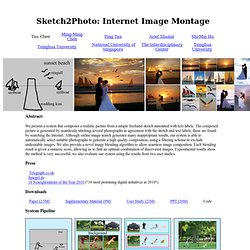
The composed picture is generated by seamlessly stitching several photographs in agreement with the sketch and text labels; these are found by searching the Internet. Although online image search generates many inappropriate results, our system is able to automatically select suitable photographs to generate a high quality composition, using a filtering scheme to exclude undesirable images. We also provide a novel image blending algorithm to allow seamless image composition. Each blending result is given a numeric score, allowing us to find an optimal combination of discovered images. Press Telegraph.co.uk Spiegel.de 10 Netexplorateurs of the Year 2010 ("10 most promising digital initiatives in 2010") Downloads Paper (2.5M) Supplementary Material (9M) User Study (23M) PPT (36M) Code System Pipeline. A simpler route to invisibility. Two years ago researchers at Duke University in the US unveiled the first "invisibility cloak" — a device that can make objects vanish from sight, at least when viewed using a narrow band of microwave frequencies.
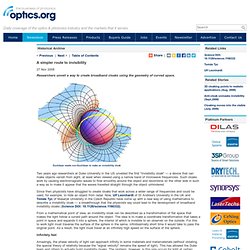
Such cloaks work by causing electromagnetic waves to flow smoothly around the object and recombine on the other side in such a way as to make it appear that the waves travelled straight through the object unhindered. Since then physicists have struggled to create cloaks that work across a wider range of frequencies and could be used, for example, to hide an object from radar.
Now, Ulf Leonhardt of St Andrew's University in the UK and Tomás Tyc of Masaryk University in the Czech Republic have come up with a new way of using mathematics to describe a invisibility cloak — a breakthrough that the physicists say could lead to the development of broadband invisibility cloaks (Science DOI: 10.1126/science.1166332). Infinitely fast Resonances not needed. Superfocus - keep your world in focus. Envisioning the future of technology — by Michell Zappa. Trufocals. As simple as TruFocals are to use, their technology is very sophisticated.
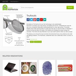
Each"lens" is actually a set of two lenses, one flexible and one firm. Theflexible lens (near the eye) has a transparent distensible membraneattached to a clear rigid surface. The pocket between them holds asmall quantity of crystal clear fluid. As you move the slider on thebridge, it pushes the fluid and alters the shape of the flexible lens.Changing the shape changes the correction. This mimics the way thelenses in your eyes used to perform when you were younger. This allows you to choose the exact correction that works best foryou at any distance and under any lighting conditions. Source: trufocals.com. 丹尼爾 塔門:用不同的方式看世界. Kinect-like camera interface for taking self-portraits. While digital cameras have made it easier to take self-portraits thanks to the inclusion of self-timers, face, smile and motion detection, and the positioning of displays on the front of the camera - as seen with Samsung's DualView camera - changing the framing or altering settings still requires the user to run back to the camera itself to get things right.
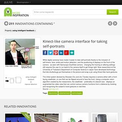
Now researchers at the University of Tsukuba's Department of Computer Science in Japan have developed technology that lets shutterbugs put themselves in the picture and snap a pic using Kinect-like hand gestures. The initial system devised by Shaowei Chu and Jiro Tanaka requires a camera either with a front-facing viewfinder, or one that can be flipped around to face the front. Source: gizmag.com. Phun - 2D physics sandbox. Visual Complexity. Visual inspiration for creative professional.