

Practical Advice for Front-End Web Development. Modern Front-End Development is a curious blend of creativity and logic.
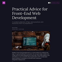
It's got something for everyone. You can get really creative and create one-of-a-kind experiences on the web, work with graphics and animations, or you can build robust applications with complicated build workflows consisting of unit tests and continuous integration/deployment. 📝 Note: This article can be kept as a reference (bookmark this) so that you can come back and have a look when you're confused about what technology to learn next.
For anybody who knows a programming language or has done some programming previously, and is just getting introduced to Front-End web development, their initial reaction is usually: This is way too easy to be considered seriously. Sites of January 2021. This is the portfolio website of Cosmin Mizra, a professional sound design freelancer.
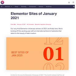
Cosmin’s modern website showcases his sound design skills, projects and music, and sound portfolio. The website was created by Camilia Filip and her team at Chamilyon Agency, a Romania-based digital marketing agency that designs Elementor-built websites. The use of Flipbox Widget on the portfolio page is a strategic way to combine the visual detail of a video game interface along with a short description of the game’s plot. Welcoming the website visitor with a visual preview of each game’s experience, you’re able to get a rich taste of every game, building up excitement for reading about it and learning more about what you’ll play.
Cosmin’s out of the box, quirky personal branding is hinted at within the most minute design elements of the site. Theme: Hello. 50 termes de typographie à connaître pour optimiser le contenu de son site. Le monde de la typographie est plein de termes spécifiques.
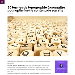
Que vous vous essayez à lacréation de votre propre site ou que vous ayez recours à un webdesigner professionnel, connaître ces termes pourrait vous être d’une grande aide. Car derrière une apparence complexe, ces termes révèlent un savoir qui peut vous aider àoptimiser la lisibilité et l’apparence de votre site web. Et comme nous l’avons vu dans un article précédent (19 générateurs de palettes de couleurs pour simplifier le web-design), l’apparence de votre site est capital pourattirer l’œil, inciter un internaute à rester sur votre site, et même à y revenir ultérieurement.
Voici donc la liste de50 termes en la matière qu’il peut être utile de connaître : 1. Le crénage représente l’espace entre deux lettre. Le crénage est important sur un site web. 2. L’inter-lettre est donc unespace de taille égale entre toutes les lettres. 3. L’interligne est l’espace entre deux lignes de texte. 4. 5. 6. 7. 8. 9.
Why Design Thinking Works. Occasionally, a new way of organizing work leads to extraordinary improvements. Total quality management did that in manufacturing in the 1980s by combining a set of tools—kanban cards, quality circles, and so on—with the insight that people on the shop floor could do much higher level work than they usually were asked to. That blend of tools and insight, applied to a work process, can be thought of as a social technology. In a recent seven-year study in which I looked in depth at 50 projects from a range of sectors, including business, health care, and social services, I have seen that another social technology, design thinking, has the potential to do for innovation exactly what TQM did for manufacturing: unleash people’s full creative energies, win their commitment, and radically improve processes.
The Challenges of Innovation. Free Resources For Designers and Developers. Evolving the Google Identity. Google is not a conventional company.
Our mission—to organize the world’s information and make it universally accessible and useful—continues to evolve. Last year we introduced Material Design to help designers and developers embrace an expanding, multi-device, multi-screen world. With those considerations in mind, we are excited to share a new brand identity that aims to make Google more accessible and useful to our users—wherever they may encounter it. Since its inception, the Google.com homepage has been strikingly simple: The quirky, multicolored logo sits above a single, approachable input field on a clean white canvas. But as technology moves forward, the canvas itself is changing, and the inputs and needs are becoming more diverse.
Here’s a glimpse at some of the design considerations that went into taking the best of what people know and love about Google, and evolving the brand to continue to be as dynamic and unconventional as we strive to be. Uber Brand. Centre de ressources marketing Facebook - Règles d’utilisation de la marque et des éléments de marque. Google Design. What Is Design Thinking? Two years ago, Jon Kolko, chief operating officer at Austin-based design consultancy Modernist Studio, arrived at the home of a 20-year-old photography major at the University of North Texas who was considering dropping out.
The student, whom Kolko referred to by the pseudonym Kendra to protect her anonymity, was nowhere to be found. Kolko, who was previously the vice president of product design at Blackboard, was there with his colleague, chief design officer Chad Fisher. They were interviewing Kendra as part of the discovery phase of the design thinking research their firm was doing for Texas OnCourse, a state-funded college and career planning resource. They had been hired to improve a website intended to help students transfer from community colleges to four-year programs more seamlessly. The first step of their research was to figure out what was going on in the minds of students like Kendra. More on Design Innovation Frameworks‘Jobs to Be Done’ Is Growing in Popularity.