

The Racial Dot Map: One Dot Per Person for the Entire U.S. BESbswy. Real Country Sizes Shown on Mercator Projection - Engaging Data. Analyzing Maps - The Choices Program. Objectives In this lesson students will: Learn about the design elements of a map.Apply an analytical framework to analyze maps.Consider maps as sources that contain bias.Assess the value and limitations of using maps as sources.
Videos. Workbook: The Mercator Problem. Unexpected Error An unexpected error occurred.

If you continue to receive this error please contact your Tableau Server Administrator. Your World Map is Hiding Something. Take a look at a map of the world.
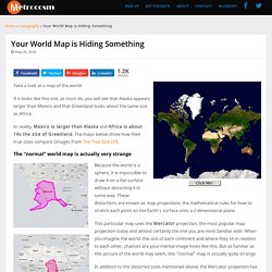
If it looks like this one, as most do, you will see that Alaska appears larger than Mexico and that Greenland looks about the same size as Africa. In reality, Mexico is larger than Alaska and Africa is about 14x the size of Greenland. The maps below show how their true sizes compare (images from The True Size Of). The Best Online Tools For Comparing The Physical Sizes Of Different Countries. Photo credit Last week I published a popular post titled “The True Size Of” Is A Must-Use Site In Every Geography Class about a new site that lets you easily compare – accurately – the sizes of different countries.

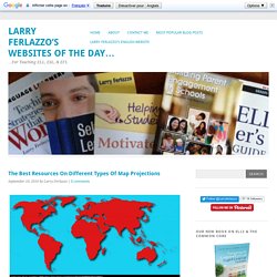
Reader John Padula then left a comment mentioning that there were also two similar sites, so I thought a short “Best” list would be in order. The Best Resources On Different Types Of Map Projections. I’m teaching Geography again to English Language Learners, and though I’d pull together some accessible resources on the different kinds of map projections.
You might also be interested in The Best Online Tools For Comparing The Physical Sizes Of Different Countries. How the World Map Looks Wildly Different Than You Think. Maps. 24 hours of global air traffic in 4 seconds. On an average day, there are roughly 90,000 commercial flights around the world.
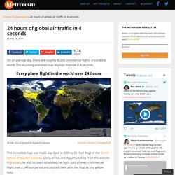
This stunning animated map displays them all in 4 seconds. Every plane flight in the world over 24 hours. Your World Map is Hiding Something. Just Updated Resources For Teaching Latitude & Longitude. Mapping World Heritage. 1.
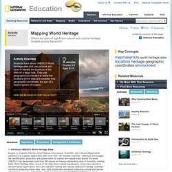
Introduce UNESCO World Heritage Sites. Explain to students that the United Nations Educational, Scientific, and Cultural Organization (UNESCO) is a global organization with more than 190 member countries. UNESCO encourages the identification, protection, and preservation of cultural and natural sites around the world. UNESCO has designated more than 900 places as having outstanding value to humanity, naming them World Heritage Sites. Some of the sites have cultural significance, some have natural or environmental significance, and some are both cultural and natural. Exploring How GIS Can Be Used to Manage Facilities and Plan Campuses. There are dozens of applications as to how GIS can be used to improve the public sector, everything from improving service delivery, gaining efficiency, and monitoring and assessing government programs.
One emerging area of GIS is the use of GIS to help plan and optimize facilities. Public sector organizations operate and maintain thousands of facilities, and with GIS, facility managers can gain new insights throughout the entire lifecycle of a facility. Map Overlays Comparing Size. All maps face the challenge of making the globe appear to scale in two dimensions.
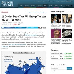
Most, like the traditional Mercator projection, keep either size or shape consistent — not both — which skews our perception of continents and countries one way or the other. But when you compare square mileage, a whole new world appears. Inspired by this map of Africa's true size from German graphic designer Kai Krause, we created 11 map overlays to open your eyes to some real geography. Carto narrative. Mapping Landforms. 1.
Interactive map of human genetic history revealed. A global map detailing the genetic histories of 95 different populations across the world, showing likely genetic impacts of European colonialism, the Arab slave trade, the Mongol Empire and European traders near the Silk Road mixing with people in China, has been revealed for the first time. The interactive map, produced by researchers from Oxford University and UCL, details the histories of genetic mixing between each of the 95 populations across Europe, Africa, Asia and South America spanning the last four millennia.
The study, published this week in Science, simultaneously identifies, dates and characterises genetic mixing between populations. To do this, the researchers developed sophisticated statistical methods to analyse the DNA of 1490 individuals in 95 populations around the world. Introduction to FieldScope. Students Map Real-World Issues with (Free) Geospatial Tools. Imagine being an emergency responder in a small town that hasn't mapped its fire hydrants, labeled rural roads with street signs, or identified evacuation points in the event of natural disaster.
Now imagine being part of a high school team that addresses those issues by thinking critically and using sophisticated geospatial tools to communicate findings. Until recently, only a small number of schools have had access to the high-powered geographical information system (GIS) software that enables detailed, layered mapping and analysis of data. Thanks to a recent $1 billion pledge from software developer Esri, free access to cloud-based mapping software is coming to 100,000 K-12 schools across the country. What Do We Mean by 'Reading' Maps? maps.nationalgeographic.com/downloads/Map_Skills_Booklet.pdf. 40 more maps that explain the world. Maps seemed to be everywhere in 2013, a trend I like to think we encouraged along with August's 40 maps that explain the world. Maps can be a remarkably powerful tool for understanding the world and how it works, but they show only what you ask them to. You might consider this, then, a collection of maps meant to inspire your inner map nerd.
I've searched far and wide for maps that can reveal and surprise and inform in ways that the daily headlines might not, with a careful eye for sourcing and detail.