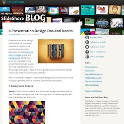

Lesson 11 Persuasive Oral Presentation Techniques. TED Talks I like. 6 Presentation Design Dos and Don’ts. Great presentation design can be difficult to master because it requires the coordination of many elements, including colors, fonts, images, icons and background.

While there are a lot of pieces to the presentation design puzzle, don’t be overwhelmed. Let the design principle of “less is more” guide your presentation design choices to keep your slides uncluttered. Not sure where to begin? Follow these design dos and don’ts to make sure your presentation is minimal, harmonious and clear. 1. Avoid: A bold, multi-colored, and patterned background with text on top. Instead Do This: Patterns can be a great addition to your presentation when used correctly. 2. Avoid: Center-aligning all of your text and images. Instead Do This: Only align some of your text in the center. 3. Avoid: Making all of the text on a slide the same size. Instead Do This: If you must have a lot of text on a slide, make the most important words larger than the other words on the slide. The "Attention Method" for Effective PowerPoint Presentations - Ted Curran.net.
This is a method of constructing effective PowerPoint presentations in a way that helps your audience pay attention to you and understand your ideas more fully.

With Attention Method, the slides are designed to add power, emphasis, and deeper understanding to your well-scripted speech. You flip slides often so that, at any given time, your slides always support only what you’re saying and contain no distracting information. Instead of one slide with several bullets, each slide should contain one idea expressed in vibrant images and minimalistic text. I developed this method while working at City Arts and Technology high school in San Francisco in 2008 and have continued to develop it over the years since.
It’s inspired by Lawrence Lessig’s uniquely minimalistic presentation style with a greater emphasis on visual impact. You can see an example of an Attention Method presentation here: Assessing with Outcomes from Samuel Merritt U Academic Tech on Vimeo. Death by PowerPoint. Ideas on how to create powerful presentations. Influencing change through presentations. Prezi - The Zooming Presentation Editor. How to create a great prezi by Adam Somlai-Fischer on Prezi. Insert PDF, PowerPoint, Excel. To convert your PowerPoint to PDF - Zamzar. Importing PowerPoint into Prezi.mp4. The Tempo of Your Presentation. One of the most important components of a successful presentation is the tempo of your words. Here are rules for you to remember and implement in attempting to connect verbally with another person (be it a sales pitch, a negotiation, or a romantic overture): 1.
People are most comfortable with individuals who speak at roughly the same pace as they do. Numerous studies have shown that one way to solidify a connection with another person is to mirror his/her speech patterns. This includes content as well as tempo. A slow speaker is going to be unconsciously uncomfortable with a fast talker.
So listen to the speech pattern of the person you wish to influence or persuade and make a deliberate effort to mirror its pace. 2. More often than not, we speak too rapidly when trying to engage or persuade others. So, you should almost always slow yourself down a little bit. 3. This is a skill everyone can learn and, in my judgment, one of the most critical talents in the business world. How to Look Confident During a Presentation" When it comes to giving a presentation, few people can compare to the late Steve Jobs.

Apple's iconic co-founder would walk on stage to deliver keynote presentations in front of thousands of media members and fans lucky enough to gain entry. Jobs, the wiry creator of such gadgets as the iPad, iPhone and iMac was known for his penchant for delivering captivating product demos. He was aided by some of the most technologically advanced visual aids in the business. Clad in his patented black mock turtleneck and jeans, Jobs mastered the art of the presentation. Even when he was unable to connect a brand new iPhone 4 to WiFi while debuting the device in 2010, he never missed a beat.
Jobs had plenty of practice at giving presentations. When you give presentations in school or at a familiar place like a church, you do so in front of peers, not colleagues. PodiumProApp.com.