

Foyer Vietnam. Office x Ogilvy & Mather. American design agency Office have collaborated with advertising specialists Ogilvy & Mather New York to create a fresh and engaging visual dialect for IBM’s Smarter Planet campaign.
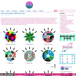
The series of adverts contain bold and simple graphics that represent complex world problems, broken down into bite sized chunks. Dealing with issues including energy, healthcare and education the campaign aims to show that we already have the innovation and technology resources needed to solve these problems. The Office team were inspired by the creative vision that designer Paul Rand developed for IBM in past decades.
Through a simplistic yet exciting approach Rand’s work communicated a sense of impact and clarity that people felt they could easily understand. www.ibm.com/uk/SmarterPlanetwww.visitoffice.com Blog contributor at People of Print. Crystalet - Brand Design by b2s6. The Juice Agency in 24 Words. The Juice Agency. Contributed by Kirk Clyne, creative director at The Juice Agency.
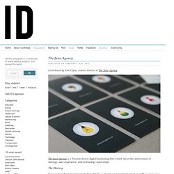
The Juice Agency is a Toronto-based digital marketing firm which sits at the intersection of strategy, user experience, and technology innovation. The History Juice evolved from Communicate New Media, a design and development shop with a seven year history of creating award-winning work for some of Canada’s leading advertising and marketing agencies. As marketing budgets shifted more towards digital initiatives, we often found that the briefs we received were lacking in sound strategy, weren’t grounded in best practices around digital or social executions, and often weren’t asking the right questions or solving real business problems.
Oxford University Clinical Research Unit. Contributed by Vietnam-based graphic designer Scott Lambert.
OUCRU was established in 1991 with support from the Hospital for Tropical Diseases in Ho Chi Minh City, Vietnam, the Health Services of HCMC and the Wellcome Trust. OUCRU also now works with it’s partners in many places including: Thailand, Indonesia, and Nepal. The unit’s strategic aim is to have a positive and significant impact on global health and, in particular, the prevention, diagnosis and treatment of infectious diseases. This is being achieved via an integrated long-term research programme, contributions to training, the scientific literature, national and international meetings and membership of national and international committees.
The World's First Generative Logo? Exploratorium Generative Identity. GFSmith: Print Test brochure contents. BME / UNIVERSITY LOGO AND PICTOGRAMS REDESIGN on the Behance Network. Cafe King - living identity on the Behance Network. Create A Generative Identity Using Plexus. Toko. Concept. Design. Atelier Müesli – Design graphique. MIT Media Lab Identity. Okdeluxe ★ COP15 generative identity software. < back to front page Generative identity software for COP15 the United Nations Climate Change Conference held in Copenhagen in 2009.
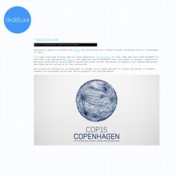
I joined long-time friends and all-time superstars shiftcontrol to help them add real-time movement to the COP15 logo designed by nr2154. Our approach was to generate the logo based on dynamic, generative patterns governed by rules like flocking and force fields. Onedotzero generative identity 2009. Onedotzero-ident - Project Hosting on Google Code. Onedotzero is an international moving image festival, showcasing a variety of work from innovators across the globe.
This year's festival identity was created collaboratively by Wieden+Kennedy & Karsten Schmidt (PostSpectacular). All identity assets were generated using a tailor made design/visualization tool, which has also been adapted to create a large scale (48m wide) interactive installation at BFI Southbank during the London festival. The installation allowed users to submit their own messages and manipulate them through gestural interactions using various features of the new Maemo/Linux based Nokia N900 device. The 17 Sides of a Cultural Identity. Built in 2005 by Rem Koolhaas’ OMA in the city of Porto, Portugal the Casa da Música is, without a doubt, a significant architectural statement — further emphasised by its intense angles and towering presence.
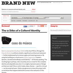
By using the building as a visual source, Stefan Sagmeister created a dynamic, faceted and endlessly varied identity — all literally speaking. The resulting logo is perhaps, well, not pretty, but as a vessel for the complete identity and adaptable execution it is a mighty impressive piece of design architecture itself. One on which styles, ideas, themes — specific or broad — can be projected upon. Brand New Classroom: Search Results. Universal Everything. Universal Everything. V&A Decode: open source identity. Visual identity and interactive installation by @BeetRootDesign at the PhotoBiennale 2010 #processing #maxmsp. Created by created by Beetroot, PhotoBiennale- Sites is a retrospective presentation of the Photobiennale Topos festival displaying 2330 works-sites by 266 photographers from 36 countries.
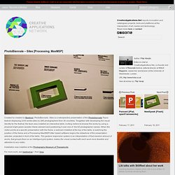
Toogether with developing the visual identity for the festival, the team also installed an interactive table, inviting visitors to browse the works by using a physical bright green wooden frame element and positioning it over one of the 63 photographer names. When the visitor points at a specific presentation with the frame, a webcam installed at the top of the table, is watching the position of the frame and a Processing-Max/MSP/Jitter based software begins the slideshow of the presentation selected, projected in front of the table.
This gesture responsive system is an interpretation of that massive amount of works, that groups them on an intelligent grid system, makes the visual contact with each work more feasible and attractive to any visitor. For more work, see beetroot.gr + their blog.