
Hero's Journey. Create Easy Infographics, Reports, Presentations. Make Beautiful Infographics. Infographics Templates Archives - Page 2 of 6. 10 Tools to Create Beautiful Infographics and Visualize Data. Sep 02 2014 They used to say content is king.
But what really makes up content? Gone are the days when “content” meant purely text. Today, if you want to engage and enchant your customers, your content must have some visual cues. The human brain processes visual information much quicker than text. Visme. Global-internet-map-2009-x.jpg (3000×2067) The State of Social Media 2011: Social is the new normal Brian Solis. InShare889 Part 6 in a series introducing my new book, The End of Business as Usual…this is not content from the book, this series serves as its prequel.
The state of social media is no insignificant affair. Nor is it a conversation relegated to a niche contingent of experts and gurus. Social media is pervasive and it is transforming how people find and share information and how they connect and collaborate with one another. I say that as if I’m removed from the media and cultural (r)evolution that is digital socioeconomics.
Social media is clearly becoming the new normal. But as social media becomes part of our cultural fabric and even as we witness businesses, governments, sports teams, and almost every organization socialize communication efforts today, much of what we see is merely the beginning of something that will one day become something far more important than the medium itself. 1) Skeptics will now be recognized as laggards as they now officially stand in the way of progress. Eeks! The anatomy of fear. Global-internet-map-2011-x.png (2160×3000) International Networks Archive / Map of the Month. SeaCableHi.jpg (1703×1037) Global-internet-map-2006-x.jpg (3000×2124) Taste Buds. China Investment worldwide. African Rankings. Famine 2011 East Africa. Water Aquifers Africa. Colonial Map of Sub-Saharan Africa. Africa in Numbers. Africa-Natural-Resources. Total production oil.
African Health 1990. Energy Resources and Projects in Continental Africa 2012. Patient Adherence Infographic Sept 12.jpg (JPEG Image, 800 × 1200 pixels) - Scaled (73%) Btitish Aid 2011 to Africa. True Size of Africa. African Facebook users. The Stereotype Map Of Every U.S. State — According To British People. Liberal Americans love the Brits.
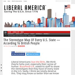
We think they’re hella cool, especially their sense of humor. BuzzFeed U.K. asked its staff to share the stereotypes that they have of every state in the U.S. Sadly, I think we totally deserve this. They may know us better than we know ourselves. Y’all enjoy. The North East. The South East. The mid-section of the U.S. And, the West. Alaska and Hawaii. Here's How The World's Most Brilliant People Scheduled Their Days. Create and share visual ideas online. Mesothelioma_facts.jpg (JPEG Image, 1000 × 2459 pixels) Resource Map Minerals Africa. How The World Spends Its Time Online - Have you ever wondered how people across the world spend their time online?

Global research firm Nielsen periodically releases data from its studies of consumer behavior online. Here are the 2010 findings regarding social networking, branding and world net usage. Total Time Online The average person spends more than 60 hours a month online. This is the equivalent of 30 straight days a year in front of a computer monitor, smart phone or other internet-capable device. Social networking accounts for 22 percent of the time while 42 percent is spent viewing content, whether watching videos, reading articles or playing online games. Among people who use the Internet, each person visits 2,646 Web pages on 89 domains and logs in 57 times per month. Most Popular Brands The percentage of all online users that visit Google is 82.
Social Network Usage The highest percentage of internet users who log onto social media is in Brazil, with 80 percent using social network sites. Daily Internet Activities. Standard & Poor's Credit Rating for each country. Odd Maps. THERE’S SO MUCH MORE to the world than we can usually glean from a map of a place.
Sure, you’ve got the political and topographical maps we’re all familiar with, and from those we can see the boundaries we’ve created and those that were naturally imposed…but what about burning questions like, “How does my country rate on the global attractiveness scale,” or “Where are all the redheads of the world hiding?” Thanks to the wealth of data floating around for free use on the internet, with these maps we visual learners can finally get a better sense of the global scheme of things, and perhaps find answers to several questions we never even thought of asking. An Infographic About Infographics (Build 20110413222027) If social media sites were superheroes.