

Tout ce que vous devez savoir sur le lean UX. Qui ?
Asma Moumni, UX Designer chez userADgents et responsable de l’Antenne parisienne FLUPA (Association francophone des professionnels de l'Experience Utilisateur), qui organise les UX-Days, les 11 et 12 juin prochains. Quoi ? La vision métier d’une UX Designer en agence spécialisée mobile et objets connectés. Comment ? Depuis quelques années, on entend beaucoup parler d’UX, pour User Experience. Lean UX, une démarche de conception itérative qui place l’utilisateur au centre Dans cette course à l’innovation constante, les cycles de développement de produits ou services se doivent d’être beaucoup plus courts pour permettre une meilleure réactivité et agilité de la part des marques qui pourront ainsi rapidement s’adapter et évoluer.
Saving time and resources in a UX Design process - Collisio. How Google Designers Adapt Material – Google Design – Medium. Material Design provides a set of tools and guidance to help you make informed decisions about the different UX design directions you could take when creating an app.
But what happens when your app doesn’t fit your particular use case? And what happens at Google when a designer is working on a product that doesn’t quite fit the guidelines? The Material guidelines adapt. In this article we’ll look at two Google apps — Keep and Inbox — to understand how they not only bend some of the rules, but how they help shape the Material Design guidelines as a whole. Inbox: Exploring the typographic grid Designing a new email web application is an extremely ambitious undertaking at Google, especially when it appears alongside an established product like Gmail.
Removing that ugly :focus ring (and keeping it too) End of blog post.

[Author leans back, puts feet on desk and starts puzzling over a Rubik’s Cube. Sensing there are still people in the room, he looks up…] Oh hey there, what are you still doing here? Oh, you want to complicate things unnecessarily? You want to handle the super-duper edge case where a user starts tabbing, but then begins using the mouse. I disapprove, but I support your right to do things the wrong way. We listen for the first press of the tab key, then add the user-is-tabbing class to the body. Easy peasy. (Performance note: running this handleFirstTab function on every key press might be a performance concern for you.
Thanks for reading. Effective UI Texts: Words to Avoid in Writing. Design better data tables – uxdesign.cc. How to identify Good Design in 6 steps – Muzli -Design Inspiration. Breaking apart the subjectivity.
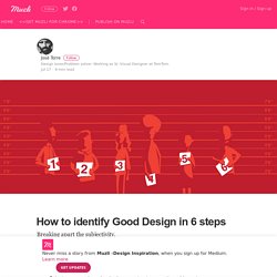
On my very first post on medium, a reader asked a question that really resonated with me. She started by saying that design is subjective and then wondered if someone could ever devise a list of principles that could define good design. So, I thought, "Why not give it a try? ", and here it goes. There are two parts to the question, being the first one the affirmation that design is subjective. Art is subjective, it’s like a game where there are almost no rules. The Psychology Principles Every UI/UX Designer Needs to Know.
Components. Style Guide. Blogs. Atomic Design by Brad Frost. Pattern Lab. Always Twisted. Front-End Development. Website Style Guide Resources. Experience Design Essentials: Animated Microinteractions In Mobile Apps. Dariel Fitzkee, the famous magician, once said, “Magic is both in the details and in the performance.”
Interaction design is just like that. Designers love to get the big picture right, but if the details aren’t handled properly, the solution will fail. The magic is all in the details. That’s why well-designed microinteractions make experiences feel crafted. To get a better understanding of how your design benefits from microinteractions, it will help to sketch out your app ideas. Official Usability, User Experience And User Interface Guidelines From Companies (2016)
6 UX Design Trends To Follow In 2016. Refills - Patterns. Experience Design on Smashing Magazine. We use ad-blockers as well, you know.
We gotta keep those servers running though. Did you know that we publish useful books and run friendly conferences — crafted for pros like yourself? E.g. upcoming SmashingConf Barcelona, dedicated to smart front-end techniques and design patterns. Posts Tagged ‘Experience Design’. We are pleased to present below all posts tagged with ‘Experience Design’. Sponsored Article Designing Card-Based User Interfaces Web and mobile apps are moving away from pages towards completely personalized experiences. In this article, I'll explain what cards mean to UI designers, and I'll review three popular card-based services. Usability and User Experience (UX) Guidelines. Design Thinking 101. History of Design Thinking It is a common misconception that design thinking is new.
Design has been practiced for ages: monuments, bridges, automobiles, subway systems are all end-products of design processes. Throughout history, good designers have applied a human-centric creative process to build meaningful and effective solutions. In the early 1900's husband and wife designers Charles and Ray Eames practiced “learning by doing,” exploring a range of needs and constraints before designing their Eames chairs, which continue to be in production even now, seventy years later. 1960's dressmaker Jean Muir was well known for her “common sense” approach to clothing design, placing as much emphasis on how her clothes felt to wear as they looked to others. These designers were innovators of their time. Despite these (and other) early examples of human-centric products, design has historically been an afterthought in the business world, applied only to touch up a product’s aesthetics.
UX Mapping Methods Compared: A Cheat Sheet. Designing and developing a product often involves a large team of people with different backgrounds and experiences who must be on the same page about the project goals, the user needs and behaviors, and even the component processes involved.
This common understanding is often built with visualizations (commonly referred to as mappings). Mappings make sense of and describe various aspects and processes associated with a product. Four Types of Mapping This article gives an overview of four commonly used mappings, their defining characteristics, and when to use which: Graphisme : 200 sites indispensables / Graphic design : 200 Essential Websites - dubostbenoit.com.