

Stop using Material Design text fields! - Matsuko Friedland. #Preface I recently started working on a project built with Google's Material Design UI library, and noticed quite a few usability and accessibility issues.

Most of these issues related to its form fields, particularly its text fields. I shared some of these issues with my colleagues, and on Twitter (Tweet 1, Tweet 2). Since I've discouraged the use of text fields like Material Design's many times before, I decided to make this post to share next time it comes up. Note: Although it is common on the web, and is in some of the images below, you should never make visible form fields without a visible label. Form Design Patterns Book Excerpt: A Registration Form. About The Author Adam Silver is an interaction designer focused on design systems and inclusive design.
He loves to help organisations deliver products and services so that … More about Adam Silver … We’re happy to announce Adam Silver’s new book Form Design Patterns. In this excerpt from the book, Adam takes a look at the foundational qualities of a well-designed form and how to think about them. You can also get the book right away → Neumorphism in user interfaces - UX Collective. Fddc639ab6073d4d5f14e2b87b6f1073. Don Norman on how design fails older consumers. The Myths of Color Contrast Accessibility. Empathy Prompts.
Accessibilité web : Comment rendre votre site web utilisable par tout le monde ? Get started with web accessibility. Web accessibility refers to the degree to which a website's UX design is available to as many people as possible.
Most often, when we’re talking about web accessibility, we are describing how people with disabilities can access the web. 10 steps to an engaging user experience The common symbol of web accessibility is screen readers. A screen reader, as the name suggests, is an assistive technology that reads the text content of the screen to the person using the computer, output as speech audio or braille. When we design for disability, we all benefit (vidéo, EN) 5 Web accessibility myths. If your business has a website, it should be accessible to disabled users.
There are ethical and commercial justifications for this, but there is also a legal reason: if your website does not meet certain accessibility standards, then you could be sued for discrimination because The Disability Discrimination Act in the UK includes blind and disabled access to the internet. Web Accessibility Initiative (WAI) Introduction Web Content Accessibility Guidelines (WCAG) is developed through the W3C process in cooperation with individuals and organizations around the world, with a goal of providing a single shared standard for web content accessibility that meets the needs of individuals, organizations, and governments internationally.
The WCAG documents explain how to make web content more accessible to people with disabilities. Web "content" generally refers to the information in a web page or web application, including: natural information such as text, images, and sounds code or markup that defines structure, presentation, etc. WCAG 2.0 checklist - a free and simple guide to WCAG 2.0. It’s extremely useful to have a WCAG 2.0 checklist to hand when you’re working through the guidelines.
A WCAG 2.0 checklist helps you to check your web accessibility progress, record how far you’ve come and set your targets out for the future. Wuhcag is all about holistic web accessibility – that means taking everything about your website into account. That’s why I don’t rush you to make every web accessibility change at once – it’s too much for you to do and so it’s bad for your users. I love a structured approach to everything in life, and your website is no exception. WAVE — Module d'analyse d'accessibilité d'une page. There’s already a blueprint for a more accessible internet.
The internet can be a hostile space for 15% of the world’s population who experience some form of disability.
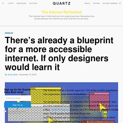
Try navigating a website as someone who is visually impaired: Turn on voice command on your computer (Command ⌘ + F5 if you’re on a Mac, enable Navigator if you’re on a PC) and go to Amazon’s Kindle store. You’ll quickly find out that those who rely on voice commands can’t skip around and are doomed to listen to every notation about every page element before getting to the one piece of information they need. “It’s a crime that the most versatile device on the planet—the computer—has not adapted well to people who need help,” laments Vint Cerf, the “father of the internet,” who co-authored the net’s communication protocol with Bob Kahn.
The 75-year old computer scientist knows this pain point first hand having been born with a hearing impairment and color blindness. The internet was a welcoming place when Cerf conceived of it. Some recommendations are less obvious. Base de bons et mauvais exemples. Cards. Testing the accessibility of pattern libraries. Idées pour tester l'accessibilité d'un site soi-même (en anglais) Contrast Rebellion - to hell with unreadable, low-contrast texts! How the Web Became Unreadable. It’s been getting harder for me to read things on my phone and my laptop.
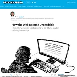
I’ve caught myself squinting and holding the screen closer to my face. La couleur ne suffit pas (EN) Tanaguru — Site d'analyse de contraste. Hex Naw — Site d'analyse de contraste. Cercle Chromatique Accessible - Palette de couleur Accessible. Accessible color palette builder. Color Safe - accessible web color combinations. Color Oracle. Color Accessibility Workflows.
Designing UI with Color Blind Users in Mind. Color plays an integral role in UI design.
When done right, it improves user experience, influences purchasing decisions, and reflects the brands voice. Improving The Color Accessibility For Color-Blind Users. Bonnes pratiques daltonisme (5% des internautes) (EN) One of my friends from college is color blind and every time someone finds out about this, the prompt question is — “Do you know which color this is?”
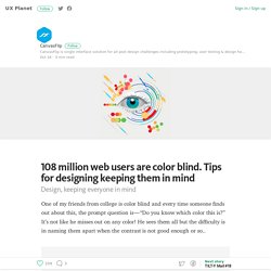
It’s not like he misses out on any color! He sees them all but the difficulty is in naming them apart when the contrast is not good enough or so.. As designers, you pick up the best colors for the canvas and the most engaging content for your users, but often miss out on the color blind ones. Repeating the ever-repeated stats — 8% of the males and 0.5% of the females are color blind. Visolve - the assistive software for people with color blindness. How we all see colors differently—Color theory in design. There’s the old question: “Do you see that color the same way I see it in my mind?” To some extend this will remain a philosophical question involving the swapping of hypothetical consciousnesses between hypothetical brains. But here’s what we do know. Three reasons why people looking at one thing can see something differently.
Orange You Accessible? – Ericka Seastrand. Index. 10 screen readers. Best Free Screen Recorder Software. Techniques to Display Text over Background Images – uxdesign.cc. Your Body Text Is Too Small - Marvel Blog. Body text is the key component in communicating the main bulk of a message or story, and it’s probably the most important element on a website, even if people sometimes read just the headlines. Why would we limit the effectiveness of body text by minimizing its size to a browser-default that’s now over 20 years old, even on large displays?
The majority of websites are still anywhere in the range of 15–18px. We’re starting to see some sites adopt larger body text at around 20px or even greater on smaller desktop displays, but not enough in my opinion.* *I’ll be referring to font sizes in px (pixels) instead of pt (point) throughout this article so it’s easily relatable to the framework of the web and digital space. Now, I’m not saying that small typography is bad. A Little History Through the typewriter era we ascertained that 12pt was about the optimum size for legibility in print despite the fact that books, magazines and newspapers go smaller to reduce paper quantity costs. 1. 2. 3. 4. 1. Myths About How Blind People Use the Internet. Accessibility - Mac.