

50 Inspirational Branding & Identity Design Projects. Print is definitely not dead!
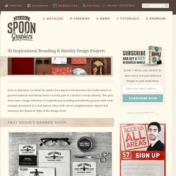
No matter how big the web becomes the tactile nature of printed material will always form a crucial part of a brand’s overall identity. This post showcases a huge collection of inspirational branding and identity projects with each example presented in a neat layout, often with clever complementary objects that reinforce the theme or style of the design work. Join the mailing list to have every new post hand delivered to your email inbox. 40 Awesome Examples of HTML5 Portfolio Websites. HTML5 are the next generation fundamental markup language for the web, and will redefine the possibilities in web design and web development.
When combined with an action oriented language such as jQuery, the range of effects and applications that can be created are amazing. HTML5 are able to change the way you design Web sites. Include many new advanced features that one can not begin to see how they work. These new features and design techniques make it much easier create a website. 30 Minimal Business & Corporate Web Designs. For today’s post, I’ve created a showcase of web designs anchored in minimalism.
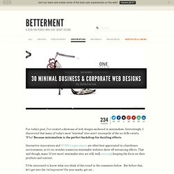
Interestingly, I discovered that many of today’s most “minimal” sites aren’t necessarily of the no-frills variety. Why? Because minimalism is the perfect backdrop for dazzling effects. Interactive innovations and HTML5 experiments are often best appreciated in a barebones environment, so it’s no wonder numerous minimalist websites show off entrancing effects. That said though, many (if not most) minimalist sites are still, well, minimal; keeping the focus on their products and content. I’d be interested to know what you think of this trend in the comments below. 30 Minimal Business & Corporate Web Designs 1. Simple design on a subtle grid. 2. Despite the many colors “above the fold,” Sur la Route Encore’s site (designed by Minuit Sept) toes the minimalist line. 3.
Retro and Vintage In Modern Web Design. Advertisement Retro and vintage are becoming a new trend.
Once rarely used in this robust, dynamic medium, early, retro and vintage elements are now becoming more and more popular in a variety of design contexts. Concepto. Styleboost. 26 Dark Website Designs That Work Well. I have compiled a showcase of the most fantastic dark website designs.
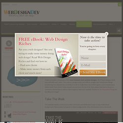
All of these designs work very well with each other. The colours, backgrounds, text effects, images and overall web design positioning has selected very carefully in order to make them top of their game, and a masterpiece within itself. If you think I have missed any out from the list of 26, then please feel free to drop in a comment. Remember to click on the images to view each website.
Thanks to Ten Thousand Things for the title post image! Take The Walk This website stands out because of the red boxes and white text it uses on top of the black background. Starbucks Coffee At Home The light text border on the dark background makes this design work very well. Evan Eckard The white text and separating white lines make the content stand out from a dark background.
Electricurren Print Huge This design uses dark blue as the main colour, and the text is a light blue to make it stand out. Nice Lion Design Level 9. Diseños de Paginas Web eCommerce. Advertising Network › Home. Are Nursing Assisting (CNA) and Medical Assisting the Same? A certified nursing assistant (CNA) is not the same as a medical assistant.
The occupations both involve working with patients and collaborating with nurses and physicians in medical settings, but a CNA has much more specific duties. CNAs aid nurses by doing patient prep work, such as taking temperature or blood pressure, feeding and bathing patients, and filling the role of a general caregiver for patients who may not need constant medical attention, but do need assistance with personal maintenance in between medical procedures.
CNAs and medical assistants may work in similar settings and perform similar tasks even if their level of education and their requirements for licensure or certification are different. A crucial difference between the two is that CNAs tend to provide bedside care to senescent patients, where medical assistants assist more with procedural or administrative preparation and housekeeping. Untappd - Drink Socially - Discover new beers and bars near you! Art & Design Inspiration. EgoPay onlineTransfer – its just like sending cash - only now its easy and swiftly processed by egopay.com. Color Profile step 12b. To get the maximum benefit, upload a current photo of yourself for our colorist to review.
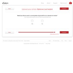
We’ll take your overall look, skin tone and style into consideration when formulating your haircolor. A recent profile in good lighting that clearly shows your hairstyle and color. A dated, dark, b+w, or cropped photo that makes it hard to see your hairstyle and color. Seanwes hand lettering. 50 Inspiring Vintage Advertisements.
Like many others I find myself captivated with vintage advertising.
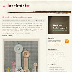
There have been numerous articles, blog posts and websites dedicated to the subject and I just can’t seem to get enough. Specifically, it is the advertising of the 50′s and 60′s that is most aesthetically pleasing to me.
Materials. Design Graphic & Photography Inspirations. Sci-Fi Art. 25 Superb Examples Of Flyer Designs. A flyer (also spelled flier or called a circular, handbill or leaflet) is a single page leaflet advertising a nightclub, event, service, or other activity.
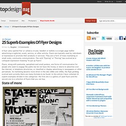
Flyers are typically used by individuals or businesses to promote their products or services. They are a form of mass marketing or small scale, community communication. The verb “flyering” or “fliering” has evolved as a colloquial expression meaning “to put up flyers”. Flyers, along with postcards, pamphlets and small posters, are forms of communication for people who want to engage the public but do not have the money or desire to advertise over the internet, in telephone directories, or classified or display advertising in newspapers or other periodicals.