

Slides Carnival - Free presentation templates. Kuvien etsiminen ja käyttö - Google Slides. Slidesin ominaisuus Kysy luennoitsijalta. Control Alt Achieve: Googlink: Using Google Drawings like a Thinglink. Google Drawings is often overshadowed by the other Google Drive tools such as Docs, Sheets, Slides, and Forms.
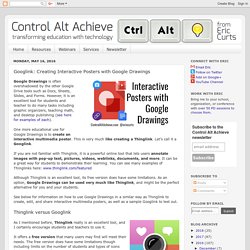
However, it is an excellent tool for students and teacher to do many tasks including graphic organizers, teaching math, and desktop publishing (see here for examples of each). One more educational use for Google Drawings is to create an interactive multimedia poster. This is very much like creating a Thinglink. Let’s call it a Googlink. If you are not familiar with Thinglink, it is a powerful online tool that lets users annotate images with pop-up text, pictures, videos, weblinks, documents, and more. Although Thinglink is an excellent tool, its free version does have some limitations. See below for information on how to use Google Drawings in a similar way as Thinglink to create, edit, and share interactive multimedia posters, as well as a sample Googlink to test out.Thinglink versus Googlink It offers a free version that many users may find will meet their needs.
Conclusion. How to add music to your Google Slides presentation. Music is a great way to liven up your presentations and keep your audience engaged.
Unlike Microsoft PowerPoint, however, Google Sheets doesn’t include support for audio files. How to use a custom design template in Google Slides. Live Polling in Google Slides: Version 1.0.1. Guess what graduated out of Beta today?
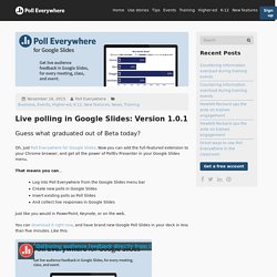
Oh, just Poll Everywhere for Google Slides. Now you can add the full-featured extension to your Chrome browser, and get all the power of PollEv Presenter in your Google Slides menu. That means you can… Log into Poll Everywhere from the Google Slides menu barCreate new polls in Google SlidesInsert existing polls as Poll SlidesAnd collect live responses in Google Slides Just like you would in PowerPoint, Keynote, or on the web. You can download it right now, and have brand new Google Poll Slides in your deck in less than five minutes.
What if I have the Beta version already installed? If you were one of the visionary giants who installed your PollEv Presenter Google Slides extension before November 11, 2015, you’re all good. How do I tell my friends and coworkers about this? 10 Easy Steps: Creating Presentation Templates in Google Slides. If you are a user of Google Slides presentation tool you may want to take it to the next step and create your own templates instead of always using the default theme.
One reason to do this is for student projects. If you have a particular way you want students to put their project together, creating a template for them to use can help them to focus on the content rather than the font choice. Create a Google Presentation. Choose the Simple Light template. Decide what design pattern you want for your template. How to Insert Non-YouTube Videos Into Google Slides.
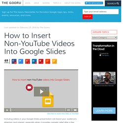
Click here to watch this video on YouTube.
Create an eBook with Google Slides. New Image Editing Tools in Google Slides and Drawings. Editable Themes and Widescreen Presentations in Google Slides. New Image Editing Tools in Google Slides and Drawings. 11 Design Tips for Beautiful Presentations. Presentations often receive a bad rap—for good reason.

We’ve all sat through those long-winded speeches and hot mess PowerPoints, which completely undermine the point of visual presentations. So, what differentiates a good presentation from a poor one? Content and design. While your speech may be perfect, the images you show can greatly add or detract from your message. Whether you’re using Visage, PowerPoint, Keynote or good old PDFs, these 11 tips will help you create well-designed presentation slides that effectively get your point across. 1) Skip the Stock Template Using the slide themes included in your software is presentation death. 2) Don’t Use More than 6 Lines of Text Packing too much information into a slide will completely undermine its purpose. 3) Ditch the Bullet Points Too many presentations are bullet point crazy. 4) Use Sans Serif Fonts With typography, go for legibility over fun. 5) Size Fonts Appropriately 6) Maintain a Strong Contrast Between Text and Background.
5 tips for mastering Google Slides. Get Google Apps News & Tips Google Slides got a major update this week, adding the ability to edit the master slides for a presentation template.

Before, in order to standardize a template for use by others, or to customize a presentation for a topic, you had to make your own template of sorts, editing each type of slide, then copying and pasting to create more that looked the same. With this update, you can now edit the master slide layout, then you can simply add more slides using the ‘New slide’ command (or, the quick add button), and your formatting is done for you. It’s great for organizations who want to keep a uniform template, and for longer presentations where formatting really matters. Here are a few pointers to get it just right. 1.
Fig 1. – Editing the master slide layouts – want the same font on all the slides, but hate having to edit each slide all the time? If you don’t need all the slide types, don’t edit them in the master slide layout. 2. 5.