

Warm Gun: Designing for Emotion. The Smashing Book - How to Turn a Site into a Remarkable Brand - Smashing Magazine. ← Design to Sell: Increasing Conversion Rates (2/2)TOCLearning from Experts: Interviews and Insights → The term “remarkable” means being worthy of notice or attention or, in the context of Web development, naturally persuading the viewer to mention or recommend a website to a friend.
Developing a remarkable brand for your website means that people will likely give credit or refer to your website voluntarily, which is a big bonus when you are starting to build and develop your website. Any niche or industry has hundreds or thousands of websites all based on the same topic, but from the crowd always emerges a bunch of websites that re-appear time and again. Understanding Your Brain for Better Design: Left vs. Right. The concept of the left and right brain only lately popped up in the late 1960′s, but since has become a well-known part of human psychology.
While we all use both sides of the brain, each of us has a dominant side, and this dominant side makes up for a huge part of our personalities. Each individual thinks a certain way, has more interest in certain areas, and above and beyond all — is most effective in certain ways. An accurate understanding of the left and right brain can help one to become more productive, efficient, and creative.
This article will cover a basic understanding of what the left and right brains are, and each of their traits. We’ll also go into how we, as creative people, can harness this understanding of the left and right brain to be more creative, as well as succeed in other work-related tasks. The Psychology of Web Design. Designers often don’t take the time they should to learn about how basic psychological principles can effect the experience their visitors have on the sites they build.
Psychological principles are either looked upon as unnecessary, or too complicated. But the truth is that they’re neither. There aren’t that many concepts associated with basic design psychology, and most are relatively straight-forward and easy to learn. They’re also mainly easy to implement, though some take a bit more care and planning than others.
Stop Designing Aesthetics, Start Designing Emotions. Despite the somewhat provocative title, you shouldn’t really stop designing aesthetics.
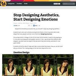
Gradients and colors and contrast are all good, but there’s a more important side to web design that many people overlook most of the time: Designing emotions. Discussing emotion in design is a bit of a hot topic at the moment, it seems to be popping up in more and more blog posts and speaker sessions. In fact I saw at least three different web designers say that it was the subject of the talk which they had recently submitted for next year’s SXSWi. So what’s all the fuss about? Strengthening behavioral cues in UX web design with Gestalt principles. Step with me, if you will, into my humble DeLorean, and travel back in history to that time you fell asleep in your design theory course.
You didn’t need Gestalt theories, you thought. You already knew how to make a killer logo. Emotional Web Design. The state of the web has changed over the years and has taken a new turn in the recent year.
Designers and marketers are beginning to examine the human element in their clients websites. With an age of worrying about Google, Yahoo & Bing and how to play the SEO game, many are forgetting about the people who are actually using the website. Sure, SEO is an important piece of website success, but if all the user is doing is finding your website and leaving, what's the point? Engaging the customer and allowing them to feel certain things when using your website is key.
Web Design for Emotion. Good design is more than just making something look pretty.
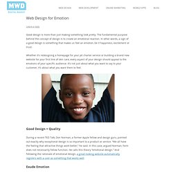
The fundamental purpose behind the concept of design is to create an emotional reaction. In other words, a sign of a good design is something that makes us feel an emotion, be it happiness, excitement or trust. Understanding User Personalities (Part 2) In part one of this series, we examined some of the more problematic personality traits user researchers are likely to encounter in their work.
Now that we’ve seen how individual personalities can put a damper on your day; let’s explore some ways to overcome the problems inherent to each. The Shy One Most shy respondents benefit from an extra dose (or three) of encouragement. This is especially important early in a session/interview, since the first few minutes sets the stage for the duration of the interview. Understanding User Personalities (Part 1) UX researchers are exposed to a broad cross-section of people and personalities, especially when it comes to conducting user tests.
Frequently, the people we encounter are willing, helpful participants to the research process — but what happens when respondents aren’t so willing or helpful? Although it’s far from ideal, it’s inevitable: some research participants are difficult to work with. In this series — covering the absolute basics of user personality types — we’ll begin by introducing some of the more problematic personalities. Psychological Manipulation in eCommerce Design. Web designers and architects use an array of psychological tricks to manipulate users into specific behaviors.
What can be learned from these tricks? And, more importantly, is it ethical? In the July 2011 issue of Wired Magazine, behavioral economist and psychology professor Dan Ariely wrote a feature on the psychological tricks used by some of today’s biggest websites. The article, “Gamed,” discusses how sites like Amazon and Groupon encourage certain types of spending behaviors through the implementation of design elements—”encourage” is one word, anyway. In another light, this tactic can appear as straight-up manipulation. Not too long ago, I met with and spoke to Ariely about his book, Predictably Irrational, which delves into the many ways humans act seemingly irrationally, and how businesses have learned to capitalize on such. How To Cultivate Emotional Engagement In Web Design.
Psychology suggests that most people buy according to how they feel about a product (their emotions) rather than logic.
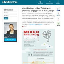
Cultivating an emotional bond with your customers is important—and it’s becoming more difficult to do. If your website isn’t tuned to resonate with your audience’s emotions, you could be losing business. » Where is the Emotion in Web Design? Lately I have been working on a number of print projects, which is a change for me due to most of my projects over the past year being almost strictly web based. The addition of print projects has been an enjoyable one, and it has even opened my eyes to a few things I seem to have been overlooking in my web work.
The most glaring thing I have noticed is missing from most of my web work is projects that hope to achieve an emotional connection between the user and the brand being communicated. Some products and services may be better served through rationalization, however after browsing the web for a while it became apparent that the vast majority of websites are completely emotionless. Why is the Web Lacking Emotion? Over the past couple of days I have been observing websites, and comparing them to the way printed materials are used to communicate. Emotional Interface Design: The Gateway to Passionate Users. We’re changing. Our relationships online and in real life are shifting as we become more public with our private lives. Online social networks have helped our real world social networks transcend time and space making it easy (and seemingly essential) to share the triumphs, tragedies, and trite moments of life.
No longer do you simply tell your best friend that you’ve broken up with your boyfriend. It feels natural to many people to tell hundreds of Twitter followers, and Facebook friends. No matter how you feel about the appropriateness of over sharing, the shift towards a public private life is changing our expectations of the relationships we create online. Figure 1: Kenny Meyers uses humor in his portfolio to connect with his audience.
Persuasion Triggers in Web Design - Smashing UX Design. Advertisement. Optimizing Emotional Engagement In Web Design Through Metrics - Smashing UX Design. Advertisement Think about what keeps you coming back to your favorite store, your favorite person or even your favorite website. It’s not just a mindless buy-go, hug-go or click-go relationship. It is a complicated, emotional connection. Designing for Emotion.