
jQuery Mobile: Markup Enhancement of dynamically added content. What can museum exhibit design teach us about UX design? As soon as you step foot in a museum exhibit, you’re faced with dozens of decisions: Read the wall of text that greets you at the entrance or dive right in?

Walk through the room clockwise or counter-clockwise? Examine the label on each piece or just soak in the visual elements and skip the little details? So it should come as no surprise that museum-exhibit designers have been thinking about the user experience for hundreds of years. Whether you’re staring at a digital screen or a gallery wall, you’ll likely find yourself in the hands of a curator, a writer, and a visual designer, all teaming up to anticipate your every need—and the needs of thousands of visitors who may be nothing like you. Beverly Serrell has spent the better part of 40 years trying to make that challenge a little easier. Beverly Serrell, museum consultant and author.
7 Rules for Creating Gorgeous UI (Part 1) – Erik D. Kennedy. Introduction OK, first things first.

This guide is not for everyone. Who is this guide for? Developers who want to be able to design their own good-looking UI in a pinch.UX designers who want their portfolio to look better than a Pentagon PowerPoint. Or UX designers who know they can sell an awesome UX better in a pretty UI package. If you went to art school or consider yourself a UI designer already, you will likely find this guide some combination of a.) boring, b.) wrong, and c.) irritating. Let me tell you what you’ll find in this guide. First, I was a UX designer with no UI skills. My portfolio looked like crap, reflecting poorly on my work and thought processMy UX consulting clients would rather buy someone’s skills if their expertise extended to more than just sketching boxes and arrowsDid I want to work for an early-stage startup at some point?
I had my excuses. “I majored in engineering — it’s almost a badge ofpride to build something that looks awful.” This article is not theory. Bootstrap 4: Everything You Need to Know. An Introduction to Parallax Scrolling Using Stellar.js. One of the most discussed web design trends of the last few years is the parallax scrolling effect.

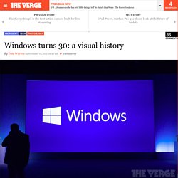
Whether you like it or not, it is used by a lot of websites. In this tutorial I’ll give you a brief introduction to parallax scrolling and show how we can reproduce it in a website using a jQuery plugin called Stellar.js. What’s Parallax Scrolling? Parallax scrolling involves the background moving at a different rate than the foreground, creating a 3D effect as you scroll down the page. Panorama. Windows turns 30: a visual history. The PC revolution started off life 30 years ago this week.

Microsoft launched its first version of Windows on November 20th, 1985, to succeed MS-DOS. It was a huge milestone that paved the way for the modern versions of Windows we use today. While Windows 10 doesn’t look anything like Windows 1.0, it still has many of its original fundamentals like scroll bars, drop-down menus, icons, dialog boxes, and apps like Notepad and MS paint. The Rise and Fall of Everest (the App) At Product Hunt, we are so passionate about helping startups and makers launch their products and share them with the world.

Much of our site is about beginnings — the moment a product launches, and the moment someone discovers something new that they love. But, we’re also big believers in reflecting on and learning from endings . Unfortunately, the endings aren’t talked about nearly enough — or as favorably — in the startup world. We were fortunate enough to have Everest Co-founder Katherine Krug share the story about the rise and fall of the beloved goal setting app. When the product launched in December 2012, Everest’s future was glaringly bright. What happened during those 24 months? The Everest Postmortem Everest set out to build a technology platform that inspired and empowered people to live their dreams and achieve their personal goals.
We approached behavior change in the following ways: We launched our iOS app in December, 2012 and officially closed shop in December, 2014. People. If you are an experienced designer, you probably agree that being inspired by others is not stealing in UI design.

It’s best practice research. It’s using design patterns. It’s following the guidelines.