

The Single Responsibility Principle Revisited. Once upon a time, at the beginning of my journey as a professional developer, I quickly heard about the principle which will save us all, part of the Sacred SOLID principles.
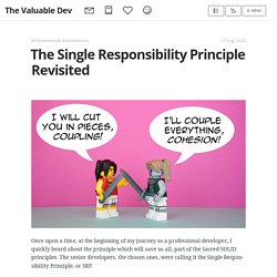
The senior developers, the chosen ones, were calling it the Single Responsibility Principle, or SRP. The SRP looked like a magic spell I could cast for my code to be instantaneously better. But first I had to understand it. What’s a responsibility? I was asking myself, my mouth full of muesli, a Sunday morning, while sloppily browsing The Internet. What to ask on a interview? - DEV. A (Very) Simple Git Workflow - DEV. This is a quick on-the-court example of what a (very!)
Simple Git workflow might look like for two people working on a personal project together.
Free Image Placeholder - DEV. Quick and simple image placeholder service.

You can create dummy images quickly and easily. Generate awesome colorful placeholders for your web sites and projects. Just specify the image size after our URL ( and you’ll get a placeholder image. Basic Usage Placeholder Images This is the most basic way to use placeholders. Copy the code and modify the size to your liking. Custom Background Color Placeholder Images You can use custom background colors with our placeholders, Check out the example code below to learn how to do this.
Custom Text Color Placeholder Images You can change the color of the placeholder text easily, Check out the example code below to learn how to do this. Get These In Place Before Starting Your Next Side Project □ - DEV. Let me introduce you to something that you might already be familiar with— Side Project Hell 😈 Basically, you end up with like 747324856 side projects and not a single one is really complete.
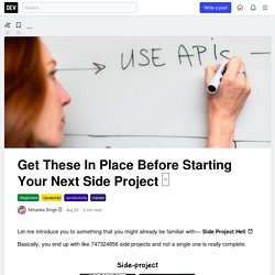
I believe, this hell would be most common in the JavaScript world. Every other day you get a kickass library and everyone wants to try it out by building their own something. To save yourself from this horror, set the following items in place: ⚠️ This is just a list, no magic. 1. This is a bold step, but super effective. Incroyable ! Ces politiques de confidentialité sont compréhensibles ! – serveur410. My Top 4 Patterns for Writing Simple Code - DEV. Ashuray/InterviewRoom: Contains all important data structure and algorithms problems asked in interviews. 10 Questions I'm Asking All Companies Before Scheduling Any Interviews - DEV. Interviewing requires a lot of time and energy.

How I optimised my online presence to get opportunities. - DEV. I'm a firm believer that a good online presence can lead to a really successful career path that may open you up to better job opportunities...
All my articles are first published and hosted on my blog - but you can also find this article here on DEV.to. You may also be interested in my tweets on my Twitter profile and my monthly newsletter. How to Build a Good API That Won’t Embarrass You : programming. Why I love the repository pattern — Lawrence Okoth-Odida. Persisting application state is not an easy job, to say the very least.
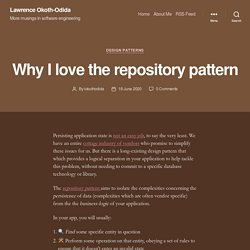
We have an entire cottage industry of vendors who promise to simplify these issues for us. But there is a long-existing design pattern that which provides a logical separation in your application to help tackle this problem, without needing to commit to a specific database technology or library. The repository pattern aims to isolate the complexities concerning the persistence of data (complexities which are often vendor specific) from the the business-logic of your application. In your app, you will usually: Persist that entity Steps (1) and (3) both concern communication with the storage layer (e.g. the database) that you are using. FailFast. Cartographie de l'expérience utilisateur via des experience maps. Les cartes d’expérience sont devenues de plus en plus utilisées ces dernières années.
La cause ? 5-most-annoying-website-features-i-face-as-a-blind-screen-reader-user-accessibility. Comment mesurer la performance de son site pour améliorer l'UX ? Être en capacité de mesurer le niveau de performance de votre site web est un défi de haute importance.
En effet, la performance a un impact direct sur l’expérience utilisateur et sur le référencement. C’est une dimension à suivre tout au long de la durée de vie de la plateforme digitale, et pas uniquement lors de son lancement. Aujourd’hui, nous vous proposons un article pratique sur les métriques de performance à suivre et les outils à exploiter pour mesurer la performance de son application digitale. Free UI Kits - A curated list - DEV. Hello Coders, This article presents a curated list with beautiful and Free UI Kits released under permissive licenses by their vendors suitable for hobby and commercial projects.
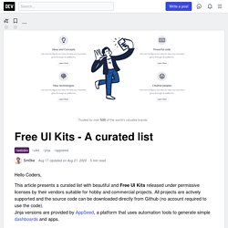
All projects are actively supported and the source code can be downloaded directly from Github (no account required to use the code). Jinja versions are provided by AppSeed, a platform that uses automation tools to generate simple dashboards and apps. Thanks for reading! Please suggest more items in the comments. Complicated Parts Of JavaScript Part#2. 3 awesome open-source iconsets! □ - DEV. Over the past few weeks I’ve been creating a list of my favorite open-source icons. They’ve really expanded my thinking on different styles and trends in the design world. Let’s get started! CSS.gg CSS.gg is a minimalist library with over 700+ icons for CSS, SVG, Figma, Adobe XD, and more!
CSS.gg also was created by With over 6000+ stars on Github, this open-source project is no joke. I’ve used CSS.gg for a project in the past and it worked very well. FontAwesome Yep, I’m assuming you saw this one coming. How to Prepare for a Technical Interview - DEV. AlgoDaily is a gentle, visual technical interview course built for how people actually learn technical material. Our fun and interactive lessons, daily coding problems in your inbox, and visualizations make it easy for you to land your dream software job. If you enjoy this content, you may also like our course and book, releasing August 22nd.
Start for free now or try our daily coding problems newsletter. Returning users can login to stop seeing this. Technical Interview preparation is hard, and that's why AlgoDaily exists. Most people waste time in their efforts. 5 Tips for Learning Grid - DEV. Follow Me on Twitter @Anna J McDougall When it comes to structuring your webpage using HTML and CSS, the most commonly used instruments are Flexbox and Grid. This week, my course has been covering Grid in a bit more detail, and I've had a chance to hear several points of confusion among those learning it for the first time, so rather than step you through how to implement Grid, I've decided to drop five tips for understanding it better, which will help you wrap your head around this effective and important concept.
For what it's worth, if you do want a step-by-step guide, I can highly recommend A Complete Guide to Grid. I keep this open in a tab every time I'm working with Grid so I have a quick reference to work with, but the first few times you use it you will probably have to go through it section by section. Now that we've covered that and already gotten two resources under your belt, let's have a look at what you need to understand about Grid: 1. 2. 3. Vue 3 new features summary - DEV. Vue-next (Vue 3) has been out for a while. It is now under release candidate stage which means there won't be big changes on the open APIs. Good to see that Vue has already been stabilized and ready to waltz into our projects. I have to say that Vue 2 is already amazing enough.
But with Vue 3's new features, it's likely to upgrade our projects to an upper level. I guess the most thrilling feature in Vue 3 would be the composition APIs. In all, it's so happy to see that Vue can also do what React does. JS - explications sur l'asynchrone illustrées. DEV is a community of software developers getting together to help one another out. The software industry relies on collaboration and networked learning. We provide a place for that to happen. Our application is open source, meaning you can inspect every little detail of the code, or chip in yourself! We are working to make our platform available for anyone to stand up similar communities in any niche or passion.
We believe in transparency and adding value to the ecosystem. How to easily turn your website to a Progressive Web App(PWA) - DEV. $(document).ready(function () { $("#next-quote").on("click", function (e) { e.preventDefault(); var randomQuoteNumber = getRandomQuoteNumber(); updateQuote(randomQuoteNumber); }); var q = location.search.split("? Q=")[1]; if (q >= 0 && q < quotes.length) { updateQuote(q); } else { $("#next-quote").click(); } }); function updateQuote(quoteNumber) { var randomQuote = quotes[quoteNumber]; $("#quote").html(randomQuote.quote); $("#author").html(randomQuote.author); $("#quote-box").removeClass().addClass("animated bounceIn").one('webkitAnimationEnd mozAnimationEnd MSAnimationEnd oanimationend animationend', function() { $(this).removeClass(); });
10 bonnes pratiques pour améliorer votre taux de conversion en 2020 ! Voici un titre bien engageant ! Dans cet article, je vous propose 10 conseils simples à mettre en place sur vos pages produits afin d’augmenter votre taux de conversion, également appelé taux de transformation ! Ces 10 conseils, même si rien n’est magique, sont basés sur des faits, ils ont fait leurs preuves et ils sont surtout réalisables et applicables pour la majorité des e-commerçants ! Les conseils pour améliorer votre taux de conversion ! Ne pas perturber les habitudes de vos clients Je sais que chaque e-commerçant aimerait avoir une boutique unique, qui casse les codes. Les habitudes sont ce qu’il y a de plus compliqués à modifier et si vous perturbez les habitudes de vos clients, vous risquez de les faire fuir.
Je vous conseille de lire cet article de Capitaine Commerce qui aborde le sujet un peu plus en profondeur. Votre bouton d’ajout au panier doit être clairement identifiable Idéalement, votre bouton d’ajout au panier doit être de la couleur primaire de votre site. Comprendre les algorithmes de parcours en 8 minutes. En dehors du titre, le générique masculin est utilisé sans aucune discrimination et uniquement dans le but d'alléger le texte. Les algorithmes de parcours de graphe sont beaucoup plus simples qu’ils en ont en l’air. Et ils tombent fréquemment en entretien d’embauche.