

The Story of Stuff Project. David Weeks Studio: Custom Lighting, Furniture and Accessories. What is service design? Why do we put more effort into the design of our coffee machines than our social services?

Hear Arren Roberts, Senior Design Officer at Shropshire County Council, explain the importance applying design methods to our public services. Arren argues the focus should be as much on the relationship with the people using the services as the technologies behind them. By putting people at the heart of his design approach, his ambition is to create public services that people actually want to use. As part of his work with Shropshire Council Arren took part in our Independence Matters Design Challenge as co-creator of Gusto, a self-help co-operative where members can do more the things they love, try new experiences and meet new people. Creating the perfect blend in Illustrator. In simple terms, the Blend tool takes two or more lines or objects and creates a series of lines or objects perfectly between the two.
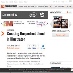
It can be used to morph one shape into another, create a 3D mesh-gradient effect or add ribbon-like rainbow effects. The Blend tool can be used on single lines or enclosed shapes and while, for the purpose of this tutorial, we'll only be using single lines, each function should be attempted with shapes as well. You might also try blending shapes and lines that are both overlapping and completely separate on the page. 01 Create two lines using the Pen or Pencil tool at any angle, any shape and any distance apart.
In the Main Menu toolbar, click Object> Blend>Blend Options, select Specified Steps in the menu and enter a value of 10. 02 Repeat Step 1, but trying different Step values (the number of lines created in the blend) and also different colours and stroke weights (line thicknesses) for your two initial lines. Illustrator’s Blend Tool: A Comprehensive Guide. A few times a each month we revisit some of our reader’s favorite posts from throughout the history of Vectortuts+.
This tutorial by Simona Pfreundner was first published on November 14th 2008. In Adobe Illustrator, the Blend Tool can help you create impressive color blends. But there is more to it than you might know. This comprehensive guide can help you unlock your creative potential and teaches the features, shortcuts, and in depth methods that the Blend Tool has to offer. Introduction If you are using Illustrator for detailed imagery creation, the Blend Tool can be your most important tool. Exercise File Below is an screenshot of the Exercise file that accompanies this tutorial, and is available to PLUS Members. 1. Overview and Keyboard Shortcuts (see image below for Menu items): 2. You can make a blend between open paths like lines Or between closed paths like shapes And blends between blends 3. Under Object > Blend > Blend Options, you will find different settings that you can apply: 4.
"What Font Should I Use?": Five Principles for Choosing and Using Typefaces. Advertisement For many beginners, the task of picking fonts is a mystifying process.
There seem to be endless choices — from normal, conventional-looking fonts to novelty candy cane fonts and bunny fonts — with no way of understanding the options, only never-ending lists of categories and recommendations. Selecting the right typeface is a mixture of firm rules and loose intuition, and takes years of experience to develop a feeling for. Here are five guidelines for picking and using fonts that I’ve developed in the course of using and teaching typography. 1. Many of my beginning students go about picking a font as though they were searching for new music to listen to: they assess the personality of each face and look for something unique and distinctive that expresses their particular aesthetic taste, perspective and personal history.
The most appropriate analogy for picking type. For better or for worse, picking a typeface is more like getting dressed in the morning. Design Principles - Unity. Unity is the relationship among the elements of a visual that helps all the elements function together.
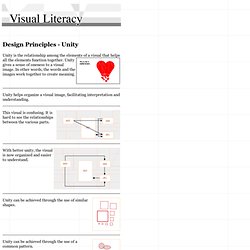
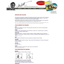
Unity gives a sense of oneness to a visual image. In other words, the words and the images work together to create meaning. Unity helps organize a visual image, facilitating interpretation and understanding. This visual is confusing. Design Principles - Harmony. Principles of Design - Harmony. Elements and principles of design. The elements and principles of design are the building blocks used to create a work of art.
Elements of Design Quick Reference Sheet. Last year, we created a Color Theory Quick Reference Poster - a cheat sheet designed to give you a quick overview of color theory at a glance.
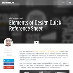
It proved fairly popular with the design community, as we received our biggest bump in traffic yet from it, and it remains one of our most popular posts. I know I still reference it quite often. One thing that quite a few readers have asked for is a similar quick reference poster, or cheat sheet, for the Elements of Design. Well, wait no longer readers – it’s here, it’s free, and it’s pretty sweet (in my humble opinion). *Edit: Guess what? Hit the jump for downloadable wallpapers, printable posters, and the original .EPS files.