

10 Fun Tools To Easily Make Your Own Infographics. People love to learn by examining visual representations of data. That’s been proven time and time again by the popularity of both infographics and Pinterest. So what if you could make your own infographics ? What would you make it of?
It’s actually easier than you think… even if you have zero design skills whatsoever. Below are my two favorite infographic-making web 2.0 tools that I highly recommend. Click the name of each tool to learn more! Visual.ly. 50 great examples of infographics » Blog of Francesco Mugnai. 20 Examples Of Infographs That You Don’t See Every Day. I think we all know what an infograph is, and nowadays they are increasingly popular.
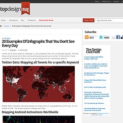
The bad thing is that almost all of them are becoming boring and very similar. In this article I have collected 20 infographs that are very unique design and also interesting subjects. Twitter Dots: Mapping all Tweets for a specific Keyword Twitter Dots translates individual tweets as simple dots on a geographical world map. It is as simple as that. Mapping Android Activations Worldwide In the war for the next smartphone platform, all weapons are allowed, including some good old mapping captured in a 1080p HD video. Visualizing the Airspace in Europe Transport visualization firm Ito World has taken flight routes drawings to the next level, in particular by adding a detailed level of information in terms of the exact travel altitudes of the tracked airplanes.
The Anatomy Of An Infographic: 5 Steps To Create A Powerful Visual. Information is very powerful but for the most bit it is bland and unimaginative.

Infographics channel information in a visually pleasing, instantly understandable manner, making it not only powerful, but extremely beautiful. Once used predominantly to make maps more approachable, scientific charts less daunting and as key learning tools for children, inforgraphics have now permeated all aspects of the modern world. I designed a couple of infographics back in college, the need arising especially around the time Soccer World Cup fever spiked. It was a fun process representing the different groups, predicting winners in each group at each stage and creating a mock pairing of teams that would clash all the way leading upto the finals. I was a devout Argentinian supporter at the time. Infographics can appear daunting to some with the sheer amount of data they present, but designed in the right manner and step by step, they can actually be one of the most fun things you will ever create. 1.
Infographics. Infographics from Scratch. In this tutorial you will learn that data doesn't have to be boring, it can be beautiful!

Learn how to use various graph tools, illustration techniques and typography to make an accurate and inspiring infographic in Adobe Illustrator. Start by using the Rectangle Tool (M) to draw a shape. Give it a subtle radial gradient too. The entire design is based on a grid of four columns. To make the columns first select the rectangle and drag a guide onto the centre of the shape. Condense the shape so it fits within the left-most guide and centre guide. Move the shape over to the right and add another guide to the centre here. Using the Rectangle Tool (M) draw a thin white box on the centre line that will be the width of the gap between the columns. Repeat the process for the other columns with your final result being below.
Infographic Dos, Don’ts and Must-Haves. Infographics Published on August 22nd, 2013 | by Yael Grauer We live in an age of data, but visualizing that data and making it tell a story can be challenging: enter the infographic.
Presenting complex information visually makes it that much more digestible, which may explain why infographics have surged in popularity. In fact, a single infographic has the potential of being viewed by up to 15 million people, according to Top Marketing Schools and the field of data visualization is growing both within business and academia, media and elsewhere. How To Create Outstanding Modern Infographics. 20 Color Combination Tools for Designers. Being able to select the right colors is key in designing an effective and intriguing design, whether for the web or for print.
If you’re able to achieve a good balance within your design, then it’ll communicate a stronger message much more easily to the users or readers because certain colors “activate” certain types of emotions. If you’d like to read more about choosing the right color scheme and the psychology of colors, I invite you to read the following articles: Color Combination Tools Below we’ve compiled a list containing 20 Color Combination Tools for Designers. You can use this list to chose the tool that better fits your needs or that you’re most comfortable using. Have we missed any? Kuler The web-hosted application for generating color themes that can inspire any project. Color Scheme Designer Color Scheme Designer has been around for some time and was recently re-written and designed. Contrast-A: Find Accessible Color Combinations Infohound Color Schemer. 20 Color Combination Tools for Designers. 10 of My Favorite Infographics.
Infographics also know as information graphics are visual representations of knowledge or data.
The infogrpahics can give small or complex amounts of information quickly for a reader to look at. Examples of these graphics can be seen on signs, maps, electrical schematics and almost anything you want to use a infographic. If you can write it then it might be possible to create an infographic. In the past mostly scientists, mathematicians, and technical users created symbols and put them together so people could easily and quickly read these graphic maps of knowledge. Today we see information graphics everywhere. To communicate the complex information quickly, infographic designers use charts, diagrams, graphics, tables, maps and illustrated grapics to relate to the data.
The Anatomy Of An Infographic: 5 Steps To Create A Powerful Visual - SpyreStudios. The Anatomy Of An Infographic: 5 Steps To Create A Powerful Visual - SpyreStudios. Blog About Infographics and Data Visualization - Cool Infographics. InfoGraphic Designs: Overview, Examples and Best Practices. Information graphics or infographics are visual representations of information, data or knowledge.
These graphics are used where complex information needs to be explained quickly and clearly, such as in signs, maps, journalism, technical writing, and education. They are also used extensively as tools by computer scientists, mathematicians, and statisticians to ease the process of developing and communicating conceptual information.
They can present a rich amount of information without intimidating you. Or sometimes they intimidate you, but make the digesting of the information much more bearable. Here in this article below, we are going to discuss best practices for designing infographics followed by some examples which might help you learn a thing or two. You may be interested in the following related articles as well. Feel free to join us and you are always welcome to share your thoughts that our readers may find helpful. Don’t forget to and follow us on Twitter — for recent updates. 01. Create Easy Infographics, Reports, Presentations.
Demographics and Lifestyle by ZIP Code.