

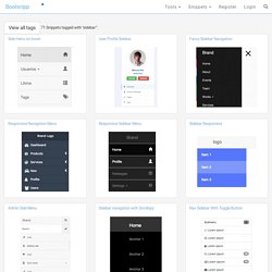
Builder. Web Design Inspiration 2017. Bootstrap and jQuery sidebar Code Examples. View all tags 71 Snippets tagged with "sidebar": Side menu on hover User Profile Sidebar Fancy Sidebar Navigation Responsive Navigation Menu Responsive Sidebar Menu Sidebar Responsive Admin Side Menu Sidebar navigation with Scrollspy Nav Sidebar With Toggle Button Sidebar with tabs Bootstrap docs sidebar Like Hangout Chat.
Tools to Learn JavaScript By Doing -Telerik Developer Network. …or how solving code puzzles can be your path to enlightenment.
Whenever I’m asked how a developer can learn more about a particular language, I stress that it’s crucial to find the technique that works best for you. Most folks can think of a few immediate ways to pick up a new language: BooksConferencesClassroom study While these work, they’ve always had a few drawbacks for me. Facebook share button Generator - Html. 6 Dreadful Design Mistakes That’ll Ruin Your SEO. Most artists hate constraints.

It’s because their profession has crafted an image of being ‘free’. It’s believed that only without boundaries can an artist wander in the sea of immense creative possibilities. Similarly if you’re a webmaster, you’ll probably not like to limit your designer’s potential. You’ll let him experiment with animated designs. And hopefully he’ll craft an elegant design that’s pleasing to your eyes. So is there a problem with this designing approach without rubrics? Yes. Such a website might not be optimized for search engines. Why? Because you will not get any website visitors in the first place. Let’s zoom out a little and think of the reason why you wanted to create (or redesign) your website? A major goal will mostly be getting more business from your website. Am I correct? Learn HTML5, CSS3, Javascript - video style tutorials. Create CSS3 - Easy CSS3 Generator.
Buttons - A CSS button library built with Sass and Compass. A Handful Of CSS Trends And How To Use Them. There are a handful of CSS and CSS3 trends that are making their way across the web.
Find out how to use them on your site… As I make my daily web travels, I’m constantly keeping an eye out for any trends or cool effects that other blogs are taking advantage of. I finally rounded up a handful of them that really stood out and wanted to share with my readers how to execute the same effects on your site. A few of these I’ve adopted here on Bluefaqs and you may have noticed that I have introduced them to the site over the last couple of months. Some of the examples below are taking advantage of CSS3 and may not work in all browsers. Text Selection Color This is kind of a neat one. Just add the following CSS to your stylesheet and you’ll be in business. Gradual Fading Links Here is another great way to add a nice subtle effect to your site. 99% of the time when you hover over any link, it will change right?
Add the following CSS to your stylesheet to take advantage of the effect. The 1px Click. Dive Into HTML5. Eloquent JavaScript. Standardista. Animate.css - a bunch of plug-and-play CSS animations. CSS Type Set. Blog - this is rachelandrew.co.uk. Web Designer Wall – Design Trends and Tutorials. CSS-Tricks. Learn CSS Positioning in Ten Steps: position static relative absolute float. 1. position:static The default positioning for all elements is position:static, which means the element is not positioned and occurs where it normally would in the document.
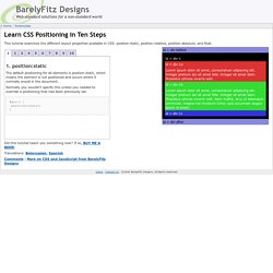
Normally you wouldn't specify this unless you needed to override a positioning that had been previously set. 2. position:relative If you specify position:relative, then you can use top or bottom, and left or right to move the element relative to where it would normally occur in the document. Let's move div-1 down 20 pixels, and to the left 40 pixels: Notice the space where div-1 normally would have been if we had not moved it: now it is an empty space. It appears that position:relative is not very useful, but it will perform an important task later in this tutorial. 3. position:absolute When you specify position:absolute, the element is removed from the document and placed exactly where you tell it to go.
Let's move div-1a to the top right of the page: Can I use... Support tables for HTML5, CSS3, etc. CSS3 Generator. Designing Websites for All Screen Resolutions. Tutorial on Designing for 800 x 600, 1024 x 768, 1280 x 1024 and higher Designing web sites to fit all resolutions is a very important web design principle.

Try out the Entheos site in all resolutions higher than 800 x 600 and you will find that it is designed to fit the page exactly. Therefore, visitors who have higher resolution can see more content in one page which reduces scrolling. Most web sites are designed for only one resolution. They may look perfect in a 800 x 600 resolution but if viewed in a 1024 x 768 resolution look a little empty. From our research we have found that majority of our viewers are on the 1024x768 resolutions and higher. Step 1: Decide on the lowest Screen Resolution.