

Game Fonts - Fonts Used for Game Logos. Nouvel onglet. Logo Trends: Logo Designs for August 2013. The month of August showed us a variety of new logos and re-designs that featured the latest logo trends from 2013.
We've seen everything from a trend toward basic elements to badges incorporated in logos this year. Now that we've moved into September, we're going to take a look back at some of the logos released in the past month and see what's trending in the latest designs. Long shadow design — Jeff Escalante. Let’s be honest guys, flat design is so old already.
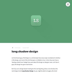
Now every major smartphone’s interface is flat design, and most of the shit that goes on dribbble is too. In fact, they even have a ‘beating a dead horse’ badge if you post about flat design on designer news. Let’s face it guys, flat design has gone mainstream. But if you are a design hipster looking for the next big thing, allow us to introduce the next design trend: Long Shadow Design. As you might be able to imagine, this trend includes objects with disproportionately long shadows, and for some reason it looks great.
Here’s a gallery of some long shadow designs that we found browsing about the internet for the past few days: Now, it may appear as if there are few important defining characteristics of long shadow design, but we can assure you that there are. Finally, it is permissible to use some subtle gradients for effect, but make sure you are tasteful. So what are you waiting for? By Jeff and Noah. How corporate logos evolve. It’s fascinating to watch the evolution of a brand.

Companies large and small inevitably change their identity over time. Those branding changes can be inspired by changes of personnel, changes in the cultural landscape, evolution of competitors, and most commonly a change in the company’s focus. This great infographic from the thelogocompany.net illustrates the evolution of some huge corporate logos from the past century. What’s really interesting is that the identities haven’t always been an improvement: both the 1955 and 1971 VW logos are preferable to the 3D rendered version of today; the classic 70s and 80s YMCA signs have been replaced with a gastly purple and red blob; Xerox’s ‘x’ wrapping a globe doesn’t speak of digitized data in the same way as the 2004 iteration.
The New Wendy’s Logo: What Went Right. Logo updates are a precarious business.

One wrong move and you’ll have an angry mob calling for your head. This is especially true with brands that people have literally interacted with for the majority of their lives. 10 points I always keep in mind while designing. The Next Microsoft. Designing Style Guidelines For Brands And Websites.
Advertisement A website is never done.
Everyone has worked on a project that changed so much after it launched that they no longer wanted it in their portfolio. One way to help those who take over your projects is to produce a style guide. Edward Tufte once said: “Great design is not democratic; it comes from great designers. If the standard is lousy, then develop another standard.” Why Create A Style Guide? You’ll have an easy guide to refer to when handing over the project.Makes you look professional. Branding Guidelines: What To Include? Strategic Brand Overview This should be short and sweet. 1See Kew’s branding guidelines2. Kew uses strong photography in its “brand essence” message, with a few paragraphs that both inspire and define the brand. Logos For print and Web, most brands revolve around the logo. 3See Cunard’s branding guidelines4. Cunard provides many variations on its minimum sizes. Les pires changements de logo jamais réalisés. Dossier un peu plus léger aujourd'hui puisque concentré autour des logos et surtout de ce qui c'est fait de pire.
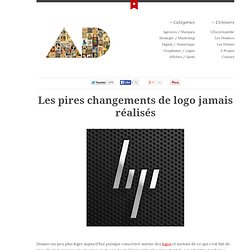
Car le logo pour une marque c'est sans doute l'élément le plus important de son identité graphique. Tout tourne autour : l'histoire, les valeurs, les idées... dans une dimension esthétique de première importance. Alors forcément quand un annonceur change son logo, on l'attend au tournant. Et plus l'annonceur est important, plus la possibilité d’échec est grande (logique). Parce que changer les habitudes de consommateur ça ne se fait pas d'un coup, l'article du jour va revenir sur ce qui s'est fait de pire dans les changements d'identité graphique et ça vaut le détour. Comedy En 2011, la chaîne canadienne "Comedy" décide de changer une partie de son logo. Logo Design Work In Process Showcase - Inspiration. Continued from our previous post – Animated logo design process showcase, we have another 25 logo design process from the same designer Breno Bitecourt, a graphic design from Brazil specialised in logo design as well as corporate identity that works with clients globally.
About Kevin Kevin Liew is a web designer and developer and keen on contributing to the web development industry. He loves frontend development and absolutely amazed by jQuery. Feel free to say hi to me, or follow @quenesswebblog on twitter. 35 Funny Illustrations of Old Twitter Logo.