

Introducción a Ink: Nuevo Marco Responsive de Correo Electrónico. Clambake Add retina-ready graphics 2a responsive email. Introducing the Clambake, the first retina ready recipe that allows high resolution logos and photographs to work on any HTML email newsletter.
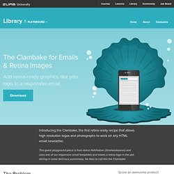
This guest playground piece is from Aaron Kahlhamer (@networkaaron) and uses one of our responsive email templates and tosses a retina logo in the pot, stirring in some delicious yumminess. He likes to call this the Clambake. The Problem Adaptive layouts thrive on max-width and min-width. Problem is … Outlook doesn't support these features.
When it comes to high-res images for retina displays, Campaign Monitor recommends using media queries to shrink down the image for a mobile device. With the code provided in this playground piece, you'll be able to add retina-ready images, such as logos, into our responsive email templates. So Let's Get Cooking! Start with a retina logo, which you can do in your favorite graphics editor. Tip: With fixed images, we need to start with the larger size. Later on, we'll be using max-width. Table Structure Proper Scale. Ink: Responsive Email Documentation. Dive into creating your responsive email.
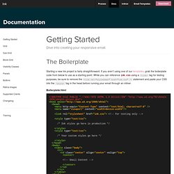
The Boilerplate Starting a new Ink project is fairly straightforward. If you aren’t using one of our templates, grab the boilerplate code from below to use as a starting point. While you can reference ink.css using a <link> tag for testing purposes, be sure to remove the <link rel="stylesheet" href="ink.css" /> statement and paste your CSS into the <style> tag in the head before running your email through an inliner.
Boilerplate.html <style type="text/css"> /* Ink styles go here in production */ </style> <style type="text/css"> /* Your custom styles go here */ Litmus blog. Mobile Gmail apps for both Android and iOS download images automatically and serve them via Google’s caching service.
As users update to the new mobile Gmail apps, we’re seeing image caching affect mobile open rates, specifically opens made with the Gmail app on Android. As Gmail open rates rise, there has been a corresponding drop in Android opens. Since January, Android opens have dropped 34%—now representing 8% of opens. April Fools’ Day gives email marketers (and marketers in general!) The perfect opportunity to show their brand personality through witty and funny techniques. If one topic dominated email marketing conversations in 2013, it was definitely Gmail tabs. Launching the Litmus Community—a hub for any and all conversations about email design, marketing, and code—was an exciting announcement for our team. We’re thrilled to introduce you to the newest member of our team! Have Webmail Users Gone Mobile? HTML Email Marketing from MailChimp. Litmus s Blog. Validadorr y marcado d'e-mails.
Understanding Recent Changes to Gmail. A lot has happened with Gmail over the last year.
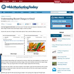
The latest news was released on December 12, 2013, when Google revealed Gmail would display images in emails by default. Anyone who uses lots of images in their emails rejoiced. Here is what the difference looks like. This image shows what a Gmail user used to see, versus what they will now see by default as of Google’s announcement on December 12, 2013. The new default image settings aren’t welcomed by everyone. This point has merit. Marketers don’t get this data anymore because Google is now caching every image sent through Gmail. Some consider this change as infuriating as the Google Analytics keyword “not provided” change that no longer lets site owners see which keywords people were using to get to their site. Video Emails Get a Boost One very positive but less talked about effect of having images shown by default is that it gives video emails a major leg up.
Gmail Tabs Weren’t Email Armageddon Actions in the Inbox The Future of Gmail. 7 Steps to Mobile-friendly Emails. Mobile is more important every day.
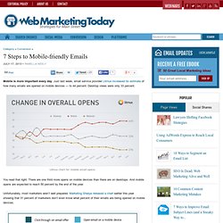
Just last week, email service provider Litmus increased its estimate of how many emails are opened on mobile devices — to 44 percent. Desktop views were only 33 percent. Campaign Monitor. Qualaroo - Behavior Insight Surveys For Smarter A/B Testing. Download Guide: Drive Conversions: Share Guide: “One accurate measurement is worth more than a thousand expert opinions” – Admiral Grace Hopper The Beginner’s Guide to Conversion Rate Optimization (CRO) is an in-depth tutorial designed to help you convert more passive website visitors into active users that engage with your content or purchase your products.

This guide will walk you through the basics of CRO—from why it matters in the first place to how you can go about building your own testing and optimization plan. This is a guide to help you map your way through the common CRO pitfalls and misconceptions by starting from the ground up—making insight-driven changes and then testing them for efficacy every step of the way.
First, a quick definition… CRO is the method of using analytics and user feedback to improve the performance of your website. At its most fundamental, CRO means figuring out what users are looking for when they arrive at your site and then giving that to them. Intro Notes.