

Infographics. What is an Infographic? A lot of phrases get thrown around in the world of information graphics.
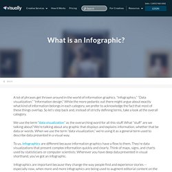
“Infographics.” “Data visualization.” “Information design.” While the more pedantic out there might argue about exactly what kind of information belongs in each category, we prefer to acknowledge the fact that most of these things overlap. So let’s step back and, instead of strictly defining terms, take a look at the overall category. We use the term “data visualization” as the overarching word for all this stuff. What Is An Infographic? A Graphic to Define Infographics.
Infoposters Are Not Infographics: A Comparison. Infographics vs Infoposters: what's the key difference? Your idea of an infographic and our idea of an infographic is probably drastically different.
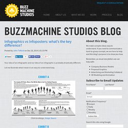
Let me illustrate what I mean in an easy-to-understand way. Exhibit A Click to enlarge, Image Source. How to Turn Infographics Into Effective Teaching Tools. Infographics have already established themselves as engaging news and marketing tools, but they are also entering the education space in new and exciting ways.
Teachers can find infographics useful classroom tools in a number of ways. Most prominently, a good graphic makes information easily accessible, as it feeds into many students’ natural tendency to learn by seeing and interacting. As educators around the country transition to the new Common Core State Standards, infographics can help them meet their learning goals. For those unfamiliar with the Common Core conversation, the new standards are meant to “provide a consistent, clear understanding of what students are expected to learn,” across the U.S. public education system.
Despite the arguments of CC detractors, what students are “expected to learn” are not facts so much as argumentation, logic and how to vet and interpret information. (*Full disclosure: PBS NewsHour Extra employs the authors of this article) 1. 2. 3. 4. 5. Why we need more visual texts in our teaching and learning. Found this fantastic infographic touting the success of infographics.
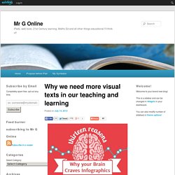
Reading it ( or more correctly, viewing it) immediately focused my thoughts on the use of visual texts in classrooms today. Click on the screenshot above to view the animated, interactive info graphic that presents 13 reasons why we should use infographics ( or visual texts in general). Unlike other infographics I link to on Mr G Online, I’m not going to discuss the specific points presented – that would be contradictory to the message of the infographic. I’ll let you get your own meaning from it. However, I am going to reflect on how it made me consider the use of visual texts in education. If we take at face value the research this infographic is based on, human beings are, at heart, visual learners.
I in no way want to devalue the importance of reading. If our brains are visually wired, then it makes sense that we visually present information, instructions, new learning, methods. Why Are Infographics So Darn Effective? [Infographic] We all know that it's more fun to look at pretty pictures or watch cool videos than it is to read plain text.
![Why Are Infographics So Darn Effective? [Infographic]](http://cdn.pearltrees.com/s/pic/th/infographics-infographic-93285745)
Why is that? Our brains do less work to digest visual content, first of all. And, more compellingly for marketers, visual content drives more traffic and engagement than plain text does. Infographics: A visual link to learning. We live in a society of information overload with technological access at every corner and, more than ever, people complaining that they simply "just don't have the time.
" We are expected to filter the constant bombardment of mostly insignificant information, making it difficult to find out what is relevant, important, and crucial to our everyday lives. Over time we are changing the way we interact with information.
Now I See! - Infographics as content scaffold and creative, formative assessment. Samples. Infographics Best Practices - Grasshopper Marketing. Infographics do more than tell information.
They tell a visual story. More precisely, they tell the point of the story. A Crowdsourced Rubric for Evaluating Infographics. I’m teaching a statistics course this spring.
It’s the fourth time I’ve taught this course, and, in an effort to make it more interesting to me and more useful for my students, I added a module on data visualization to the course this time around. I find that the data visualization chapters in most statistics textbooks look like they could have been written in the 1950s, featuring stem-and-leaf plots, box-and-whisker plots, and other very analog visualization tools. Modern data visualization tools are much more sophisticated than these, and, more importantly, these modern tools are needed to handle the multi-dimensional data sets that digital tools now make available.
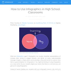
Check out, for instance, this bubble chart displaying executive salaries or this live heatmap of tweets made around the world or this interactive treemap of earthquakes since 1900. How to Use Infographics in High School Classrooms - Venngage. Photo Courtesy to Matylda Czarnecka via hackNY.org Flickr, CC BY-SA 2.0 Digitally Modified by Jonna Magno.
How to Make an Animated GIF Infographic. Eleanor Lutz has done some amazing design work with her company Tabletop Whale.

She is known especially for her work creating animated infographics using animated GIF files. She has posted How to Make An Animated Infographic as a 2-part explanation that lays out her process in Photoshop (as an animated GIF file of course!). Recently I’ve been getting a lot of emails asking for a tutorial on how to make animations. So this week I put together a quick explanation for anyone who’s interested. I archived it as a link on the menu bar of my website, so it’ll always be easy to find if you need it.This is just a run-through of my own personal animation workflow, so it’s not a definitive guide or anything. TeachMathematics: The Mathematics of Infographics.
Introduction I love infographics and there are some brilliant people making these at the moment. They are fraught with mathematical danger though and interpreting them and creating them depend on strong mathematical awareness and as such they provide opportunities for rich activity in areas of maths that go past statistics like, area and proportion for example. In this session the aim to show a number of examples that, as a group, we would analyse critically and then look at some examples of how these can be created perhaps from some of the data collected in the session ‘Data, Data, everywhere’.
All with a view to concrete ideas for lessons. The Billion Dollargram We will start with a puzzle based on the famous 'Billion Dollargram' image from information is beautiful. Presenting. Infographics as creative assessment. Interactive Infographic - 13 Reasons Why Your Brain Craves Infographics.