
TL;DR. The second bit of advice a beginning artist usually gets is “draw from life”.

And it is excellent advice! After all, if you can't draw what is right in front of you, you certainly won't be able to draw what you see in your imagination either. But the advice is a bit short, and will usually leave the artist behind unsure of what to do next. This chapter will help you to get started by explaining some different sketching methods you can use. Materials? Figure 1.1. Achieve Spatial Depth In Your Drawings, Tips from Anthony Waichulis. In the April 2008 issue of The Artist’s Magazine, Anthony Waichulis wrote about using linear and atmospheric perspective.

Give your work the illusion of spatial depth with five simple effects of perspective. By Anthony Waichulis We can observe diminishing size, detail and contrast, and the overall lightening of values as our eyes travel from the foreground of La Petite Fleur (charcoal, 9x6), by Terese Rogers, farther into the drawing. The two kinds of perspective that artists use are linear and atmospheric (or aerial). Linear perspective uses lines and vanishing points to determine how much an object’s apparent size changes with distance.
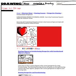
Lessons. Free art lessons - learn how sketch, drawing and painting. Foreshortening Perspective Drawing Lessons : How to Draw Foreshortened Figures, People, and Buildings and Shapes with Easy Tutorials. Drawing Figures in Foreshortening Perspective with Foreshortened Objects & Figures Learn how to draw cartoon figures in the correct perspective by using foreshortening.

The following drawing tutorial will guide you through drawing cartoon and comic figures / people in the correct perspective to improve your drawing style. Online Drawing Lessons - Composition and Design. Enhance the effectiveness of our online drawing lessons and improve the quality of your drawings by understanding the importance of Composition and Design.

Learning to draw is not only about mastering the ability to draw what you see. Knowing how to create a balanced and harmonious composition within the borders of your page is also an integral part of making art. There are no official "rules" when it comes composing a visually interesting work of art. Simply use the elements of art (line, shape, form, texture & color) to create your desired outcome. Composition (visual arts) In the visual arts—in particular painting, graphic design, photography, and sculpture—composition is the placement or arrangement of visual elements or ingredients in a work of art, as distinct from the subject of a work.

It can also be thought of as the organization of the elements of art according to the principles of art. The term composition means 'putting together,' and can apply to any work of art, from music to writing to photography, that is arranged or put together using conscious thought. In the visual arts, composition is often used interchangeably with various terms such as design, form, visual ordering, or formal structure, depending on the context.
In graphic design for press and desktop publishing composition is commonly referred to as page layout. Focusing on the Elements of Composition in Drawing. Proportion. How Often Do You Find Yourself Saying?

"I Wish I Knew How to Advance My Artistic Knowledge" Save Time and Avoid All the Effort In Searching. Divine proportions ars longa; vita brevis. I’ve been cruising a few sites to see what I could suggest as good examples of Art using the Golden Mean, or the Golden Rectangle, also known as the Divine Proportion.

In my current avoidance and procrastination mood, I’m looking for a way out of drawing a template myself, but I haven’t found what I wanted. There are several rather dry explanations from a mathematical point of view. Golden Section. The learned Franciscan Pacioli finds five attributes of God in this special proportion, the first four of which are unity and uniqueness, trinity, the impossibility of defining in terms of human ratio, and the immutability.

In the fifth, functional comparison Pacioli sets the "divine proportion" in relation to the Platonic quintessence: As God confers being to the celestial virtue, called by the other name 'fifth essence', and through that one to the other four simple bodies, that is, to the four earthly elements...and so through these to every other thing in nature. The Divine Proportion. The Divine Proportion Any objective observation we make must include a discussion of proportion for it is the rule of proportion in the examination of nature that causes us to observe an organized universe and a universe in chaos, rational and irrational numbers, harmony and discord, truth and falsity.

These descriptions are merely proportional effects of the opposition that is inherent in all things. We see harmony expressed by those emotions, feelings, and characteristics present within ourselves. This harmony is viewed within nature as the Divine Proportion. The Divine Proportion ascribed to our collective state of observation has been expressed, "For of three magnitudes, if the greatest (AB) is to the mean (CB) as the mean (CB) is to the least (AC), they therefore all shall be one.
" The Divine Proportion was closely studied by the Greek sculptor, Phidias, and as a result, it took on the name of Phi. Picture Composition : Design Your Painting. An attractive painting is almost always a painting with good picture composition.

A well-designed painting or drawing grabs your attention from a distance—even before you can see the details. In comparison, a weak composition is less visually appealing at any range. Good composition in a painting results in a harmony of shapes, colors, and values. The viewer's eyes stay interested long enough to take it all in, rather than becoming bored and wandering off.
Draw A Thumbnail Sketch. A thumbnail sketch is a vital preparatory step in drawing and painting; think of it as a mental warm up. If you make a habit of using them, you will be amazed at how this little exercise can save you time and effort, as well as help you strengthen your work's design and composition. Without much emphasis on details, this is like a shorthand note of the image you are going to create. The sketch can be of what you are seeing in physical reality; or it can be drawn purely from imagination. Or, it can be a combination of both. A thumbnail sketch is a great planning tool and helps retrieve and retain your most intense impressions of your subject. So don't skip this essential step; it's simple and doesn't require much time. Design A Drawing : Use an Appropriate Format. When you design a drawing or painting, the shape of the surface you work on plays an important role in composition. Once you pick one, all subsequent composition takes place within that particular shape.
This shape is called the 'format'. When you consciously choose the format of a work to suit the subject matter, it serves as another element that leads to a successful painting. A painting can take on different looks with each format. The art formats that artists commonly use include rectangles, squares, circles and ovals. Your goal in coming up with a good composition is to first arrange all the pictorial elements in an interesting manner within your chosen format.
Art that captures the up, down and all around visual world from one revolving point in space. This forty-page PDF takes you from traditional Renaissance, one and two point perspective, all the way to six point perspective. Six point allows you to draw the total up, down, and all around scene. Grids can be copied to help students move through these different systems very quickly. It gives students and artists a whole new way of thinking.Click here to buy New Perspective Systems.
Learn the basics of perspective drawing in this beginners art tutorial. Welcome to Art of RazDigital Art & Tutorials. Two Point Perspective Drawing Lessons : How to Draw Figures and Buildings and Shapes in 2 Pt Angular Perspective with Easy Tutorials. Perspective Drawing Tutorial : Angular Perspective This tutorial has a section on angular perspective, which is 2 point perspective.
Basics of 1 Point and 2 Point Perspective – AKA Parallel and Angular Perspective Observe that as we view the top, its outer edges appear to converge. This condition is caused by an optical illusion. As the top turns away from us, the relationship between the length and width changes or diminishes. How to Draw TARDIS from Doctor Who with Easy Two Point Perspective Techniques Today we will show you how to draw TARDIS (Time and Relative Dimension in Space) from Doctor Who.
2 Point Perspective Tutorial, Perspective Grid How-To. Perspective Basics|2 Point Perspective|3 Point Perspective|Foreshortening|Ellipse Perspective|Isometric Drawings All Tutorial Text & Images - Copyright © 2011 KHI, Inc. In this step-by-step lesson we are going to create a simple "2 Point Perspective" view drawing of our test subject example, working from both plan (overhead) and elevation view (side view or profile) reference Fig 1. Learn How to Draw - Step by step lessons and videos. Beginner Drawing Lessons - Learn To Draw.