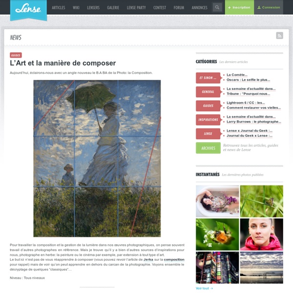


http://www.lense.fr/2011/05/25/lart-et-la-maniere-de-composer/
Related: Structure • Le nombre d'or et la composition d'un tableau • PhotographieStreet Photography Composition Lesson #13: Multiple-Subjects I think one of the most difficult compositional techniques in street photography is to incorporate multiple subjects in the frame — without it becoming too cluttered or overwhelming. Generally the problem is that most photographers that try to incorporate multiple subjects have some of the following problems: Overlapping subjectsDistracting backgroundsNo central subjectNot enough points of interest In this article I will share some of who I think are the finest photographers to have used multiple-subjects in their photos. I will analyze the images, and hopefully provide practical tips to anyone trying to incorporate more multiple subjects in the frame.
Photoshop Tutorial: Wonder Woman Pin Up Digital Painting » The Art of Roberto Campus - fantasy art, photoshop and wacom tutorials, digital illustration tips Wonder Woman Pin Up Tutorial In this Photoshop tutorial I will show how I used Photoshop and a Wacom Tablet to create a digital illustration of a voluptuous Wonder Woman pin up. The tutorial reveals one of my digital painting techniques with a step by step walk through including images for each stage and layer settings. Enjoy! Introduction: Wonder Woman is an iconic figure in the comic book world. Street Photography Composition Lesson #12: Color Theory Eric Kim, Downtown LA 2012. For today’s compositional lesson– I want to talk about color theory— and how you can better utilize colors when it comes to your street photography. Personally around 2 years ago, I made the switch from shooting fully black and white — to just shooting color film (Kodak Portra 400). Since then, I have learned to see the world in a totally different way. It has been fun, refreshing, and quite exciting. However at the same time– shooting in color presented a new bag of worms.
Making of 'Superbad' by Mike Thompson Introduction My painting of Michael Cera, titled "SuperBad", was actually created as part of a pitch for his new movie, Youth Revolt. The client wanted to persuade the studio to use an illustrated poster for this film, rather than the usual photographed one sheet. The direction I was given was to keep the art vibrant and make sure that Cera looked as nerdy as possible. They wanted a MAD Magazine type of look, minus the distortion. This is the original mock up that the client sent in their brief (Fig.01).
Street Photography Composition Lesson #10: Urban Landscapes For today’s lesson I want to talk about “urban landscapes.” Urban landscapes aren’t really compositions in the specific sense (compared to lines, curves, etc)– but I still feel they are relevant when creating our street photographs. If you guys have read my prior lessons on composition– I have thought a lot about what a “composition” really is. For me at the end of the day– a composition can really be anything. The dictionary’s definition to composition is as follows: Composition: The combining of distinct parts or elements to form a whole.
From Sketch to Vector Illustration Hey everyone! Welcome back to the GoMediaZine. There has been such a wonderful response on my vector art tutorial “Beautiful Vector Illustration” that I thought I better write another one. If you recall in that tutorial I discussed how to create vector illustrations using photographs as your starting point. A technique of vector illustrating that takes a little bit more skill that I did not cover is starting with a hand drawn sketches. I will focus on that technique of vector illustrating for this tutorial.
Street Photography Composition Lesson #8: Curves All photos in this article are copyrighted by their respective photographers. For today’s compositional lesson– I want to talk about curves. To start off, why curves? Well– curves are some of the most dynamic lines that exist. 40+ Digital Painting Tutorials You Should Study If you’re one of those designers who aspire to create digitally painted artwork like these, we think you’d learn more than a thing or two in this collection of tutorials. Read through them, study the variety of techniques they employ, and come out an accomplished digital painter in your own right! Painting Wavy Hair Learn how to paint wavy hair digitally. Get all sorts of helpful advice, from which brushes to use to what steps to take to make the hair shine.
Street Photography Composition Lesson #7: Perspective All photographs in this article are copyrighted by their respective photographers. For today’s compositional lesson I want to talk about perspective. Google defines “perspective” as the following: Quick Tip: Easily Add Cartoon Color and Shading to Lineart Ask any cartoonist what they’re least favorite part of creating comics and they’ll all tell you its adding color. It is dreadfully tedious and time consuming. But not anymore. In this short tutorial, you’ll learn how to quickly add color and shading to lineart. you’ll also learn a few shortcuts that can help you on larger graphic projects.