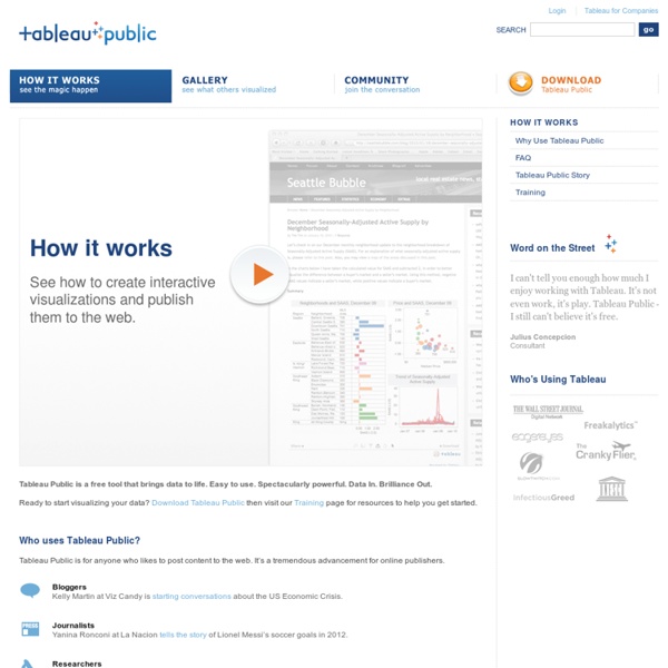


http://www.tableausoftware.com/public/how-it-works
Infographics: How to Strike the Elusive Balance between Data and Visualization They started out as a social media experiment and then suddenly everyone wanted a piece. A couple years back, if you dropped the word ‘Infographic’ or ‘Dataviz’ in a conversation, you would have been greeted by a good number of confused looks even if you were among other web designers. Today, so many infographics have gone viral that it’s practically impossible to ignore them. You’ll find them tweeted by your friends who want to share an interesting new find, promoted by companies eager to display their growth trends and utilized by even the White House for its progress reports. No matter what you are searching for online, whether employment statistics or endangered animals, you are sure to find an infographic for it. If you, miraculously, aren’t able to recall any that you have seen, take a look at this list of the 10 best infographics of 2011 via Nowsourcing to catch up.
10 Tools for Creating Infographics and Visualizations The author's posts are entirely his or her own (excluding the unlikely event of hypnosis) and may not always reflect the views of Moz. Hello there! I'm Miranda Rensch, Product Manager at SEOmoz and lover of visual communication. Communicating visually is one of the most effective ways to explain complex concepts and relationships, and can be a great way to explain your services/products and create valuable site content. I often use diagrams and whiteboarding in order to communicate new features and concepts internally with my team. 5 Tools For Creating Your Own Infographics Five years ago, almost nobody knew what the heck an infographic was. (I sure didn’t, and I was a graphic design major in college at the time.) Now that the infographic craze has saturated us with new visual knowledge (and marketing gimmicks), something interesting has happened: The creation of infographics has become democratized. No longer is the act of creating a visual data story confined to professional designers using professional tools like Adobe Illustrator or Photoshop.
Great tools for data visualization Most data is meaningless to most people — unless it is visualized. Stepping beyond familiar visualizations like bar charts and pie charts, there are many approaches to visualizing data, from mapping (e.g., color coding a map to show voting patterns) to visualizing networks (e.g., the links between people). You are not limited to Microsoft Excel, or your own programming abilities. We’re now in an awesome generation for visualization, with dozens of freely available software libraries — which developers have spent months (or years!)
Content Marketing Framework: Plan Plan the work. Work the plan. Planning can take a number of forms, depending on where you lie in your content marketing journey. If you are just beginning to build your program, planning might take the form of a business case or even a simple mission statement. For other organizations that have been building a content marketing program for some time, it may exist as a regular checkpoint to ensure that your programs continue to meet broader (and sometimes changing) business goals. How Pop Chart Lab Turned Trendy Infographics Into A Serious Business Halfway into 2014, Pop Chart Lab has released more than a dozen new posters. We’ve covered many of them here on Co.Design: a compendium of sentence diagrams, a guide to the world of whiskey, maps of wineries in Napa, and cocktail bars in New York City, to name a few. The studio's latest project, released yesterday, is a series of city maps available in laser-cut hardboard, oak, walnut, or cherry.
Google-map-editing florist sentenced Last updated 15:24 16/02/2010 A former Napier florist who changed her competitors' details on Google Maps to direct clients to her business was today sentenced to 100 hours community service. Kendra Drinkwater, 40, who ran a company called Napier Florist from her home had previously admitted six charges of accessing a computer system for dishonest gain. The offences were committed between November 1 and December 4 last year, with Drinkwater editing the details of six of her competitors on 100 occasions. She told police it was an "addiction" and she had changed the details so hers was the only company customers could contact. The case has received widespread publicity, including appearing in a newspaper in Switzerland and been referred to on blog sites in various parts of the world.
3 things the Joker has taught me about content marketing - NewsReach As an avid Batman fan, I thought Heath Ledger’s portrayal of the Joker in the Dark Knight was one of the most terrifying and brilliant examples of acting in modern cinema. He was also brutally honest in the movie and because of this I’d like to take some of his more famous lines from the movie and apply them to what content marketers have had to come to grips with recently. 1. “You wanna know how I got these scars…?”