

Downloads » Cone Trees- User Research & Design The Usability Testing Process (diagram) March 14, 2010 Chinese translation of the diagram and article (by Ryana). Russian translation of the diagram and article (by Dmitry Satin). Are you interested in a high-res print out of this diagram for putting up on the cork board by your office desk? Download the A4 Poster PDF for free.Usability Testing Process Poster (A4 PDF) (downloaded 2157 times) Send me a pic: Did you put it up at work? A usability test consists of the following steps: 1- Usability test planning 2.1- Participant Recruitment 2.2 Scenario & Task creation 3- Execute the usability test/ conduct usability test sessions 4- Data Analysis 5- Reporting 6- Usability test recommendation incorporation checkpoint I will follow up with another post to explain the steps in detail, but for now, here is some detail on step 6. After you report the usability test findings and recommendations, stakeholders will agree to incorporate a certain number of recommendations. June 24, 2009 June 1, 2009
组件 · Bootstrap 用于显示链接列表的可切换、有上下文的菜单。JavaScript 下拉菜单插件让它有交互性。 案例 将下拉菜单触发器和下拉菜单都包裹在.dropdown里,或者另一个声明了position: relative;的元素。 <div class="dropdown"><button class="btn dropdown-toggle sr-only" type="button" id="dropdownMenu1" data-toggle="dropdown"> Dropdown <span class="caret"></span></button><ul class="dropdown-menu" role="menu" aria-labelledby="dropdownMenu1"><li role="presentation"><a role="menuitem" tabindex="-1" href="#">Action</a></li><li role="presentation"><a role="menuitem" tabindex="-1" href="#">Another action</a></li><li role="presentation"><a role="menuitem" tabindex="-1" href="#">Something else here</a></li><li role="presentation" class="divider"></li><li role="presentation"><a role="menuitem" tabindex="-1" href="#">Separated link</a></li></ul></div> 对齐选项 给下拉菜单.dropdown-menu加上.pull-right 使文字右对齐。 <ul class="dropdown-menu pull-right" role="menu" aria-labelledby="dLabel"> ... 在任何下拉菜单中均可通过添加标题来标明一组动作。 禁用的菜单项 给下拉菜单中的<li>加上.disabled禁用链接。 用按钮组把一组按钮放在同一行里。 按钮组中的工具提示和弹出框需要特别的设置 基本案例 把一系列的.btn按钮放入.btn-group。 尺寸
Quick Recipes & Easy Recipe Ideas - Tablespoon Patterns : Designing Interfaces Selected patterns from the book are featured here on the website, in their entirety. Here are all of the patterns in the second edition of the book, sorted by chapter. Most of these patterns are not online yet, but many of them will become available over time as featured patterns. Patience! What users do Patterns of user behavior Safe Exploration Instant Gratification Satisficing Changes in Midstream Deferred Choices Incremental Construction Habituation Microbreaks NEW Spatial Memory Prospective Memory Streamlined Repetition Keyboard Only Other People’s Advice Personal Recommendations NEW Getting around Navigation, signposts, and wayfinding Clear Entry Points Menu Page NEW Pyramid Modal Panel Deep-linked State NEW Escape Hatch Fat Menus NEW Sitemap Footer NEW Sign-in Tools NEW Sequence Map Breadcrumbs Annotated Scrollbar Animated Transition Organizing the page Lists of things Images, messages, search results, etc. Doing things Going mobile
Meaningful Transitions // Home Flat UI - Free User Interface Kit Header 3The Vatican transitions to a Header 4Great American Bites: Telluride's Oak, The Header 5Author Diane Alberts loves her some good Header 6With the success of young-adult book-to-movie Paragraph Cum sociis natoque penatibus et magnis dis parturient montes, nascetur ridiculus mus. Image Lead Text Cum sociis natoque penatibus et magnis dis parturient montes, nascetur ridiculus mus. Quote Cum sociis natoque penatibus et magnis dis parturient montes, nascetur ridiculus mus. Small Font Cum sociis natoque penatibus et magnis dis parturient montes, nascetur ridiculus mus.
Usability articles and resources Browse by topic Browse by category Latest article 5 reasons why your first user research activity should be a usability test 4 April, 2016 - A usability test is the wrong research method when you want to discover if there's a real user need for your product; when you want to understand the environment where your system is used; and when you want to find out how people use your product in their daily lives. User experience e-books Bright Ideas for User Experience Managers If you're a user experience manager (or just like to take a strategic view), start here. Usability Test Moderation: The Comic If you've been tasked with running a usability test, then you'll love this instructional guide. ISO 9241 for Beginners ISO 9241 is widely cited by user experience experts who would be hard pushed to name any other standard — but all most usability professionals know about the standard is its name. Usability Test Plan Toolkit Morae for Usability Practitioners User Experience Research articles & resources
UXmatters :: Insights and inspiration for the user experience community Animatable: One property, two values, endless possibilities box-shadow From: 0 0 black To: 0 150px 10px -50px rgba(0,0,0,.5) Author: @leaverou What's a Pattern Accordion There are too many items to fit into a limited space without overwhelming the user. Add / Subscribe A person wants to subscribe to the content of another person and read it in an environment of their own choosing. Animate Transition The designer needs to communicate that an object is changing its spatial relationship within the page. Architecture of a Review A product or website needs to present ratings and reviews with a variety of informational elements. Auto Complete The user needs to enter an item into a text box which could ambiguous or hard to remember and therefore has the potential to be mis-typed. Availability Provide a way for a user to display to other people (either the public, or their contacts, depending on the rules of the system) when they are available for contact and when not. Breadcrumbs User needs to navigate potentially large quantities of information efficiently, without becoming lost. Brighten Transition Calendar Picker Carousel Collapse Transition Cross Fade Transition
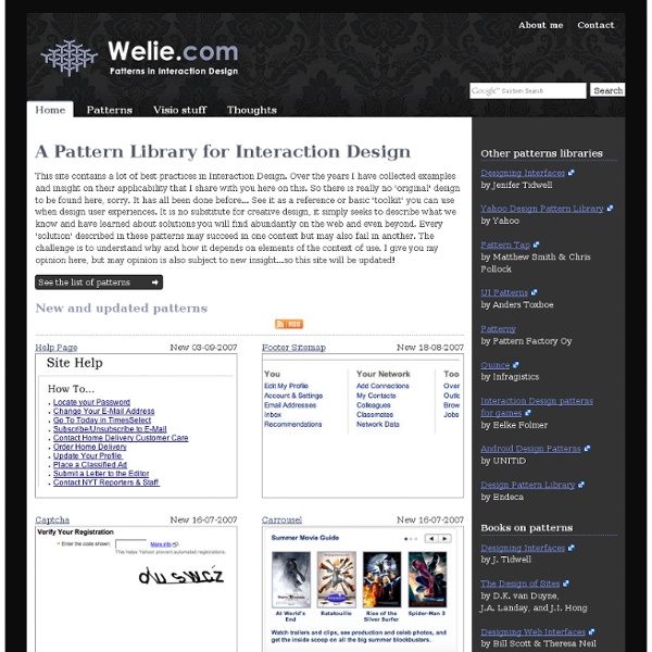
Interaction Design Pattern Library - Welie.com Suggest a pattern Have you seen new examples of patterns out there that have not been described on this site? Send me a link to an example and I'll add it to my to-do list. Suggest a pattern Latest comments Form (Lucas Gwadana) Sometimes the ERROR handling is not explicit enough because when a user makes an... Map Navigator (Marcus) For print pages etc static maps are still relevant. Accordion (dellmre) Ajax accordion samples with source code Autocomplete (Zorg) I believe the name of this pattern to be misleading. Slideshow (Joshua) Slideshows on Homepages can be very beneficial.