Paper Fold Effect in App Design - UI A round up of all cool paper fold design from dribbble. Paperfolding technique is one of the cool UI effects used in Mobile App because it works very well and quite realistic with touch gesture. Here, a few are pure concept and a few are actually a real implementations. About Kevin Kevin Liew is a web designer and developer and keen on contributing to the web development industry. 18 Deliciously Designed iOS Icons 23 Minimal and Attractive Weather App Designs 30 Ultra Realistic Stereophonic iPad iOS Interface
Toolglass and Magic Lenses: The See-Through Interface Bier, E. A., Stone, M., Pier, K., Buxton, W. & DeRose. T. (1993). Toolglass and magic lenses: the see-through interface. , 73-80. Eric A. Xerox PARC, 3333 Coyote Hill Road, Palo Alto, CA 94304 (1) of Toronto, (2)University of Washington (TM) are new user interface tools that can appear, as though on a transparent sheet of glass, between an application and a traditional cursor. I.3.6 [ ]: Methodology and Techniques-interaction techniques; H.5.2 [ ]: User Interfaces-interaction styles; I.3.3 [ ]: Picture/Image Generation-viewing algorithms; I.3.4 [ ]: Graphics Utilities-graphics editors multi-hand, button, lens, viewing filter, control panel, menu, transparent, macro 1. We introduce a new style of graphical user interface, called the . Two hands can be used to operate the see-through interface. A set of simple widgets called is shown in figure 1. Click-through buttons. Many widgets can be placed on a single sheet, as shown in figure 2. A sheet of widgets. 2. Multi-Handed Interfaces 3. . Grids
Flat UI Kit - HTML/PSD Design Framework Header 3The Vatican transitions to a Header 4Great American Bites: Telluride's Oak, The Header 5Author Diane Alberts loves her some good Header 6With the success of young-adult book-to-movie Paragraph Cum sociis natoque penatibus et magnis dis parturient montes, nascetur ridiculus mus. Image Lead Text Cum sociis natoque penatibus et magnis dis parturient montes, nascetur ridiculus mus. Quote Cum sociis natoque penatibus et magnis dis parturient montes, nascetur ridiculus mus. Small Font Cum sociis natoque penatibus et magnis dis parturient montes, nascetur ridiculus mus. 5-Step Guide to Optimizing Landing Pages The most effective way to boost lead generation is to improve the performance of your landing pages . So, how do you do that? While we keep advising marketers to test with their specific audiences, there are actually a few best practices you should take into consideration. Here, C stands for Conversion , M is Motivation , V is Value Proposition, I is Incentive , F stands for Friction , and A means Anxiety . 1. The first condition for the production of top-performing landing pages is to accurately convey the value you offer. 2. The most important factor in determining high conversions for landing pages is the user’s motivation. 3. As the MECLABS folks like to say, “one of the most effective ways to increase conversion is to decrease friction.” 4. “If you are not using an incentive, you are leaving money on the table,” said Dr. 5. Anxiety, as MECLABS defines it, includes “psychological concerns simulated by a given element in the sales process.”
Android Niceties Free Mobile Website Creator | Build a Free Mobile Site | IXM by IM creator Full Spectrum: 10 Books on Sensemaking for the TED 2012 Bookstore This week, I’m at TED , where I had the honor of curating a selection of books for the TED Bookstore around this year’s theme, . Here are my picks, along with the original text that appears on the little cards in the bookstore, and my blurb about the selection: I believe creativity is combinatorial — it’s our ability to take existing pieces of knowledge, information, insight, and ideas that we’ve gathered over the course of our lives, and recombine them into new ideas. Curation – the purposeful filtration of information – is what fills our mental pool of resources with the most meaningful building blocks of creativity possible. In a way, it’s a sensemaking mechanism for the world, allowing us to see not only why different pieces matter but also how they relate to one another and might fit together. by : Take a closer look here . by : Peek inside the beautiful spreads here . by and : by : Take closer look at these illustrated gems here . , edited by : Read some of the answers here . * by : by :
Assessing Your Team's UX Skills By Jared M. Spool Originally published: Dec 10, 2007 "I didn't realize it required so many different skills," the newly-appointed user experience (UX) team manager told us. Unfortunately, this isn't the first time we'd heard this from a manager. Migrating Away from the Specialists Approach Traditionally, when an organization set out to build a UX team, they did so by recruiting and hiring individuals trained in the various specialties. However, most organizations couldn't afford such a team. Organizations that couldn't afford a team would then "wing it", training the personnel at hand to solve the problems on an as-needed-basis. Yet, over time, the specialties have become better at explaining what they do. Assessing the Team's UX Skills Part of the role of today's UX manager is to ensure the UX team has all the necessary skills, at the best level possible. To help managers with the assessment, we've created a simple 130-point scoring process. The assessment is easy to complete.
Creative UI Design Examples for Great UX UX (User Experience) is all those elements and factors related to the user's interaction with a particular environment or device which generate a positive or negative perception of the product, brand or device. UX is subjective and focused on use. The standard definition of UX is "a person's perceptions and responses that result from the use or anticipated use of a product, system or service". These factors are related to design and usability, but also to the emotions and feelings generated in the user, accessibility, brand trust... In the case of the web, the user's experience with the device is not a matter of concern to web designers: big hardware companies do the job of building our machines and computers. However, web designers have much to say about the user experience that the interfaces and websites that we develop generate: it is a key element of our work! GUI to present information: The interface controls should be intuitive and easy to use. UI Elements and Techniques:
Content Curation Primer Photo by Stuck in Customs What is Content Curation? Content curation is the process of sorting through the vast amounts of content on the web and presenting it in a meaningful and organized way around a specific theme. The work involves sifting, sorting, arranging, and publishing information. A content curator cherry picks the best content that is important and relevant to share with their community. It isn’t unlike what a museum curator does to produce an exhibition: They identify the theme, they provide the context, they decide which paintings to hang on the wall, how they should be annotated, and how they should be displayed for the public. Content curation is not about collecting links or being an information pack rat, it is more about putting them into a context with organization, annotation, and presentation. People and organizations are now making and sharing media and content all over the social web. Content Curation Provides Value from the Inside Out Getting Started
Perspectives in Experience Design The Intersection book is here! The first copy of Intersection arrived in our Düsseldorf office today! … read more Perspectives in Experience Design Note: this is the first of a series of blogposts after finishing the manuscript of my book “INTERSECTION“. Last week, Jesse James Garrett gave his talk on Design for Engagement at UX Paris. I don’t want to delve too much into the question what an experience is or whether it can be designed, but rather whether and why it is a user experience. So, what is the difference between these things, and how do they interrelate? Quo Vadis Design Thinking? Wie so oft: Word weiß die Antwort! July 5th: IBF Live on Intranet Design I will be joining this month’s IBF Live, a virtual show on Intranets and the Digital Workplace. Good Intranet Design is incredibly hard. This is a recap of my visit to the EAC and BPM conferences in early June 2011. In particular, I enjoyed these sessions very much: Getting started
Building a Kick-Ass Social Media Dashboard If you are tasked with building a social media dashboard to track your efforts, look no further than this post. I have built many dashboards over the years and as a personal resolution to making my job easier, I decided to cut to the chase and get to the metrics that matter most. That means cutting out the everyday metrics that litter and cloud up the social media manager’s real success story. Now I am not saying that tracking followers, fans, sentiment, etc. is not important, but those are the vanity metrics that tend to give social media a bad name. These type of metrics are great indicators but they don’t really tie back to your business bottom line: driving revenue. With that being said here are the top metrics that I measure here at Marketo on a weekly basis. Referring Traffic from Social Google Analytics is a fantastic way to measure how much traffic is being referred to your website from the various social channels. Conversions from Social This one’s pretty self-explanatory.
Past issue - UI Design Newsletter An experiment conducted by an Israeli research team in 1999 shows that even in a complex thinking process certain patterns of creativity emerge. The team assembled a group of 200 award-winning, highly regarded ads, and after studying them, decided that 89% could be classified by just six templates. (Just like the “seven basic plots” that all stories follow.) The research team also tried to use their six templates to classify 200 other ads that had not received awards. When the researchers tried to classify these less successful ads, they could classify only two percent of them. The researchers didn’t stop there. The Bottom Line: Highly creative ads are more predictable than uncreative ones. The REAL Bottom Line: This research is based on award-winning ads. To achieve REAL results, you need to understand the deep intellectual and emotional drives and blocks of your customers. Or maybe, as T.S. The Six Creative Templates are…
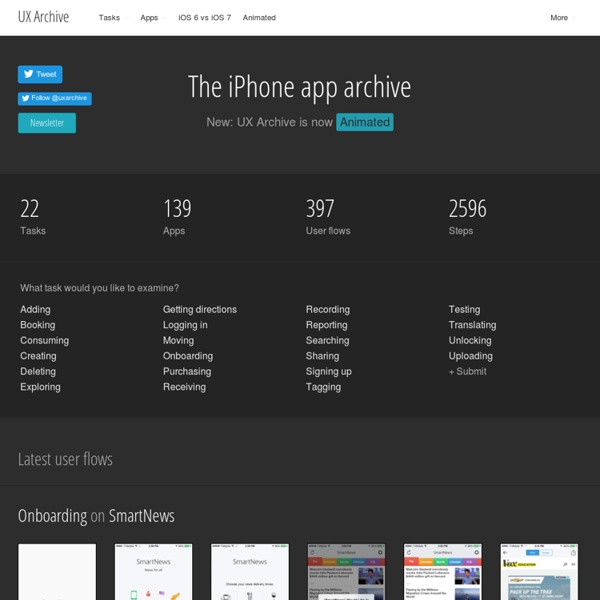
An archive of the most interesting user flows for inspiration to design the best user experiences / UI by angelahoatwork Mar 12