

Retro Poster Design Template. Vector.Eps.10 - 244052524. Gatorade Evoluciona & New Line 3 Series campaigns on Behance. 15 Beautiful Free Fonts For Your Creative Designs. Home » Fonts » 15 Beautiful Free Fonts For Your Creative Designs Advertisement A design is incomplete without typography.
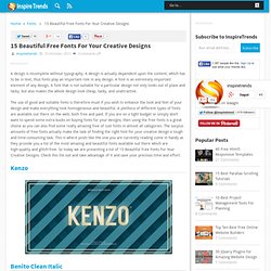
A design is actually dependent upon the content, which has to be in text, thus fonts play an important role in any design. A font is an extremely important element of any design. A font that is not suitable for a particular design not only looks out of place and tacky, but also makes the whole design look cheap, tacky, and unattractive. The use of good and suitable fonts is therefore must if you wish to enhance the look and feel of your design and make everything look homogeneous and beautiful. Benito Clean Italic Yeseva One Matchup Light Airbag EtharnigSc & EtharnigNo12 Ponsi Rounded Slab What’s My Age Again Cyntho Slab Pro Regular Braxton ATF Lorem Bouh Type font Vast Shadow.
MasterCard Mobile Website on Behance. TheBrave on Behance. Holiday Inn mural on Behance. Beliveo - interactive agency on Behance. Yorokobu Mag illustrations V on Behance. Starbucks - Home Brew on Behance. Starbucks Bean to Beverage Chalk Board Mural on Behance. Red Bull Studios on Behance. Eurovision on Behance. 25th Anniversary Branding on Behance. Dance Studio Brochure on Behance. Geometry Pattern on Behance. Islands on the Net Project on Behance. Type - Two on Behance. Lettering on Behance. Logopond - Identity Inspiration.
How to Create an Entangled Lettering Illustration – Part 2. In the second part of this tutorial series, we're going to bring this treatment to life with some color.
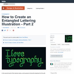
Stick around to learn about casting shadows and highlights through abstract color shapes. Before you proceed with this part, I suggest you back up the original file from part 1. Adjustments to a stroked path are much easier than tampering with a double sided, expanded arch. First of all, expand the paths altogether (Object > Expand). Before we begin to add color, we need to add shadows. Expand the stroked path (Object > Expand). Once you've done the same for the bottom, grab the Rounded Rectangle Tool and create a rectangle from corner to corner. Repeat this process and apply it to any straight parts of the letters where using the tool is possible.
For other parts, we'll have to create the gap in a different way. Expand the stroke (Object > Expand), and make sure to have it on top of the layer you want trimmed. You now need to round off the corners of the newly created gaps. "I am not a morning person" poster on Behance. 41 Minimal Poster Designs – Inspiration #3. Inspiring posters with minimal design its just awesome.
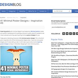
Minimal posters makes are a perfect marketing tool for putting up around in public places for people to see, I have collected some truly awe-inspiring minimal posters designs for you. Today we’ve interesting showcase of 41 minimal poster designs. This is the third post ( inspiration #3 ) of the minimal poster design series. I have lots more poster designs and i’ll share with you later. 1.s3.envato.com/files/13532759/merry_christmas_big. 15 Minimal Desktop Wallpapers for Christmas. Christmas is rapidly approaching, and no doubt most of you would have already decorated your desktop with a jolly, festive and seasonally uplifting Christmas-card-a-like wallpaper.
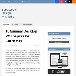
At the risk of sounding like the Grinch, I am not a huge fan of these typical Christmas desktop wallpapers, it s all just a little bit too noisy for me. I do love Christmas, I really do. But being a huge minimalist fan I like my desktop wallpaper to be just that. So, if you are just like me, I have found 15 wallpapers that will allow you to celebrate Christmas and still maintain your minimalist sanity. Christmas Time Size(s): 2560x1600px Download Page → Let it Snow Size(s): 2560x1600px Download Page → Christmas Background Size(s): 1366x768px Download Page → GALLERY FOR KIDS on Behance. FRDN on Behance. Resultado de imágenes de Google para. WE WORK on Behance. WeWork is an office-suite business, with a distinct concept - it constructs space with open floor plans and glass partitioning to enhance tenant interaction, which builds a physical social network capability resulting in business activities between tenants.
Its mission is to create environments that support creativity, collaboration and innovation. WeWork has grown to six buildings and nearly 2000 members. It was Squat Design's challenge to create a brand system for all the buildings and the corporate entity that was not only consistent but also flexible enough to grow as WeWork continued to expand in new locations. Additionally, it must be international in scope for WeWork’s objective to grow globally.
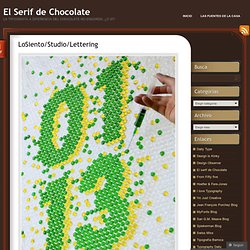
Lastly, the flexibility must be able to expand cross-industry as the WeWork brand branches out. El Serif de Chocolate. Desde Serbia tenemos el trabajo caligráfico de Lazar Dimitrijevic, que tiene un estilo muy expresivo y lleno de color, destaca su uso de la textura del trazo caligráfico, así como el enfasis que pone en la composición de la pieza.
Sitio. Blog Archive » FUEL TV Rebrand. 53molotrece.jpg (800×1190) A4sLidzCIAEQxit.jpg:large (800×1052)