

Disco Balls and Design: The Architectural Performance of Night Clubs. Developers: ES5 builds are disabled during development to take advantage of 2x faster build times.

Please see the example below or our config docs if you would like to develop on a browser that does not fully support ES2017 and custom elements. Note that as of Stencil v2, ES5 builds and polyfills are disabled during production builds. You can enable these in your stencil.config.ts file. When testing browsers it is recommended to always test in production mode, and ES5 builds should always be enabled during production builds. YODEZEEN inserts atmospheric Japanese restaurant in former Kyiv Arsenal building. Restrooms housed within a red metal mesh structure and a central open kitchen feature in this Japanese restaurant in Kyiv by local architecture and design firm YODEZEEN.
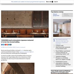
Located in an 18th-century brick building with art nouveau elements, the Virgin Izakaya Bar is in a central area of the Ukrainian city that was previously dedicated to weapons production. Izakaya refers to a type of informal bar serving drinks and small plates of food that are ubiquitous in Japan. The word izakaya (居酒屋) is made up of three kanji with the meaning: stay-drink-place. Sal de Jade Restaurant / 0studio Arquitectura. Sal de Jade Restaurant / 0studio Arquitectura Share FacebookTwitterPinterestWhatsappMail Or Area: 510 m² Year: 2021 Photographs: César BéjarManufacturers: AutoDesk, ILUMINACION ALPIN LED, MOOMA Mosaicos, TIMBERDUCK FURNITURE, TRES TINTAS TAPIZ, Trimble Navigation Lead Architects: Juan Antonio Corcuera, Miguel Ángel Delgado Design Team:Josselyn Ibarra, Ramón Padilla, Rosman Ocampo, Paulina SalinasClients:Grupo AFALCity:Hermosillo More SpecsLess Specs Text description provided by the architects.
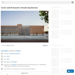
In order for the interior to be fully alive, the atmospheres achieved by the proposed materials aim to provide an intimate experience for each of the visitors. By developing the entire program on a single level, the building has a laterally incorporated space that plays an opposite role to the volume. From bank vault to bar: Shelby is a clandestine drinking spot in Detroit. In Detroit’s Financial District, the 1920s US Mortgage Bond Building is home to an Australian-inspired coffee shop Coffee Down Under and Shelby – a secret speakeasy tucked away in the old bank vault.
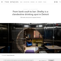
Designed by Detroit and Boston based architecture firm Primary Projects, Shelby’s interiors use motifs of early 20th-century banking to nod to the space’s past. The teller enclosures are transformed into a tiered, arcade-like back bar to display bottles. The material palette hints at the colours of money; a gold back bar (a repetitive bank teller pattern, built by Fillmore in Woodbridge), green velour banquette seats, and metallic fixtures. How This Taco Bell Concept Store Plans To Revolutionize The Drive-Thru Experience. Australia's dramatic sunsets inform design of Today is Long cafe. The terracotta colour scheme and semi-circular forms used throughout this Hong Kong cafe by architecture firms Studio Etain Ho and Absence from Island pay homage to Uluru and Australia's spectacular sunsets.

Located on a street corner in Hong Kong's Sai Ying Pun district, the 30-square-metre cafe sits at the bottom of an old apartment building. It has a generous facade and a tight, triangular plan into which the architects have managed to squeeze a compact kitchen and bar area with a serving counter, as well as an area of bench seating and two toilets. Called Today is Long, the cafe is owned by a barista and a public-relations manager, who bonded over their shared love of coffee and the fact they'd both spent time studying and working in Australia. "The cafe is a place to house their fond memories of Australia and the good coffee that makes their life," explained Etain Ho, who also runs Absence from Island alongside its founder Chi Chun Tang.
Tokyo's brutalist restaurant Grillno wraps guests in 50 shades of grey. Low lighting emphasises the textured walls and tabletops at this Tokyo restaurant, which cocoons diners in a soothingly muted palette.
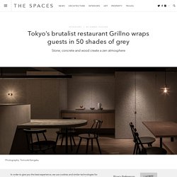
Japanese architect Keiji Ashizawa designed Grillno, creating interiors that reflect the concrete apartment block it’s located at the base of. Walls are covered in cement-board, while tables are made from thick slabs of concrete – as is the long open kitchen counter, where guests can watch chefs prepare smoked and grilled food from the menu. Photography: Tomooki Kengaku 1 of 6.
CCD completes '50% cloud' restaurant with undulating red brick volumes in china. DDconcept tops restaurant in vietnam with three-dimensional bamboo ceiling. YOD turns a 200-year-old mansion into a restaurant in central kiev. How the pandemic will change fast food restaurant designs. As a result, major chains have redesigned their restaurants to reflect the rapid change.
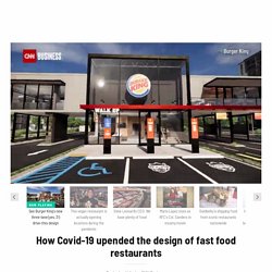
They're reinvesting in the exterior of stores, with drive-thru lanes gaining prominence. Even the parking lot is getting fresh eyes with dedicated parking spots for app orders or delivery drivers. Sadly, it also means the end of the dining room for now. Chains are de-emphasizing them because many states have placed restrictions on capacity and people's growing preference to eat far away from strangers. Burger King unveiled two new restaurant designs in September that both have drive-thrus, burger pickup lockers, takeout counters and more.
What makes the new concept unique is the reimagined exterior and parking lot. The restaurants will also be smaller: One prototype has no indoor dining option at all. Drive-thru and delivery have been crucial for Burger King's US business during the pandemic, when indoor dining has been banned or restricted. Billowing rattan columns by enter projects occupy bangkok's spice & barley. Biasol channels 1980s nostalgia inside Melbourne restaurant Billie Buoy. Design studio Biasol clashed hot pink and midnight blue to form the bold interiors of this 1980s-inspired restaurant in Melbourne, Australia.
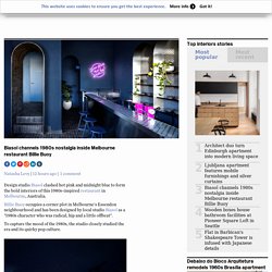
Billie Buoy occupies a corner plot in Melbourne's Essendon neighbourhood and has been designed by local studio Biasol as a "1980s character who was radical, hip and a little offbeat". To capture the mood of the 1980s, the studio closely studied the era and its quirky pop culture. "We looked back to the days before the internet and cell phones – we dusted off our Atari and Walkman, put a John Hughes movie in the VHS, and jammed to New Order and Madonna," said the studio. Berlin restaurants in extraordinary spaces. Berlin is known for its gritty aesthetic with rough-and-ready eateries across the city.
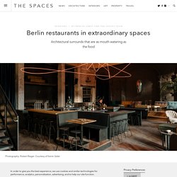
But its fine dining scene has a more nuanced character, serving modern cuisine amid battle-scarred historic surrounds. From an Art Deco school girl’s school to a converted apothecary, buildings are being repurposed to house these culinary hubs. And their design is every bit as enticing as their menus. Join us on an archi-tour of some of Berlin’s most beautiful restaurants. Kink Oliver Mansaray and Daniel Scheppan blend industrial grit with bohemian flair inside their provocatively titled new Prenzlauer Berg haunt, Kink. Corrugated white metal clads Vietnamese restaurant in Austin. Texas firm Magic Architecture has covered this Vietnamese restaurant with white corrugated metal to make it stand out from the "busy and graphic mess" of its location in Austin.

The local practice designed Sip Pho eatery for a first-generation Vietnamese family on a plot that was formerly home to a barbecue restaurant. It is located on 29th Street in the Texas city near a ballroom and a taco shack. While the other buildings are decorated in bright colours and graphics, the restaurant has a bold and simple white exterior. Madrid restaurant Mo de Movimiento champions sustainability with its up-cycled interiors - The Spaces. Courtesy Mo de Movimiento 1 of 7 Spanish entrepreneurs Felipe Turell and Javier Antequera have opened a new dining establishment geared towards positive social and environmental impact, built in what was once Madrid’s Espronceda Theatre. Conceptual designer Lucas Muñoz, represented by Machado-Muñoz gallery, was appointed to craft Mo de Movimiento as a space that champions recycling and adaptive reuse. Wood recovered from the previous site was used to build Enzo Mari-inspired chairs, while benches and tables were fashioned out of rubble from the demolition.
Second-hand industrial street lights hang from above, rewired with environmentally friendly LED bulbs. Linehouse channels nostalgia for interiors of Basehall food court. Films from the 1970s informed the aesthetic of Basehall, an upscale food court in Hong Kong designed by studio Linehouse. Basehall is a food hall set within Jardine House, a 52-storey skyscraper in Hong Kong that's punctuated by rows of circular windows.
Following its completion in 1972, the distinctive building was featured in a number of films. These early cinematic depictions came to influence Linehouse's interior design scheme for Basehall. "Jardine House was a landmark on the Hong Kong skyline and the tallest building in Asia for several years," said the studio. Qualia restaurant in Mumbai features dramatic bronze chainmail curtains. Undulating chainmail curtains lend a stage-like quality to the open kitchen of this Mumbai restaurant designed by Serie Architects. Qualia is set on the ground floor of Mumbai's Lodha World One skyscraper and has been designed to let diners "feel part of the entire practice of cooking".
To achieve this, Serie Architects orientated all of the dining areas throughout the 370-square-metre restaurant towards its grand open kitchen, which runs the entire length of the rear wall. The kitchen is split into three sections: a drinks bar, a central cooking space – which includes its own hearth – and an area dedicated to making the desserts. Above each of these sections dangles a bronze chainmail screen. The screens gently undulate, much like the heavy velvet curtains seen in a theatre, making the kitchen below appear as a "stage". "The bronze chainmail is used to create a division of spaces whilst allowing partial visibility between them," said practice co-founder Christopher Lee. Berlin bar and restaurant Kink is ready to serve you now - The Spaces.
A post-industrial space in Berlin has been revamped to create the interior of Kink Bar & Restaurant. The Berlin restaurant-bar sits in a former brewery complex in the city’s Prenzlauer Berg. It features a suspended, looping neon installation and dark surroundings, which create its ambient, immersive atmosphere. 1 of 11. Chubby Girl noodle bar takes cues from the landscape of south-west China. The stepped terrazzo floor, strip lighting and foggy mirrored walls inside this Beijing noodle bar designed by Office AIO are meant to mimic the urban makeup of the city of Chongqing. Chubby Girl is situated in Beijing's Xiang'Er hutong and, since 2015, has been locals' go-to spot for Chongqing noodles – a spicy street food dish that hails from the city of Chongqing in south-west China.
When Office AIO was approached to overhaul the restaurant, it was initially hesitant to make major aesthetic changes to the interior that loyal diners had grown accustomed to. The studio ended up designing a fit-out informed by the landscape of Chongqing, nodding to both Chubby Girl's menu and the history of the restaurant – the first branch opened in Chongqing in 1998. A key point of reference was the work of photographers Nadav Kander, Mark Horn and Tim Franco, who have all captured images of Chongqing's dense urban fabric, towering industrial structures and twinkling night skyline. Studio Modijefsky overhauls 119-year-old restaurant Bonnie in Amsterdam. Mikuni Izukogen restaurant by Kengo Kuma features latticed roof. Interlocking cypress-wood planks form the roof of the Mikuni Izukogen restaurant that Kengo Kuma has perched on a rocky hillside in Honshū, Japan.
Mikuni Izukogen is located on the Izu Peninsula, a resort area known for its rugged beaches, luscious greenery and abundance of hot springs. Kengo Kuma and Associates wanted the building to appear as a "cloud-like structure" amongst the surrounding landscape and spent time considering how to best connect it to its hilly site. MASS Design Group outlines strategies restaurants can adopt in response to coronavirus. US architecture firm MASS Design Group has suggested that restaurants add barriers, remove bar seating and seek local produce sources to curtail the spread of infection and allow patrons to safely eat out following the coronavirus lockdown. London's Silo restaurant has a zero-waste ethos and interiors - The Spaces.
Studio Seilern Architects perches restaurant on top of Mount Gütsch. Roman Plyus designs Buhairest bar in Hungary to look good on Instagram. Roman and Williams Guild New York boasts florist, boutique and cafe. Ras Al Khaimah's minimalist Hoof cafe is designed to recall horse stalls. Sinks that look like water troughs and rustic plaster walls feature within this spartan UAE cafe recently completed by design studio Bone.
Herringbone brickwork covers Chinese restaurant The Tang in New York by New Practice Studio. This Cocktail Lounge Is Built Inside an Airplane Cabin. Greenery spills over chunky concrete beams in Lima's Statera Restaurant. K-thengono designs elevated lounge garden for hotel rooftop in indonesia. Portal 92 designs Village Cafe to evoke the feeling of an Indian village. CASE-REAL converts dry cleaner store into sushi restaurant in fukuoka. White & The Bear children's restaurant has white walls and timber furniture. Studio Esteta designs Via Porta cafe to look like an Italian street. Moncayo Club House in Mexico City is elevated atop stone plinths.
Underwater Restaurant Has Been Completed In Norway And It Looks Out Of This World. The Most Beautiful Restaurants of 2018. Barcelona's Orvay bar takes design cues from winemaking. The Forgotten Treehouse Bars of Bygone Summers in Paris. Bambubuild constructs restaurant in vietnam using prefabricated bamboo. Only If creates space-themed underground coffee bar in New York. Peter pichler completes wood-wrapped mountain restaurant in the italian alps. Kleydesign tells a story within blue cup coffee shop in kiev.
BTR workshop completes simplylife restaurant in shenzhen. Huffingtonpost. The Breathtaking Japanese Design of One New Chicago Bar. Insider's Guide: 14 Don't-Miss Restaurants, Coffee Shops, and Cocktail Bars in Berlin: Remodelista. Iconic Restaurants Revamped - Empire Diner, Tosca Cafe, and more. Decadent and Decayed: Dry Cocktail Bar in Milan: Remodelista. Restaurant Visit: Roy Choi's Commissary, Inside a Greenhouse in LA: Gardenista. Best Coffee Shops In America - Best Coffee Shop In The Country. The World Is His Oyster: Saltwater in Inverness, CA: Remodelista. Bestie Currywurst in Vancouver. The Whale Wins: A Seattle Restaurant Inspired by the Sea.
Warehouse Dining in Berlin, Michelin Chef Included. Star Wars: Is Melbourne the New Coffee Bar Capital? Old World Grandeur in Downtown LA: Remodelista. McDonalds restaurants: photo gallery. A Room with a View: Cafe Aura in Japan. The Theater Crowd: Bar & Co. in Helsinki.