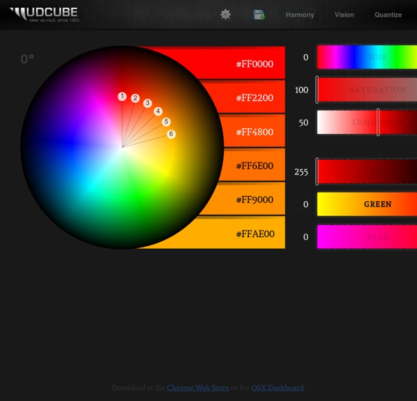


http://galacticmilk.com/sphere/
45+ Useful Tools for Choosing the Right Color Palette - TrendLeaks Color is one of the most decisive elements in any kind of design and the color palette used have a huge effect on the mood of the viewers. Experienced designers know exactly what colors to use for waking up certain emotions and feelings in people. One of the initial steps when designing websites and creating graphic designs is to choose the right color palette. This will work as the foundation for coloring any design element during the work, which is why, creating a cool color up front palette may be a bit challenging. One of the popular ways to get started is to look for color inspiration e.g. in stripe patterns and colorful websites or simply use a color tool. Finding the right tool to help you choose the right color palette is however not that easy.
CMYK to Pantone - Find PMS colors close to CMYK color RGB : (255, 255, 255), HEX : #ffffff Input CMYK color code, then you will know what Pantone colors are closed. Have you ever been asked to find a Pantone color equivalent to a CMYK color ? Finding what PMS colors are close to a CMYK color is a difficult and painful experience, your client may only have a CMYK color and the manufacturer ask a PMS color, how you match these requirements ? PSG Art tutorial Foreword I believe there is logic behind why a picture works or not. I also believe that humans are meat machines, and that one day computers will be able to emulate humans and what we do.
Double Word Graffiti British graffitist Peter Preffington started doing regular tagging on walls, and over the years, he has developed a new style that includes painting various words in one image. His work looks to be influenced from traditional graphic design. Top: The words spell “Colour” and “Greys.” Pink to orange “Fade.” A “White” outline and black “Dots.” itchy animation - quirky illustration and characters by Richard Yot LIGHT - a detailed tutorial Throughout this article I will be using a diagram of a white ball on white card to demonstrate how light behaves in different everyday situations: Here it illustrates a sunny afternoon. The main source of light is the sun, whilst the blue sky supplies a second source of light with very different characteristics. Some light is also bouncing between the white base and the ball and supplies a third source of light. The brightest light is coming from the sun and is white light emanating from a small source, which causes it to cast sharp edged shadows.
Working Space Comparison: sRGB vs. Adobe RGB 1998 Adobe RGB 1998 and sRGB IEC61966-2.1 (sRGB) are two of the most common working spaces used in digital photography. This section aims to clear up some of the confusion associated with sRGB and Adobe RGB 1998, and to provide guidance on when to use each working space. sRGB is a RGB color space proposed by HP and Microsoft because it approximates the color gamut of the most common computer display devices. Since sRGB serves as a "best guess" for how another person's monitor produces color, it has become the standard color space for displaying images on the internet. sRGB's color gamut encompasses just 35% of the visible colors specified by CIE (see section on color spaces). Although sRGB results in one of the narrowest gamuts of any working space, sRGB's gamut is still considered broad enough for most color applications.
color theory Vision and color are at the heart of painting. Here is the most comprehensive discussion for artists of color perception, color psychology, "color theory" and color mixing available online, and one of the most comprehensive available anywhere in any format. modern color theory (concepts) talking about color • misconceptions in tradtional color theory • additive & subtractive color mixing • visual color relationships modern color theory (applications) material color relationships • talking about paints • many painters' palettes • principles of color contrast • color symbolism • summary
Color Consumption - RockPaperInk.com June 14, 2012 Authors: Jake Lefebure, Pum Lefebure In the new world of motion graphics, the oldest design rule still applies: less is more. With a combination of animation, sound and time, controlling the visual design of a piece could be the difference between giving your viewers an energetic and memorable experience or overload them into a rainbow-induced seizure. For a portfolio or demo reel, color can influence the order of projects as much as the type of work made or the client represented.