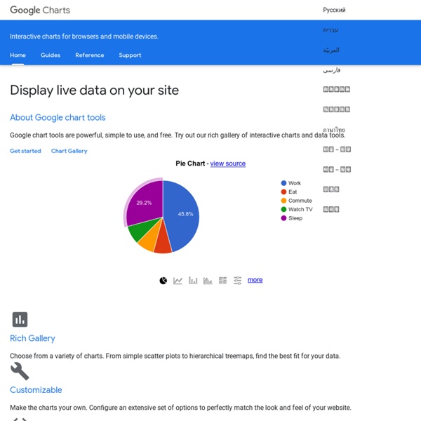


https://developers.google.com/chart/
22 free tools for data visualization and analysis You may not think you've got much in common with an investigative journalist or an academic medical researcher. But if you're trying to extract useful information from an ever-increasing inflow of data, you'll likely find visualization useful -- whether it's to show patterns or trends with graphics instead of mountains of text, or to try to explain complex issues to a nontechnical audience. There are many tools around to help turn data into graphics, but they can carry hefty price tags. The World Factbook People from nearly every country share information with CIA, and new individuals contact us daily. If you have information you think might interest CIA due to our foreign intelligence collection mission, there are many ways to reach us. If you know of an imminent threat to a location inside the U.S., immediately contact your local law enforcement or FBI Field Office. For threats outside the U.S., contact CIA or go to a U.S.
Telefonica grabs Jasper cloud to hook up British vending machines High performance access to file storage Telefonica has signed an exclusive deal with Jasper Wireless for use of its machine-to-machine cloud in the UK, hoping Jasper's kit will drive developers to a cellular solution. Machine to machine is already an important market for network operators, but it's going to get much more important as embedded intelligence grows. With starter kits around €120, including three SIMs, Jasper Wireless facilitates quick prototyping and testing, as long as you're happy using O2's network. Quick Tip Friday: Emailing Into Your Evernote Account Posted by Stefanie Fazzio on 20 Apr 2012 Comment Did you know that you can send emails from your inbox directly into your Evernote account and automatically assign them to destination notebooks? If you haven’t discovered this feature yet, you’ll find that it’s a great way to save messages like electronic receipts, travel information, and anything else you might want to find later in a place that you can search and access from any computer or mobile device (your Evernote account!). To do this:
Tutorials How to Make a State Grid Map in R Something of a cross between a reference table and a map, the state grid provides equal space to each state and a semblance of the country to quickly pick out individual states. How to Make Animated Line Charts in R Sometimes it's useful to animate the multiple lines instead of showing them all at once. How to Make a Multi-line Step Chart in R For the times your data represents immediate changes in value.
How to Create a Personal Information Encryption Scheme to Easily Hide Your Data in Plain Sight I think the article is saying you could use LastPass to generate your LastPass password and the article's encryption scheme to keep the password in plain sight. Then you would not have to remember it. For example if your LastPass encryption key password was something like /%/K\G,_sO¦R¥ÅÀbݾöà~¼ÐÂ4×òO?ù;ñN:è1?xð¸½ñç Cirro Touts Big Data-Ready Analytic Platform Cirro Touts Big Data-Ready Analytic Platform Don't know how to get started with your big data project? BI start-up Cirro claims to have just what you're looking for.
Offers Businesses Seminars and Consulting on Better Charts and Graphs Our first example shows a before figure of multiple pie charts and an after figure of a diverging stacked bar chart. Click Here for a discussion of this figure. Our second example also shows a before figure of multiple pie charts. It’s a series of 42 pie charts presented by VIDA showing male and female representation in prestigious literary journals. We show the first two pies here; the original figure is available at the VIDA site. EX. 2 AFTER (Hover mouse over bars to see counts and values.) How to Plot the Cyclomatic Complexity of Your Project - Streamhead The Cyclomatic Complexity Number of your program is a very rough measurement of how many paths can be taken through your source code. It can be calculated fully automatically. While it is far from perfect, it will give you an idea of how complex your program is. More importantly, it can also be used as a metric for the complexity evolution of a program over time.
Make Loyal Customers With Gamified Rewards #gsummit2012 Commercial airline companies have been using customer loyalty programs for 30 years, and that's why Krishnan Saranathan, managing director of United Airlines Mileage Plus program gave the keynote address at the Gamification Summit. United has been increasingly using games theory and gaming strategy the last couple of years, Saranathan said, and he shared a couple of the company's secrets in his brief address. How Gamification Shapes Consumer Marketing Obviously, Mileage Plus focuses on the people who fly the most.
Data Visualization: Modern Approaches - Smashing Magazine About The Author Vitaly Friedman loves beautiful content and doesn’t like to give in easily. When he is not writing or speaking at a conference, he’s most probably running … More about Vitaly Friedman … Data presentation can be beautiful, elegant and descriptive. There is a variety of conventional ways to visualize data - tables, histograms, pie charts and bar graphs are being used every day, in every project and on every possible occasion.