
https://sci2.cns.iu.edu/user/index.php
Related: ScienceAcademic Language Development Note: Bronx schools in NYC are using a special combination of SciGen units to prepare students for a yearly science fair.Download Science Fair Packet 6.4 Is that really a fair test? This unit introduces students to what “fair” means in science and how to make a test fair. Visual Text Analysis with ImageMagick – Zach Whalen In my classes, I’ve been talking about and showing off the kinds of visual analysis one can accomplish by extracting frames from video and comparing them in a montage format. This approach has been pioneered by Lev Manovich, Jeremy Douglass and others under the heading of Software Studies, and Manovich’s website discusses this technique and provides some tools for these and other cultural analytics. ImagePlot (a macro for ImageJ) is one such tool that many have had success with.
Exploration Education Physical Science Advanced {Homeschool Review} Often when I write a product review, I base my opinion on using the product for six or eight weeks. This year we used nearly all of Exploration Education's Physical Science Advanced program before I finalized the review. I'm just as pleased with the program after more than thirty weeks of lessons as I was when Brennan first started using it last fall. Download 6600 Free Films from The Prelinger Archives and Use Them However You Like Features, commercials, art pieces, stock footage, home movies, propaganda: the history of cinema so far has produced countless individual forms, all of which also count as documentaries. Watch any kind of film made sufficiently long ago and you look through a window onto the attitudes, aesthetics, and accoutrements of another time. And if it’s one made long enough ago or of obscure enough ownership to fall into the public domain, you can incorporate that piece of history into your own modern, era-spanning work in any way you like. Now, Prelinger Archives has made that easier than ever by making more than 6600 films free on the Internet Archive to download and use. “Prelinger Archives was founded in 1983 by Rick Prelinger in New York City,” says the collection’s about page. “Over the next twenty years, it grew into a collection of over 60,000 ‘ephemeral’ (advertising, educational, industrial, and amateur) films.
Wind Turbine - Museum of Science and Industry Build a wind turbine to generate electricity and explore energy transformation. Materials Three PVC pipes, one about 30 cm long and the others at least 15 cm longThree PVC T-jointsOne PVC elbow jointMotorWire (about two feet long)Wire cuttersHub (available from Kid Wind Project)Wood dowelsMultimeterAlligator clipsScissorsTapeHair dryer or fanMaterials for blades, such as balsa wood, aluminum foil, construction paper, popsicle sticks, etc. Directions Insert a 15-cm PVC pipe into the middle hole of a PVC T-joint. ImageJ - program do analizy obrazów i jego zastosowania You are using an outdated version of Firefox which is not supported by ResearchGate anymore. For a faster, safer browsing experience, upgrade your browser now. <div class="c-box-warning full-width-element" style="text-align: center; "><div style="margin: auto; padding:10px;" class="container"><b>For full functionality of ResearchGate it is necessary to enable JavaScript. Here are the <a href=" rel="nofollow" target="_blank"> instructions how to enable JavaScript in your web browser</a>.
Roller Coaster - Museum of Science and Industry Learn about energy as you send a marble through a roller coaster that you design. Materials Marbles or small balls About 6 feet of flexible tubing, such as ¾-inch foam pipe insulation Masking tape Plastic cup Scissors Various supports, such as boxes, paper towel tubes or books Directions Cut the tubing in half. Hands on Engineering STEM Projects for Kids and Students AdWords We use AdWords to deploy digital advertising on sites supported by AdWords. Ads are based on both AdWords data and behavioral data that we collect while you’re on our sites. Physics & Physical Science Demos, Labs, & Projects for High School Teachers This site is designed to help physics teachers share their ideas. Many of us are the sole physics teacher in their school. It’s nice to know there are others out there to help develop experiments and demonstrations. I will be listing many of my demos and activities along with a commentary on what works and what doesn’t. This will only work if you other teachers add to the site. Comments, ideas, explanations – all are welcome.
You'll Flip Over Forces & Motion Submitted by Heidi BaitzLudlow Elementary SchoolLudlow, Vermont 05149baitzh@ludlowelementary.org Digital Wish Grant Does Your Classroom Flip? “We are Newtonians, fervent and devout, when we speak of forces and masses, of action and reaction; when we say that a sports team has momentum, when we note the inertia of a tradition or bureaucracy; and when we stretch out an arm and feel the force of gravity all around, pulling earthward.” James Gleick BumperDucks Note: The Adobe Flash plugin is needed to play this game on the web. Please enable your Flash settings on your web browser. For issues with Google Chrome or Chromebook, please see Google Chrome Help.
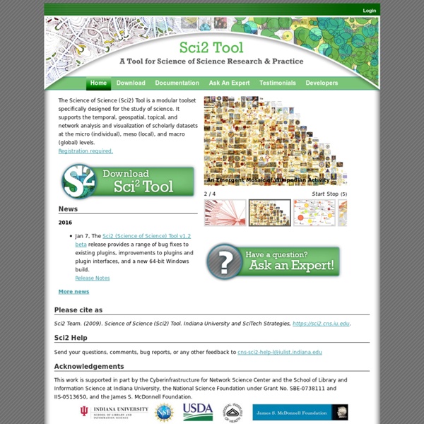
Sci2 Manual SCOTT WEINGART, TED POLLEY ET AL The Science of Science (Sci2) Tool is a modular toolset specifically designed for the study of science. It supports the temporal, geospatial, topical, and network analysis and visualization of datasets at the micro (individual), meso (local), and macro (global) levels. Users of the tool can: access science datasets online or load their own; perform different types of analysis with the most effective algorithms available; use different visualizations to interactively explore and understand specific datasets; share datasets and algorithms across scientific boundaries. Click here to access the manual. Manual: by nadiafank Jun 3