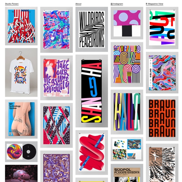


Lisa Guedel Dolle You studied at Ecole cantonale d'art de Lausanne (ECAL), what's the course like there and what have you taken from it? ECAL seems to be the perfect school for those who want to learn the essence of graphic design – typography, grids, typesetting, etc. It remains a small public art school where you can easily interact with students of all disciplines. During three intense years you learn almost all the basic design rules that allow you to develop your own practice and personal interests. I believe ECAL owes its reputation to its professors.
Think Positive Designer Prints We are international leaders in direct to fabric digital printing and textile design and our passion for colour has driven us to provide unparalleled quality colour reproduction. Our art room can create design originals and translate and develop your creative concepts into a printable format. We’re even able to take iconic old screen-prints and digitally remaster the colour and design to produce exquisite new digital silks or add a new dimension to a golden oldie. Designers need to be able to depend on a reproducible colour palette. In digital, we dare to think red not orange and we think blue not purple. Modern World Does the subject matter present any particular challenges, and if so how did you get around these? I knew I wanted to work with letterpress and wood type to give the identity a lo-fi raw quality. This was informed by the printed material in the band’s archive, because it was from the seventies it had a handmade analogue feel.
Uehara & Watanabe may 15, 2012 yosuke uehara + yoshie watanabe: kigi exhibition ‘kiwi exhibition’ by yosuke uehara + yoshie watanabe installation view all images courtesy of yosuke uehara + yoshie watanabe André Baldinger André Baldinger 2000 The Newut family is a new Grotesque in which the capitals are designed to be the same height as the lowercases. You can chose from three variationes: Classic, Tip or Plain. Each variation has three weights, Light, Medium and Heavy. Contributors Tibor Kalman (July 6, 1949–May 2, 1999) was an influential American graphic designer of Hungarian origin, well-known for his work as editor-in-chief of Colors magazine. Kalman was born in Budapest and became a U.S. resident in 1956, after he and his family fled Hungary to escape the Soviet invasion, settling in Poughkeepsie, New York. He later attended NYU, dropping out after one year of Journalism classes. In the 1970s Kalman worked at a small New York City bookstore that eventually became Barnes & Noble. He later became the supervisor of their in-house design department.
Top 20 graphic designers to follow on Pinterest There are many ways that designers can make the most of social networks, but one of the best places to find inspiration has to be Pinterest. Having said that, with so many boards to wade through, it's also an easy place to lose hours of your life. So to help you find and pin the most interesting stuff, we’ve picked some of the best graphic designers to follow. Enjoy! 10 famous graphic designers you should be able to name-drop We all know that as graphic designers we have to study those who came before us and advanced the field of design. Here at 99designs, we love focusing in on the work of some of the biggies. We’ve covered giants like Paul Rand, Milton Glaser, Saul Bass and more on this blog. But there are a lot of famous graphic designers, hundreds in fact, who have made hugely significant contributions to graphic design at large who you also need to know, and as stated in the title of this post — need to be able to name-drop in a conversation.