
20 Infographic Driven Website Designs – the Latest Web Design Trend. Infographics have now permeated through all aspects of the modern web world.
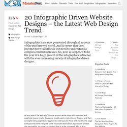
And it seems that they become more valuable as our need to understand a complex content increases. So, 2011 is supposed to be the year of a huge growth of the infographics influence with the ever-increasing variety of infographic driven designs. As you search the web you’ll come across a wide range of interactive and graphical maps, charts, diagrams, blackboards, instructional designs and their concepts being copied and applied to web layouts. More and more home page backgrounds now integrate some visualized data about a particular project, site navigation, or some key content that is to be conveyed. Why is it so popular? Have a look on the examples of infographic driven designs given below and that will make you more clear about the concept.
Amazeelabs.com Cornerd.com Pointlesscorp.com Ipolecat.com Fusionads.net Digitalpodge.co.uk. Tag "Freebies" on Smashing Magazine. Posts Tagged ‘Freebies’.
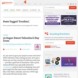
We are pleased to present below all posts tagged with ‘Freebies’. Freebie 30 Sugar-Sweet Valentine’s Day Icons So, you want to give your projects some extra love? With Valentine's Day coming up soon, we've got a fresh new set that consists of a delicious selection — just like a good box of chocolates. Take a peek, and you'll find icons especially tailored to e-commerce projects (such as shopping carts and price tags), but also some more versatile motifs like a love letter, calendar, and even a WiFi sign that sends off some lovely vibes.
This catchy icon set is available in two different styles — each available in AI, SVG, EPS, Sketch, CSH and PNG formats. Read more... Freebie: Clothing Icons (40 Icons, 9 Styles, AI, EPS, SVG, PNG) Winter means getting out your scarf and a cozy hat to brave the cold — if you're located in the Northern hemisphere that is. Please note that this icon set is licensed under a Creative Commons Attribution 3.0 Unported. The Collective Legal Guide For Designers (Contract Samples) Rule number one for designers of all kinds: use a contract.
Sometimes, this is easier said than done. Should I use a service agreement? A retainer? A licensing contract? With the help of Docracy1, we collected the experience of many designers to provide a wide range of starting points for less experienced creative professionals, and to start a permanent free legal resource for the community. Below you’ll find a collection of legal documents curated by our fantastic community. Important notice: free sample documents and commentary are never a substitute to legal advice. What Document Should I Sign With My Client? Understanding Site Navigation: Key Terms (Part 1) When kicking off a project, the first step Antharia takes is to look at the site navigation. We meet with the client at what we call the “kickoff meeting” (which usually lasts about 3-4 hours), during which we discuss every aspect of the site’s key features, elements, and demographics, as well as the database and any expectations the client or user may have.
After this comprehensive session, my team and I return to our office, where we hold an internal kickoff. Planning And Implementing Website Navigation. Advertisement The thing that makes navigation difficult to work with in Web design is that it can be so versatile.
Navigation can be simple or complex: a few main pages or a multi-level architecture; one set of content for logged-in users and another for logged-out users; and so on. Because navigation can vary so much between websites, there are no set guidelines or how-to’s for organizing navigation. Designing navigation is an art in itself, and designers become better at it with experience. It’s all about using good information architecture: “the art of expressing a model or concept of information used in activities that require explicit details of complex systems.” Organizing Navigation Structure. Best 20 webfonts from Google Web Fonts and @font-face embedding. At the moment there are several ways to use non-system fonts on a website.
We will focus on the two least complicated, least expensive systems, Google Web Fonts and the @font-face rule. Fear not, we have not ruled out other paid methods such as Typekit, Fonts.com Web Fonts, Fontdeck, Webtype, WebINK or Fontspring for future posts as they certainly offer high quality typefaces and deserve to be considered. It’s important to be aware that web fonts can generate inadequate visualizations on operating systems which have subpixel rendering turned off in the case of Windows XP.
They can also be represented differently depending on the browser used to visualize them. The aim of this post is to facilitate the choice of a series of fonts (out of the hundreds available) whose technical and visual characteristics make them more readable and compatible with a wide variety of devices, browsers and operating systems. Basically, there are two implementation models: 1. 2. Web Design: 20 Hottest Trends To Watch Out For in 2013. All throughout 2012 there has been an enormous surge in new web design trends.
