

Cuscini maddalena 2011. 32 User Interface (UI) Elements Designers Need To Know. User interface (UI) elements are the parts we use to build apps or websites.

They add interactivity to a user interface, providing touchpoints for the user as they navigate their way around; think buttons, scrollbars, menu items and checkboxes. As a user interface (UI) designer, you’ll use UI elements to create a visual language and ensure consistency across your product—making it user-friendly and easy to navigate without too much thought on the user’s part. In this guide, we’ll explore some of the most common user interface elements, considering when and why you might use them. Ready? Let’s go. Angular Material UI component library.
Storybook: UI component explorer for frontend developers. Components. Mobile optimized UI components for your web app. Material-UI: A popular React UI framework. UI Components - Ionic Documentation. Developers: ES5 builds are disabled during development to take advantage of 2x faster build times.
Please see the example below or our config docs if you would like to develop on a browser that does not fully support ES2017 and custom elements. Note that by default, ES5 builds and polyfills are enabled during production builds. When testing browsers it is recommended to always test in production mode, and ES5 builds should always be enabled during production builds. This is only an experiment and if it slows down app development then we will revert this and enable ES5 builds during dev. Semantic UI. HTML Projects – 1000 Projects. The Online Seminar Hall and Auditorium Booking System is divided into four main modules.

Each and every module performs a particular work. 26 Impressive web projects built with CSS only. Top 10 Projects For Beginners To Practice HTML and CSS Skills. Learning to code is always exciting and fun for everyone and when it comes to stepping into the programming world most of the people start with the easiest thing HTML and CSS.
Every beginner’s coding journey in frontend starts with these two basic building blocks and you need to be creative when it comes to designing a beautiful application. Initially, beginners enjoy making buttons, adding the links, adding images, working with layout and a lot of cool stuff in web designing but when it comes to making a project using only HTML and CSS they get stuck and confuse about what they should make to practice all these stuff.
Afterall their knowledge is just limited to HTML and CSS. No matter what after learning everything at some point you will realize that making a project is important to practice HTML and CSS skills. You need to check how HTML and CSS work together to design a beautiful frontend application. 1. 2. 3. 4. 5. 6. You can make a static page holding an event or conference. 7. 8. 7 Projects to practice HTML & CSS skills for beginners. Building a UI Component Design System - Bits and Pieces. So far so good.
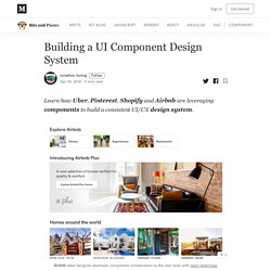
But, how can you actually create a component-based design system on which UI/UX designers and developers can collaborate? This can be easier said than done (see: “UI Design System and Component Library: Where Things Break”). So here’s a question… “what is your design system really?” Ask a designer, and they will say it’s some images and guidelines. Apart from components, it will include guidelines for fonts, sizes, margins, positions, and other important aspects of the visual experience you provide to people. As a developer, and they will say it’s a component library on GitHub, written in React, Vue, Angular or just JavaScript.
32 User Interface (UI) Elements Designers Need To Know. Creating a UI Component Design System (step-by-step guide) Giovanni Izzo. UI Design: guida definitiva alla progettazione dell’interfaccia utente. I siti non sono tutti uguali, molti di essi appaiono molto gradevoli nell’aspetto, ma offrono una navigazione poco intuitiva e ospitano contenuti difficili da reperire.
Altri invece sono molto facili da utilizzare e propongono un’interfaccia utente piacevole, che permette di individuare velocemente e con pochi passaggi i contenuti che si cercano. Contrast Checker. You are here: Home > Resources > Contrast Checker <p><strong>This tool requires Javascript.
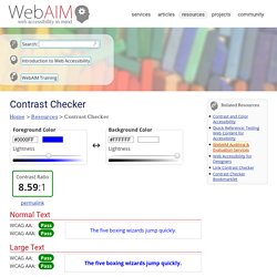
</strong></p> WCAG - Contrast Checker. Validation Color Palette. Color Tester - A tool for webdesigner. How to Choose Good Website Color Schemes (Oct 2019) By now, you should be thinking “Wow, color is like magic!
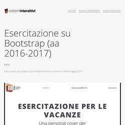
Why aren’t more people using it to their advantage?” Well, because most people don’t know how. So, in the next section, we will show you 3 easy steps you can follow to start using color to your advantage on your website. 3 steps to using color on your website – the right way There are 3 main colors you need to consider when you are designing your website: Choosing a dominant color as your brand colorChoosing 1 to 2 accent colors to create a color scheme for your websiteChoosing a background color to complete your design. Esercitazione su Bootstrap (aa 2016-2017) Esempio Puoi vedere l'esempio du cui vedi qui codice html e css qui: Ho inserito nel codice molti commenti che spigano perchè ho fatto alcune scelte.
Download 32 free Figma design for your next projects - uistore.design. Sketch App Sources - Free design resources and plugins - Icons, UI Kits, Wireframes, iOS, Android Templates for Sketch. 8b – Web design, UX/UI design. La UX (user experience) possiamo identificarla come l’esperienza personale che si ottiene interagendo con un prodotto (sito web, eCommerce, app, oggetto).
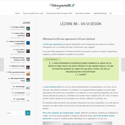
Il mercato delle esperienze è l’ambiente all’interno del quale si vendono i prodotti. L’esperienza negativa o positiva definisce la qualità di un prodotto. Ecco la preistoria di internet, quei siti anni '90 che funzionano ancora. C'E' STATO un tempo - era la prima metà degli anni '90 - in cui Internet, per chi già navigava, voleva dire Lycos e WebCrawler (due tra i più popolari motori di ricerca dell'epoca creati da studenti universitari nel 1994), Netscape (il browser che rivaleggiava con il colosso Internet Explorer) e Geocities (il popolare servizio grauito di host di pagine web lanciato nel 1994 e poi acquisito da Yahoo nel 1999). Era l'epoca dei modem a 56k, dell'attesa infinita per il caricamento delle pagine web e del completamento dei download. E di conseguenza era l'era dei siti web "leggeri", dalla grafica essenziale, animati nella maggior parte dei casi da colorate .gif.
Il processo creativo completo di UX Design in 14 fasi. Progettazione di Interfacce e Valutazione dell' Usabilitá. Fabio Paternò fabio.paterno at isti.cnr.it Orario: Lunedì 10.15 - 11.45 - Laboratorio H al Polo Fibonaccie Giovedì 12.00 - 13.30 - Lab 1 a Palazzo Ricci.