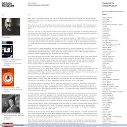

Saul Bass. SAUL BASS (1920-1996) was not only one of the great graphic designers of the mid-20th century but the undisputed master of film title design thanks to his collaborations with Alfred Hitchcock, Otto Preminger and Martin Scorsese.

When the reels of film for Otto Preminger’s controversial new drugs movie, The Man with the Golden Arm, arrived at US movie theatres in 1955, a note was stuck on the cans - "Projectionists – pull curtain before titles". Until then, the lists of cast and crew members which passed for movie titles were so dull that projectionists only pulled back the curtains to reveal the screen once they’d finished. But Preminger wanted his audience to see The Man with the Golden Arm’s titles as an integral part of the film. The movie’s theme was the struggle of its hero - a jazz musician played by Frank Sinatra - to overcome his heroin addiction. Designed by the graphic designer Saul Bass the titles featured an animated black paper-cut-out of a heroin addict’s arm.
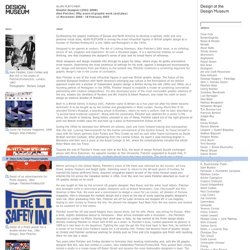
Biography. Alan Fletcher / Alan Fletcher: fifty years of graphic work (and play) Alan Fletcher Graphic Designer (1931-2006) Alan Fletcher: fifty years of graphic work (and play) 11 November 2006 - 18 February 2007 Designed to be opened at random, The Art of Looking Sideways, Alan Fletcher’s 2001 book, is an unfailing source of wit, elegance and inspiration.

At over a thousand pages, it is a spectacular treatise on visual thinking, one that illustrates the designer’s sense of play and his broad frame of reference. While designers and design students rifle through its pages for ideas, others enjoy its gently provocative mind-teasers. Alan Fletcher is one of the most influential figures in post-war British graphic design. Born to a British family in Kenya 1931, Fletcher came to Britain as a five year-old after his father became terminally ill to be bought up by his mother and grandparents in West London. During the 1950s he attended four different art schools, each one more forward looking and cosmopolitan than the last. In 1991, Fletcher decided to leave Pentagram.
Reputations: Neville Brody. Neville Brody was born in London in 1957.

He attended the London College of Printing from 1976-79 before becoming a freelance designer, mainly of record sleeves. In 1981 he became designer of The Face magazine, where his typographic experiments won international acclaim. He went on to art direct Arena, Per Lui (Italy) and Actuel (France). A book of his collected designs, The Graphic Language of Neville Brody, was published in 1988 to coincide with a retrospective at London’s Victoria & Albert Museum. He is an enthusiastic advocate of computer-based design and in 1991 helped to launch Fuse, a disk-based ‘interactive’ magazine of new typefaces. Rick Poynor: It is almost four years since your book and the exhibition at the V&A and during that time you have kept a much lower profile than in the preceding period. Neville Brody: After the exhibition a number of things happened, the most significant of which was that we completely stopped getting any British work.
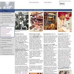
NB: Certainly. Home : Design Is History. History of Posters : The Photographic Poster. Club Dada (1916-22) The art and cultural movement Dada, originated in Switzerland during WWI, encompassed visual arts, theater, poetry and graphic design.

Its members, "were responding to the violence and trauma of World War I—and to the shock of modernity more generally—by developing shock tactics of their own. They critiqued traditional conceptions of the artist as master of his medium by using prefabricated materials or relegating aesthetic decisions to chance. Posters for a Cause. WWI Recruiting Soldiers At the start of WWI in 1914 there was no draft for the British Army but as newly mechanized war equipment and gas warfare caused huge casualties, it was increasingly difficult to get men to enlist.

Posters were used to inspire, or shame, men into joining up. (above) After the sinking of the ship Lusitania, a report circulated about the discovery of a deceased English mother clutching her child, both innocent victims of the attack. The subsequent poster design needed no explanation for English men to connect between the image and the word ENLIST. (Above Top) Alfred Leete's 1914 image of England's Secretary of State for War, Lord Kitchener, is craftily designed to look as if it is pointing at you from any vantage point. (Above bottom) James Montgomery Flagg's 1916 magazine cover of Uncle Sam was circulated on 4 million posters in 1917. There were dramatic changes in the perception of women's war roles between WWI and WWII. The German Call to Arms Social Cause Poster. The History of Visual Communication. This website, which contains the material of the course VA312, taught at Sabanci University, Istanbul, Turkey; attempts to walk you through the long and diverse history of a particular aspect of human endeavour: The translation of ideas, stories and concepts that are largely textual and/or word based into a visual format, i.e. visual communication.

Wikipedia defines visual communication as: