

Human Brain Capacity in Terabytes. Storage is a hot commodity in my organization.
We have 100TB’s and still need more. We have many databases that grow daily, some with millions of records. When I take a step back, I say “Wow, that’s a ton of data”. I have heard that Yahoo has an open “tab” with NetApp buying terabytes per day. I was recently asked what I thought the human brain capacity was in terabytes. Robert Birge (Syracuse University) who studies the storage of data in proteins, estimated in 1996 that the memory capacity of the brain was between one and ten terabytes, with a most likely value of 3 terabytes. It looks like we could replace all of our storage systems with one human. Like this: Human brain. © Andrei Calangiu | agency: dreamstime.com The typical adult human brain weighs about 3 pounds (1.4 kilograms).
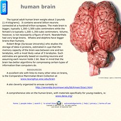
It contains several billion neurons connected at a hundred trillion synapses. The male brain is bigger; typically 1,300–1,500 cubic centimeters while the female's is typically 1,200–1,350 cubic centimeters. Volume, however, is not necessarily a figure of merit. Neanderthals had very large brains. Robert Birge (Syracuse University) who studies the storage of data in proteins, estimated in 1996 that the memory capacity of the brain was between one and ten terabytes, with a most likely value of 3 terabytes. A excellent site with links to many other sites on brains, is the Comparative Mammalian Brain Collection at www.neurophys.wisc.edu/brain A site cleverly organized to arouse curiosity is:
Brain and Brain Research Information - Dana Foundation. The Human Mind's Raw Capacity. Think Design Blog - Free Vectors - 230 Marker Illustrator Brushes. So normally I make my weekend post on Saturday, but this freebie took a bit longer than expected to wrap up.

But here it is! It is 230 free vector marker brushes. The pack includes all shapes, sizes and colors. I tried to include as many colors as possible, but elected for mostly toned down colors, so that they could have a wider range of uses. Google Analytics Add Social Reports To Service; Measure Social Media's ROI. Being able to measure the impact and addition of social media on your site has been the holy grail for many marketers.
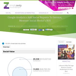
It's normally said that it improves the number of visits and interactions with your site, but exactly how much of an improvement it makes has been unclear. Until now, that is. Google Analytics has unveiled a new set of social reports, designed to connect social media stats with business metrics and give you a clear picture of how exactly social media is benefiting your site. Announcing the changes on their Analytics blog, Group project manager Phil Mui said that the three main factors that Analytics will help with are: The main change is that there is an overview report for social value, letting you see how much conversation value is generated from the different social media sites. Visualize Science. Collaborative Development & Testing Stories On the Fly. Think Design Blog - Free Vectors - 230 Marker Illustrator Brushes. Visual Thinking Archive. Mastering Film » Digging Deep – An Interview with Frank Rose. I’m incredibly honored to bring you my first interview on this site, with Frank Rose, author of The Art of Immersion: How the Digital Generation is Remaking Hollywood, Madison Avenue, and the Way We Tell Stories, published by Norton in 2011.

In this interview, Frank and I discuss the new generation of “the people formerly known as the audience,” transmedia storytelling, the history of immersion, issues that arise from it, and film’s place in this new storytelling culture. TYLER WEAVER (TW): Tell me a bit about the Art of Immersion, the book itself, and how you came to write it. FRANK ROSE (FR): I had been writing for Wired for close to ten years when I started on the book. Mostly what I had done for Wired was covering the intersection of media and technology.
Advertising — literally everything from Hollywood to cell phones. The first was a piece on 3D, and I interviewed James Cameron. FR: Right! The idea of serialization is purely a product of technology. TW: Right. TW: I agree with you. Crayon Physics Deluxe. A visual exploration on mapping complex networks. DAYTUM. Gallery of Data Visualization - Introducton. This Gallery of Data Visualization displays some examples of the Best and Worst of Statistical Graphics, with the view that the contrast may be useful, inform current practice, and provide some pointers to both historical and current work.
We go from what is arguably the best statistical graphic ever drawn, to the current record-holder for the worst. Like good writing, good graphical displays of data communicate ideas with clarity, precision, and efficiency. Like poor writing, bad graphical displays distort or obscure the data, make it harder to understand or compare, or otherwise thwart the communicative effect which the graph should convey. [See the Bad Writing Contest for examples of The Best of Bad Writing. See the ACCENT Principles for effective graphical display.] WorkingPaperonNewProductsandExtremeValueTheorybyDahanandMendelson.PDF (application/pdf Object)