brandalism
The Brandalism project involved the takeover of 35 billboards in 5 UK cities using artworks which challenged the authority and legitimacy of the advertising industry. Read more about the project here….. For a look at today’s advertising industry, check out our ‘Why Brandalise?’ piece.
Sweet Station
Zemer Peled Peled was born and raised in a Kibbutz in the northern part of Israel. After completing a BA (Hons) at the Bezalel Academy of Art and Design in Jerusalem she graduated with an MA (Hons) from the Royal College of Art. In recent years her work has been featured nationally and internationally in museums and galleries including Sotheby’s and Saatchi Gallery-London, Eretz Israel Museum-Tel Aviv and the Orangerie du Senate, Paris among others. Zemer Peled’s work examines the beauty and brutality of the natural world.
Remarkable Contemporary Home by Mizuishi Architect Atelier & Luxury...
Remarkable and contemporary home by Mizuishi Architect Atelier Mizuishi Architect Atelier have designed the River Side House in Horinouchi, an incredible, comfortable and contemporary house which stretches the imagination in terms of perception, space and aesthetics. The exterior of the house is purposely underwhelming, which merely adds to the magic of the residence.
Moleskine Art
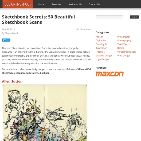
Advertisement More than quick sketches and drawings, Moleskine art can encompass mixed media and even digital art. The imperfect lines, smudges and wrinkles give it dimension and raw honesty that more than ever are sought by digital artists and implemented in software. Regardless of any advancement in technology, pen and paper will always be the number once choice for any budding artist or seasoned illustrator. No theme or medium is ever neglected for the Moleskine treatment if the mood strikes the artist, spawning art like no other. With abstracts, travel themes and even other-worldly monsters, this collection of Moleskine art sketches and drawings is sure to inspire thought and spark your muse.
The Art of Negative Space. on the Behance Network
Sign Up Log In The Art of Negative Space. Project Featured On: Behance.net — 7/13/2011 Wacom Gallery — 12/8/2013
ROA New Mural In Vardø, Norway StreetArtNews
While you discovered some progress shots a few days ago (covered), ROA completed his new mural for the Komafest festival in Norway. Painted on the outside of an old warehouse in Vardø's port, this piece is inspired from the dwarf whale, a species experiencing a renewed slaughter by Japan and Norway. Next up for ROA, Rochester and Wall Therapy so stay tuned for more...
Illustration portfolios
Vast array of illustration drawing styles. Editorial design. Eye candy curator / editor of Featured by, Carole Guevin showcases the world wide digital culture. No hype just beautiful
The Astounding Design Of Eixample, Barcelona
Constructed in the early 20th century, Eixample is a district of the Spanish city of Barcelona known for the urban planning that divided the district into octagonal blocks. Influenced by a range of schools of architecture, Eixample Barcelona was designed in a grid pattern with long streets, wide avenues, and rounded street corners. Despite being in the center of a thriving European metropolis, the district provides improved living conditions for inhabitants including extensive sun light, improved ventilation, and more open green space for public use. And of course, the result from the grid-like structure is astounding from above:


