
Homepage - Material Design. Inspiring Examples of UX Design Portfolios. Illustration by Lidia Lukianova As a UX designer, your portfolio is your business card.

It shows what you do, how you do it, and how well you can demonstrate it. For most designers, getting started on your portfolio is the biggest challenge and, for many of us, the best way to jump that hurdle is to get some inspiration from other designers. Here, I’ve compiled a shortlist of some UX design portfolios that I found inspiring, along with some tips to help you show off your work in the best way possible. Building your portfolio: Where to start The best approach to creating a stunning portfolio is to blend strategy and design into an iterative process, just like you do in every project you work on. Instead, start with a concept sketch to hone in on how you want your portfolio to look, then move into mid-fidelity to refine your layout, and finally move into high-fidelity adding your color palette and visual elements.
Long-form case study portfolios Specialist portfolios Minimalist portfolios. Getting started with grids in digital design. There are 5 main types of grids.

Some are better than others for web design, but you have likely used all 5 at one point in your design career. Baseline grid A baseline grid is a bit more technical, it’s defined by where the text sits. Essentially, it’s the leading or spacing between the baselines. This grid helps to create a good experience for the reader, especially where there is a lot of text to read.
While it’s essential for print design like book layouts, it’s also critical to consider the baseline grid in web design. Manuscript grid A manuscript grid is the foundation for all books, newspapers, and magazines. Column grid Column grids help break up text, photos, and illustrations. The space between columns is called the gutters, they should be the same size across all. Not all column grids have to be symmetrical. Take a look at how this blog homepage uses this asymmetrical column grid. Modular grid Modular grids are similar to column grids but differ with the addition of rows. The power of the 100-day design challenge. Exciting 1st -35th Day During the first 1/3 of my journey, I was so excited and ambitious about my daily illustrations.

Making illustration was the first thing right after waking up. Initially, I learned new skills by following tutorials for a week, and then I gradually started creating things from heart. There were tons of idea in my brain — I made my own logo, made the Chinese painting series and the Lunar New Year series. My motivation and confidence both peaked somewhere around the 30th day. Tiring 35th — 70th Days Having become more proficient with my tool, I attempted to go pro, like making bigger scenes or photo-based vectors. Also, as my quarter was nearing its end, I was getting busier with my final projects and my portfolio. During this period, I usually started my daily design at 12am and wrapped up by 3am. I tried to kill two birds with one stone, by taking advantage of the challenge to make illustrations for my portfolio, which added some more flavor and personality to it. Blexbolex. « Blexbolex, pseudonyme de Bernard Granger, né à Douai en 1966, est un illustrateur et un auteur de bande dessinée français.

Entré à 18 ans à l’école des Beaux-Arts d’Angoulême, en section peinture avec l’intention de devenir peintre, Blexbolex en sort six ans plus tard sérigraphe. […] À la manière des affiches des films de Jacques Tati, le dessin de Blexbolex, très stylisé, séduit de plus en plus de lecteurs. Son style rappelle les polars des années 1950-1960, avec un graphisme et un chromatisme très marqué.
Il est l’un des rares auteurs de la jeune génération à poursuivre à sa manière le travail de déconstruction de la ligne claire mené dans les années 1970 par Joost Swarte. » (cit.wikiwand.com) « J’ai abandonné le trait d’une part parce que je n’en avais plus besoin, et d’autre part parce que je ne savais jamais où le placer.
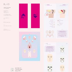
Il me gênait. . « Un style très Art Déco, à mi-chemin entre Vladimir Lebedev et les affichistes russes. Blexbolex / 2008 / Editions Albin Michel Jeunesse – BLEXBOLEX – Atelier Coop. 44 Affiches de cinéma de affichiste Rene Ferracci - Affiches de cinéma orginales par Dominique BESSON. Graphisme. Take me back i'm yours <3 graphisme transféministe >>--666--> art ^^ performances ** collaborations ... textes & publications TRANSformation : MT* / FT*, projet de DSAA Design d'Illustration Scientifique, en collaboration avec OUTrans, Paris, 2011-2013 Changer de sexe, c’est-à-dire inverser l’ordre établi du féminin et du masculin, des sexes et des genres, n’est pas accueilli comme un choix raisonné ni sensé.

Sex change, i.e. reversing the established order of the feminine and the masculine, of genitals and genders, is not usually deemed a reasoned or sensible choice. Queer Graphics. Trans-formation / FT* & MT*, 2010-2013 – GLAD! Engaging with graphic design helped the emergence of implicit yet crucial contents and issues. Le design graphique au XXIe siècle : étudier, créer, agir.