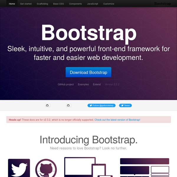


http://getbootstrap.com/2.3.2/
Bootstrap Form Builder Rendered source of your form: About Created By Adam Moore (@minikomi) to help take the stress out of writing all that markup to get bootstrap forms together. Less Framework 4 I called Less Framework "a CSS grid system for designing adaptive websites". It was basically a fixed-width grid that adapted to a couple of then popular screen widths by shedding some of its columns. It also had matching typographic presets to go with it, built with a modular scale based on the golden ratio. The resources it was originally published with are still available on GitHub. Contrary to how most CSS frameworks work, Less Framework simply provided a set of code comments and visual templates, instead of having predefined classes to control the layout with. This is how I still work today and definitely a method I advocate.
Customizing Twitter Bootstrap's Nav Bar Color in 2.0 - The Nyaruka Blog Twitter Bootstrap is the bee's knees. At Nyaruka we've used it for virtually every single project since it arrived on the scene. And we aren't the only ones. Sites across the web have picked it up as a great tool to get functional, good looking designs up quickly. But there's one downside to the popularity of Bootstrap, it is all too easy to have your site look like every other Bootstrap site. 20 Awesome Resources for Twitter Bootstrap Lovers Generators Bootstrap Custom Build Before diving into great third party Bootstrap resources, it’s worth pointing out a great little tool right from Twitter that allows you to completely customize an impressive range of Boostrap features so that you can create a custom build that’s perfect for your project. If you haven’t checked out Bootstrap in a while, you should give this a look because it’s new with Twitter Bootstrap 2.0. Not only can you use it to take an overweight download and transform it into something lean, you can also save yourself a lot of CSS work by customizing colors, fonts etc. before you even initiate the download. StyleBootstrap.info
Golden Grid System GGS was my next step after Less Framework. Instead of a fixed-width grid, it used a fully fluid-width one, without even a maximum width. The resources it was published with are still available on GitHub. The idea was to take a 18-column grid, use the outermost columns as margins, and use the remaining 16 to lay elements out. On smaller screens the 16 columns could be folded into 8, 4 and 2.
56 Pure CSS Effects Javascript Alternatives Including Demos Cascading Style Sheet (CSS) is a document format which provides a set of style rules which can then be incorporated in an XHTML or HTML document. It is a means to separate web content from formatting and presentation information. Although CSS is generally considered a simple and straightforward language, sometimes it requires creativity, skill and a bit of experimentation. Andy Clarke at Smashing Conference In his talk at Smashing Conference, Andy Clarke talks about how responsive design needs to transcend designers, we need to rework our design process, and we need to be more honest and open with our clients. Responsive design is not just our problem We need to fix our design process How to tell your client they’re an idiot to their face and not get fired. Responsive design is not just our problem We’ve been focusing on the design and technical problems of responsive design. We’ve been treating responsive design as a creative challenge. However it’s more of a business problem.
Beautiful Buttons for Twitter Bootstrappers This is an extension to the Twitter Bootstrap framework. It makes creating pretty buttons easy. (Send improvements to @charliepark.) First, monkey with the sliders on the left. Use your arrow keys for extra precision. (Button Puffiness might not affect all browsers.)
Customize Twitter Bootstrap To Not Look Bootstrap-y - Aj freelancer NOTICE: This article is outdated. Please read my article on how to build Bootstrap 3.0 themes the proper way. Thank you! Projects — Andy Taylor Style Manual An incomplete, personal grammar reference. When something is in question, I plan to document the opinions of multiple books (and other sources), drawing my own conclusions and setting my own rules for style. 1140px CSS Grid A (retired) responsive CSS grid system.
Nifty Modal Window Effects A set of experimental modal window appearance effects with CSS transitions and animations. View demo Download source Today we want to share some ideas for modal window effects with you. There are infinite possibilities for transitioning the appearance of a dialog box and we wanted to provide some ideas of how to show dialog boxes and provide some inspiration. A pixel is not a pixel is not a pixel Page last changed today Yesterday John Gruber wrote about the upped pixel density in the upcoming iPhone (960x640 instead of 480x320), and why Apple did this. He also wondered what the consequences for web developers would be. Now I happen to be deeply engaged in cross-browser research of widths and heights on mobile phones, and can state with reasonable certainty that in 99% of the cases these changes will not impact web developers at all.
Helps you understand how your site looks on multiple devices: mobile devices, tablets, computers, etc. So it helps you in your design. (might want to use grid system to design) by dpvagabond Apr 20