
Overview: Epi Measurmeants. Absolute vs relative risk – making sense of media stories. Some activities are riskier than others.

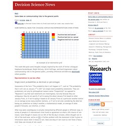
Some ideas on communicating risks to the general public. An example of an information grid This week DSN posts some thoughts (largely inspired by the work of former colleagues Stephanie Kurzenhäuser, Ralph Hertwig, Ulrich Hoffrage, and Gerd Gigerenzer) about communicating risks to the general public, providing references and delicious downloads where possible.
Representations to use less often Single-event probabilities as decimals or percentages Statements of the form “The probability that X will happen is Y”, such as “The probability that it will rain on January 1st is 30%” are single-event probability statements. What may seem unambiguous is actually interpreted by different people in different ways. In addition, when risks are described as probabilities, people tend to overweight small probabilities and underweight large probabilities. Conditional probabilities as decimals or percentages Doctors given problems of the type: The probability of colorectal cancer in a certain population is 0.3% [base rate]. Relative risks. When can odds ratios mislead? Huw Talfryn Oakley Davies (hd@st-and.ac.uk), lecturer in health care managementa, Iain Kinloch Crombieb, reader in epidemiology, Manouche Tavakolia, lecturer in health and industrial economics Author Affiliations Correspondence to: Dr DaviesAccepted 24 February 1998 Odds ratios are a common measure of the size of an effect and may be reported in case-control studies, cohort studies, or clinical trials.
How to explain screening test outcomes. Lawnmowers versus terrorists. Birth Control Pills Still Linked to Breast Cancer, Study Finds. The dark side of early diagnosis. The Masks Masquerade. SIX ERRORS: 1) missing the compounding effects of masks, 2) missing the nonlinearity of the probability of infection to viral exposures, 3) missing absence of evidence (of benefits of mask wearing) for evidence of absence (of benefits of mask wearing), 4) missing the point that people do not need governments to produce facial covering: they can make their own, 5) missing the compounding effects of statistical signals, 6) ignoring the Non-Aggression Principle by pseudolibertarians (masks are also to protect others from you; it’s a multiplicative process: every person you infect will infect others).
In fact masks (and faceshields) supplemented with constraints of superspreader events can save us trillions of dollars in future lockdowns (and lawsuits) and be potentially sufficient (under adequate compliance) to stem the pandemic. Bureaucrats do not like simple solutions. First error: missing the compounding effect. R Epidemics Consortium. An R View into Epidemiology. By Joseph Rickert If you have been tracking the numbers for the COVID-19 pandemic, you must have looked at dozens of models and tried to make some comparisons.
Even under the best of situations it is difficult to compare models, and this is especially true if you don’t have sufficient domain knowledge. Experts tend to leave out assumptions and background material that they know other experts will take for granted. This leaves newcomers pretty much on their own. It has been my experience that a good way for an R literate person to begin to acquire knowledge in a new field is to find some appropriate packages, study the vignettes, work through the examples, and read whatever source material they may reference.
Because there is no epidemiology task view, a good place to start is to search CRAN directly. The two main packages I used to search were: pkgsearch which searches CRAN package data and dlstats which retrieves package download information from the RStudio mirror. COVID19 Epidemiology with R. Tim Churches is a Senior Research Fellow at the UNSW Medicine South Western Sydney Clinical School at Liverpool Hospital, and a health data scientist at the Ingham Institute for Applied Medical Research, also located at Liverpool, Sydney.
His background is in general medicine, general practice medicine, occupational health, public health practice, particularly population health surveillance, and clinical epidemiology. As I write this on 4th March, 2020, the world is on the cusp of a global COVID-19 pandemic caused by the SARS-Cov2 virus. Every news report is dominated by alarming, and ever-growing cumulative counts of global cases and deaths due to COVID-19. Dashboards of global spread are beginning to light up like Christmas trees. For R users, an obvious question is: “Does R have anything to offer in helping to understand the situation?”.
Simulating COVID19 Interventions in R. By Tim Churches Tim Churches is a Senior Research Fellow at the UNSW Medicine South Western Sydney Clinical School at Liverpool Hospital, and a health data scientist at the Ingham Institute for Applied Medical Research.
Test positivity rates and disease incidence. Test positivity rates and disease incidence OK, lets talk about test positivity rates ie the proportion of administered tests that conclude the subject has the disease being tested for.
These are in the news, with COVID-19 test positivity being used as an informal indicator of COVID-19 incidence and the quality of the confirmed case data, for example in Nate Silver’s daily commentaries. There’s a good recent piece in The Atlantic on why high test positivity rates are a particular problem for understanding incidence in the US where tests have been scarce. Estimating Covid-19 reproduction number with delays and right-truncation. This great preprint recently came out from a team of Katelyn Gostic and others.

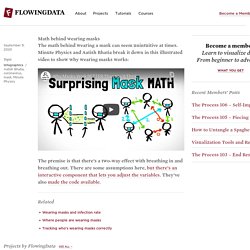
It uses simulations to test various methods of estimating the effective reproduction number . Math behind wearing masks. Math behind wearing masks September 9, 2020 Topic Infographics / Aatish Bhatia, coronavirus, mask, Minute Physics The math behind wearing a mask can seem unintuitive at times.
