

Rating the Severity of Usability Problems: Measuring Usability. Jeff Sauro • July 30, 2013 If only one out of 1000 users encounters a problem with a website, then it's a minor problem.
If that sentence bothered you, it should. It could be that that single problem resulted in one visitor's financial information inadvertently being posted to the website for the world to see. User Experience Magazine - The Magazine of the User Experience Professionals Association. 10 Free Screen Readers For Blind Or Visually Impaired Users. It is not difficult for a sighted person to imagine how being blind or visually impaired could make using a computer difficult.
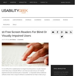
Just close your eyes and you will instantly experience that even processing text is impossible – or impossible without additional software at least. Now a range of software is available that can help to make using a computer an easier, more enjoyable and more productive experience for blind or visually impaired users. Essential Software: A Screen Reader A screen reader is an essential piece of software for a blind or visually impaired person. Simply put, a screen reader transmits whatever text is displayed on the computer screen into a form that a visually impaired user can process (usually tactile, auditory or a combination of both).
The State Of Responsive Web Design. Advertisement Meet the new Sketch Handbook, our brand new Smashing book that will help you master all the tricky, advanced facets of Sketch.
Filled with practical examples and tutorials in 12 chapters, the book will help you become more proficient in your work. Get the book now → Responsive Web Design: What It Is and How To Use It. Advertisement Almost every new client these days wants a mobile version of their website.

It’s practically essential after all: one design for the BlackBerry, another for the iPhone, the iPad, netbook, Kindle — and all screen resolutions must be compatible, too. In the next five years, we’ll likely need to design for a number of additional inventions. When will the madness stop? It won’t, of course. In the field of Web design and development, we’re quickly getting to the point of being unable to keep up with the endless new resolutions and devices. Seven Guidelines For Designing High-Performance Mobile User Experiences. Advertisement A positive first impression is essential to relationships.

People look for trust and integrity, and they expect subsequent encounters to reflect and reinforce their first impression. The same principles apply to brands and their products. Design plays an important role in building lasting relationships with end users and, thus, in supporting the brand’s promise. Users expect mobile services to be relevant and user-friendly and to perform well. Your daily dose of design tips and inspiration. User Experience Strategy. Research : Home. 7 Key Design Tips for High-Converting Landing Pages [+ Free Templates] Here's some food for thought: Companies see a 55% increase in leads when increasing their number of landing pages from just 10 to 15 , according to our 2012 Marketing Benchmarks Report .
Here's some more food for thought: According to MarketingSherpa's Landing Page Optimization Benchmarks Report , layout is a major factor in website performance. Landing pages are a fundamental -- and undeniable -- part of a sucessful inbound marketing strategy. They are the hub of your lead generation efforts, and that's why every campaign you run and offer you create should be tied to a custom landing page -- as opposed to an ambigious homepage where visitors have to guess what to do next. Flat Pixels: The Battle Between Flat Design And Skeuomorphism. Get the Kindle version: If you're paying attention to what's going on in the design world, you've probably noticed the ongoing debate around skeuomorphism vs flat design.
So here's a quick test. Which of these two calculators feature a skeuomorphic design? Which of these two apps is skeuomorphic? If you answered "skeuowhat? " But if you answered "the app on the right, of course! " The correct answer is that both apps are skeuomorphs. Defining Skeuomorphism This obscure word describes the way designs often borrow a particular feature from the past, even when the functional need for it is gone. Or, as Wikipedia tells us [1]: A skeuomorph is a physical ornament or design on an object copied from a form of the object when made from another material or by other techniques. While Wikipedia only mentions "physical ornaments", the digital world has seen skeuomorphism popularized in the past couple years mainly thanks to the recent iOS-inspired trend of rich textures and life-like controls.
Notes.
Defining and Informing the Complex Field of User Experience (UX) Guiding Principles for UX Designers. Editor's Note: This is a republication of a very popular article Whitney Hess (@whitneyhess) originally wrote on her blog, Pleasure & Pain, back in November.
We usually avoid duplicating popular content, but this is such valuable information that we wanted to make sure as many people saw it as possible. Five months ago I wrote a post titled, "So you wanna be a user experience designer," in which I gathered all of the resources in my UX arsenal: publications and blogs, books, local events, organizations, mailing lists, webinars, workshops, conferences, and schooling. My intent was to give aspiring user experience designers, or even those on the hunt for additional inspiration, a launching pad for getting started. The response has been pretty remarkable—the link continues to be sent around the Twitterverse and referenced in the blogosphere.
Dev & Design. A List Apart: For People Who Make Websites.