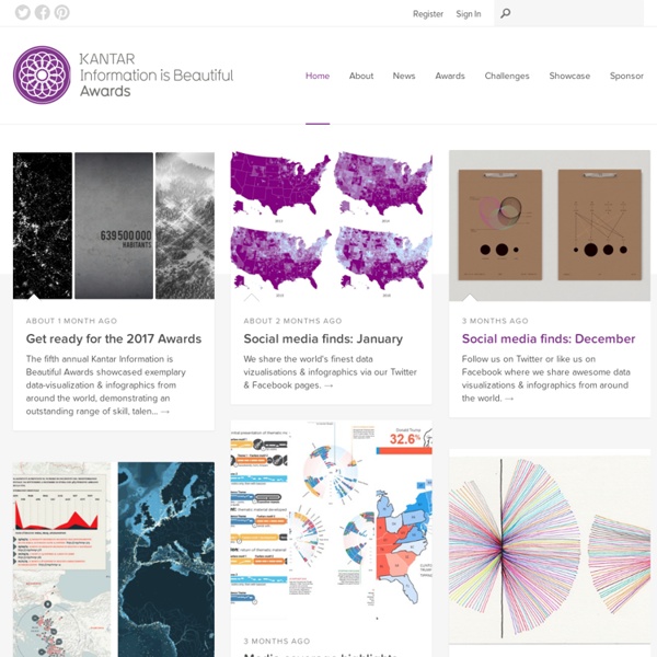


http://www.informationisbeautifulawards.com/
Related: Big data • Maps and VizThe One-Stop Shop for Big Data Today, I’m going to explain in plain English the top 10 most influential data mining algorithms as voted on by 3 separate panels in this survey paper. Once you know what they are, how they work, what they do and where you can find them, my hope is you’ll have this blog post as a springboard to learn even more about data mining. What are we waiting for? Let’s get started! Here are the algorithms: 1.
Distribution of Hispanic or Latino Population by Specific Origin: 2010 Within the larger category of Hispanic or Latino Origin, people responding to the Census questionnaire reported many different specific origins. The clustering and dispersion of people in those categories can be explored in this interactive graphic. The area of each circle shown reflects the proportion of the group that lives in a given county. About Pattern Tap Designers don’t design in a vacuum. They find inspiration and influence from the world around them. They collect other designs besides their own. Designs they love.
A Passionate, Unapologetic Plea for Creative Writing in Schools - Rebecca Wallace-Segall Some fiction and memoir programs are a waste of classroom time. Others sharpen students' thinking and provide them with unmatched insight. Good teachers know the difference. ellichen/Shutterstock "I'm not sure if eight-year-olds should be permitted to have death or murder references in their short stories," said a New York City public school principal to me at the end of the day today. If We Assume: Colors in Visualizations, a Rainbow of References “...I wondered if it was blasphemous to tell God that rainbows are kitsch.” --Steve Toltz, A Fraction of the Whole Color is one of the most fundamental, and sometimes most challenging, aspects of data visualization. Many times you may not know why a given color scheme looks bad (or good), but your eye can quickly pick it out. There are many schools of thought about color families, color meanings, complimentary colors, and which you should use in figures/plots. The rainbow color table, a default in many programs/languages, frequently produces horrible results.
A Practical Intro to Data Science — Zipfian Academy - Data Science Bootcamp Are you a interested in taking a course with us? Learn more on our programs page or contact us. There are plenty of articles and discussions on the web about what data science is, what qualities define a data scientist, how to nurture them, and how you should position yourself to be a competitive applicant. There are far fewer resources out there about the steps to take in order to obtain the skills necessary to practice this elusive discipline. Anscombe's quartet All four sets are identical when examined using simple summary statistics, but vary considerably when graphed Anscombe's quartet comprises four datasets that have nearly identical simple descriptive statistics, yet appear very different when graphed. Each dataset consists of eleven (x,y) points.
Tab Navigation with Smooth Horizontal Sliding Using jQuery In this tutorial I'll show you how to create a navigation menu that slides horizontally. It begins with a set of "tabs" on the right side of a containing element. When clicked, a tab slides to the left to reveal a group of links. Click the tab again, and it slides back. While I've never had a need to build one of these for any of my own projects, quite a few people have asked if I would demonstrate how it might be done, so here goes.
2012 Global Brand Simplicity Index The need for simplicity and the corresponding economic value is greater than ever. In Siegel+Gale's third annual Global Brand Simplicity Index™ we evaluate the state, significance and impact of simplicity and provide recommendations on how brands can improve their customer relationships and create value. Key findings include: The financial value brands can derive from greater simplicityThe crucial link between simplicity and the ability to innovateThe increased likelihood that global consumers will recommend a brand that offers a simpler experienceThe best and worst brands and industries when it comes to simplicity and what can be learned from them This year we analyzed the customer experience within the travel and hospitality, retail banking, and restaurant and grocery industries to understand how scale and different attributes of simplicity affect consumer perceptions.
Data Visualisation Blogs Hi Tom, great list. Your readers might want to check out as well. There is the Digg Explorer, Digg Trends, Word Association Clouds and many other interactive applications to explore information in new ways.