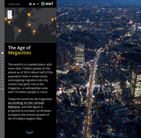


http://storymaps.esri.com/stories/2014/growth-of-cities/
Related: Carto • urbanisationEducation Available languages — Using OpenStreetMap in an Educational Context For information about academic research related to OpenStreetMap, see Research. For a general article about how to map educational facilities in OpenStreetMap, see Education features. Students learning about OpenStreetMap at a workshop at FEATI University in the Philippines These Charts Show That Detroit Is Surprisingly Crowded Detroit is often described as sparsely inhabited and marred by abandoned buildings, but its population density—the number of people per square mile—ranks 69th among the nearly 300 U.S. cities with more than 100,000 residents. Despite losing more than a million people over the last 60 years, Detroit’s density is still higher than in Sacramento, Denver, Austin, Atlanta, and Salt Lake City, to name a few. Portland, Oregon, is roughly the same size as Detroit, yet has nearly 1,000 people less per square mile. The Motor City is also ahead of sprawling Sun Belt cities such as Houston, Las Vegas, and Phoenix, which is almost four times the size of Detroit but has half the population density. But these places are never described as empty, likely because they have not seen the same level of urban decay. Built for two million people, today Detroit is home to less than 700,000.
Urban world: Mapping the economic power of cities Six hundred cities—the City 600—are projected to generate more than 60 percent of global growth to 2025. Within this group, companies need to adjust their strategy to include the 577 fast-growing “middleweight cities.” The urban world is shifting. Today only 600 urban centers generate about 60 percent of global GDP. While 600 cities will continue to account for the same share of global GDP in 2025, this group of 600 will have a very different membership. The Agas Map Our new (as of the beginning of 2015) implementation of the Agas Map is based on the OpenLayers 3.0 library. It presents the map as a zoomable, rotatable tiled image with several hundred locations plotted on it. In the default view, the locations are initially hidden; you can show them by checking checkboxes in the navigation panel which appears at the top right of the map.
World City Populations Interactive Map 1950-2030 The Global Urban Transformation This map visualises the radical transformation that has occurred across the globe in the last 60 years, from a 30% urban world in 1950, to a 54% urban world in 2015 and a predicted two-thirds urban world in 2050. In 1950 there were 740m people living in cities; there are now 4 billion, rising to a predicted 6.3b by 2050. The circles on the map are proportional to city populations in 1950, 1990, 2015 and 2030. Move your mouse over cities to explore their detailed dynamics.
Block by Block, Brooklyn’s Past and Present On my weekly walk to get groceries, I pass a row of brownstones — some well-kempt and majestic, some fossil-like and crumbling — bookended by a gleaming, square-windowed silver tower. It’s an architectural contrast of a kind that’s commonplace throughout Brooklyn. The borough’s a patchwork of the old and new, but traces of its history aren’t spread evenly. There are 320,000-odd buildings in Brooklyn, and I’ve plotted and shaded each of them according to its year of construction.
Mapping America’s Futures What will America look like in 2030? We can already see that the population is aging and becoming more diverse, but how will those trends play out at the local and regional levels? And what if, in the future, we live longer or have more babies? How would those trends affect the population in different cities and states? These demographic shifts matter a great deal to states and local communities. Mapping the Flow of International Trade According the UN’s Comtrade database, the global market for imported goods totaled $15.6 trillion in 2015. This map shows where those goods came from and where they went, each dot representing $1 billion in value. Select a country to see the flow of goods in and out of that country. The Flow of International Trade (full screen) Full screen version / Youtube With the election of Donald Trump, international trade is suddenly at the top of the U.S. agenda.
Map: L.A. street quality grades L.A. street quality grades An analysis by the Los Angeles Times Data Desk Explore pavement quality ratings for each of the 68,000 street segments in L.A., graded from A to F. MORE: Read the story | How we made this map advertisement Street quality grades The problem with maps. Mandatory Accompanying Playlist The World The world is round. Google says so. The problem is, spheres can be hard to get your head around… Imagine we want to see a map of the whole world. We might try something like this. World Migration Map - Data Visualization by Metrocosm This map shows the estimated net immigration (inflows minus outflows) by origin and destination country between 2010 and 2015. Blue circles = positive net migration (more inflows). Red circles = negative net migration (more outflows). Each yellow dot represents 1,000 people.