

DataIsBeautiful. 9 Infographic Design Examples That Will Leave You Inspired. Infographics aren’t a new phenomenon, but they’ve grown in popularity over the last decade.
More and more brands, creatives, and consumers are seeing the value of infographic design. Infographics can help communicate information in numerous ways, and we’ve compiled some of our favorite infographic designs to show how. Some of these infographic design examples are more practical, “how-to” stories, while others shed light on important social issues, but they all have (at least) one thing in common: They look badass. We hope they leave you inspired to create your own infographics. Enjoy! A Well-Balanced Blog As the market becomes saturated with infographics, finding unique and creative ways to rise above the noise is essential. The Sound Of Color. Commetrix - Dynamic Network Visualization Software - Dynamic Visualization of Networks - Dynamic Social Network Analysis Software Visualization - Dynamic Network Analysis - Virtual Communities. Centrifuge Systems. Centrifuge Analytics v2.10 Press Announcement Centrifuge Systems announced the general availability of Centrifuge Analytics v2.10, an industry leading security-focused release of its unique data discovery through link analysis and visualization platform.
Extend and refine the already robust Centrifuge access control and security policies to specify not only who is allowed access to restricted projects, but also who is NOT. Traditionally applications are based on the whitelist access models: if you have a key, you can open the door. It is typically done that way because it’s easier to create a list of people who can use the application rather than who cannot. Data 101 Archives - Visage. In our Data Visualization 101 series, we cover each chart type to help you sharpen your data visualization skills.
For a general data refresher, start here. So far in our series, we’ve dealt with tools for clearly displaying two dimensions of data, but what happens when you have a third or fourth? Do you use a bar chart and stack bars with different variables next to one another? Do you use multiple graphs and compare the results? Welcome to the bubble chart. What It Is In its most basic form, the bubble chart communicates two dimensions of data: one, a numerical value visualized in the scale of its circular bubbles, and the second in what each bubble represents.
List of Wearables. Tools to Create Infographics. Visualization and Statistics. Business Intelligence Dashboard Software. Amitabh Bachchan. VoD Advertising. Interactive data viz. TULP interactive. Welcome to the website of HICHERT+PARTNER AG. Visualising Data » Blog Archive » Essential Resources: Web-based visualisation tools. This is part of a series of posts to share with readers a useful collection of some of the most important, effective and practical data visualisation resources.
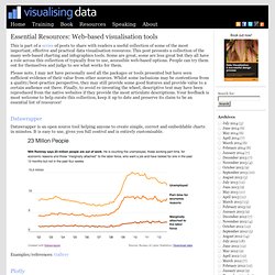
This post presents a collection of the many web-based charting and infographics tools. Some are great, some are less great but they all have a role across this collection of typically free to use, accessible web-based options. People can try them out for themselves and judge to see what works for them. Please note, I may not have personally used all the packages or tools presented but have seen sufficient evidence of their value from other sources. Whilst some inclusions may be contentious from a quality/best-practice perspective, they may still provide some good features and provide value to a certain audience out there. Datawrapper Datawrapper is an open source tool helping anyone to create simple, correct and embeddable charts in minutes.
Examples/references: Gallery Plotly Examples/references: Gallery Google Fusion Tables Slice. Visual Analytics and Data Discovery. OEM Partnerships. For over ten years we have been building mutually beneficial partnerships.
Our partner programs enable independent software vendors to rollout a dashboard solution at a cost significantly lower than developing a complete solution in house. The iDashboards OEM Program has been built on a strong foundation of values including: Beyond Dashboards: Business Intelligence Tools for Program Analysis and Reporting. 8 Articles Discussing Visual and Visualisation Literacy » Seeing Data. In many ways we are in a golden age of experimentation and discovery in data visualisation.
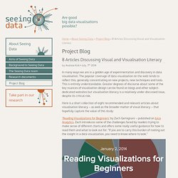
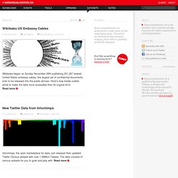
The popular coverage of data visualisation on the web tends to reflect this, generally concentrating on new projects, new techniques and tools. This is entirely understandable. Datasets on Datavisualization.ch. Wikileaks US Embassy Cables 29 Nov 2010 Datasets Infographic, Politics Wikileaks began on Sunday November 28th publishing 251,287 leaked United States embassy cables, the largest set of confidential documents ever to be released into the public domain.
Create Infographics. Map Your Business newsletter. Big Data Analytics. The Five Best Libraries For Building Data Visualizations. An explosion in the number of available data sources and data-processing tools means that more people than ever are jumping into the world of data visualization.
But with so much to learn, it can be intimidating to know just where to start. So which library is best, and what advice do the pros have? Read on and find out. Like telling the history of personal computers without mentioning Steve Jobs, it’s impossible to talk about data visualization without talking about D3. Arguably the most dominant and important programming library in the field, D3 (short for Data Driven Documents) is an open source JavaScript library usually used to generate SVG graphics. 2Reactions D3’s popularity owes a lot to the sudden interest in SVG by web designers--largely because vector graphics look superb on the kind of high-resolution screens (think Apple's Retina display), which are becoming increasingly common. 1Reaction While D3 is a generalist library, it’s not perfect for everything, however.
Vega Gephi. JESS3. Social Explorer. Infographic. Why Data Visualizations. A picture is worth 1000 words A proverb is a simple and concrete saying popularly known and revered, which expresses a truth, based on common sense or the practical experience of humanity.
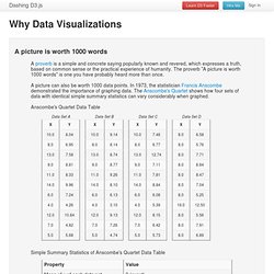
The proverb "A picture is worth 1000 words" is one you have probably heard more than once. A picture can also be worth 1000 data points. In 1973, the statistician Francis Anscombe demonstrated the importance of graphing data. The Anscombe's Quartet shows how four sets of data with identical simple summary statistics can vary considerably when graphed. Making Business Decisions Easier with Data Visualizations. Informed decision making is the foundation upon which successful businesses are built.
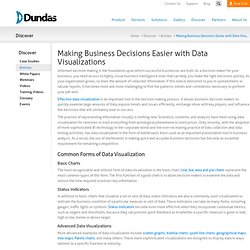
As a decision maker for your business, you need access to highly visual business intelligence tools that can help you make the right decisions quickly. As your organization grows, so does the amount of collected information. If this data is delivered to you in spreadsheets or tabular reports, it becomes more and more challenging to find the patterns, trends and correlations necessary to perform your job well. 5 Methods for Visualizing Unstructured Data. The Best Infographics Of 2013 – So Far. Infographics show data in a visual way, and make the information much more accessible for English Language Learners — and everybody else. Interactive infographics are especially engaging because they allow users to customize the data they see. You’ll find both kinds in this list. You might also be interested in: Welcome to the Visually Marketplace.